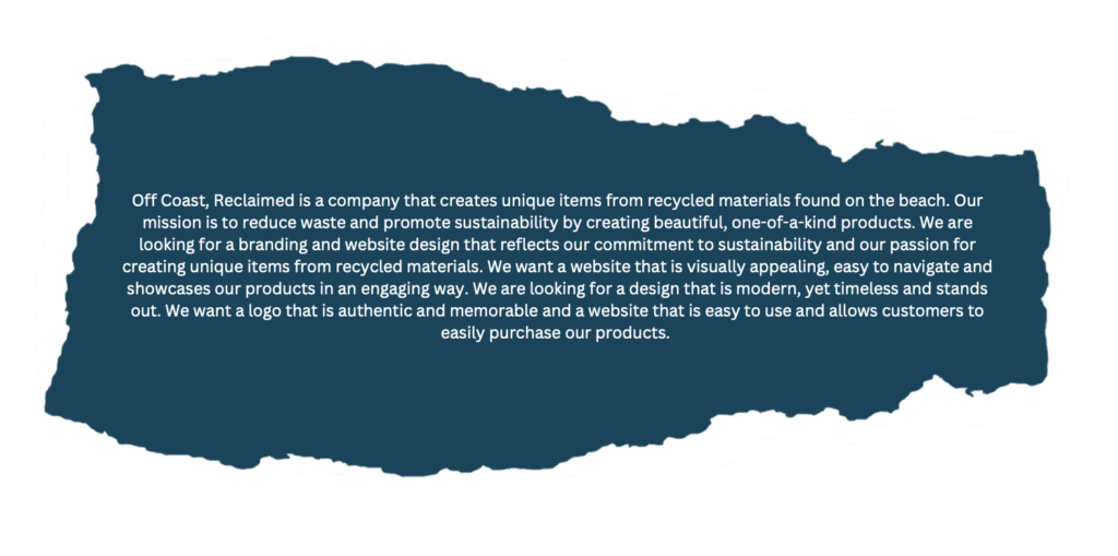
This is my final project at university. I have developed the Off Coast company from my original business plan. I wanted to create a company that would promote sustainability as well as surround a topic I’m passionate about. The topic consists of litter build-up on beaches, I decided to focus on this topic as I have always been a nature lover and have been brought up to respect nature. With interests such as surfing and jet skiing, beaches and the ocean are very important to me. From past experiences, I’ve witnessed what pollution can do to beaches and the effect it can have on wildlife. Over the past years, I have changed how I purchase products. Preferring to buy from sustainable brands and recycled clothing shops. I have noticed more interest in buying sustainably and people taking accountability for their waste.
As you scroll down the page you will be able to see the process of how I got to the final product. Alongside imagery, I will be narrating the development of the project from notes taken throughout.
I created this initial mind map when deciding what business I wanted to create. As you can see, a lot of research was needed to make sure this idea was possible. I also wanted to focus on a USP ( Unique Selling Point ) as this would assist in attracting customers.
After receiving positive feedback on my business plan in my last semester, I decided to carry on with the project and create branding and a website for the company.
TimeLine
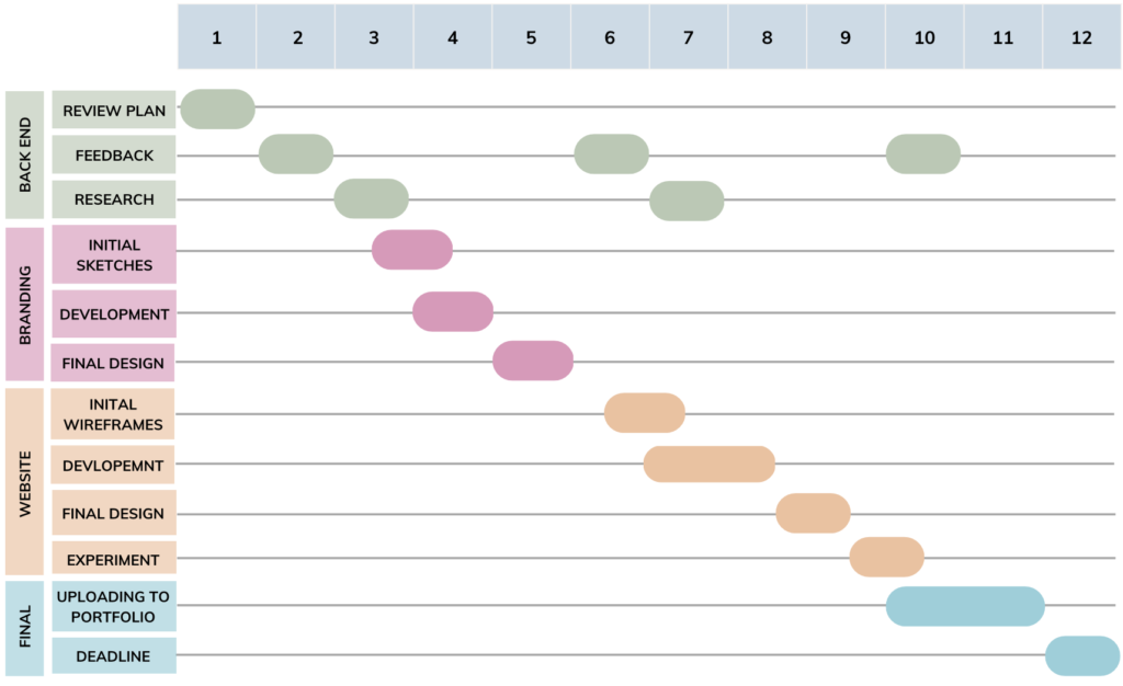
Before starting the project, I decided to map out a timeline of how many weeks I had to create the finished outcome. This was critical to ensuring that the project was finished to a high standard while also finishing my other modules. The major goal was to meet the final deadline in week 12. However on of my milestones was in week 10, where I wanted to conduct exposure experiments to ensure satisfaction with users in order to gather feedback and make any necessary changes.
In this semester, there were possible risks of running out of time due to the many components such as branding, research, website development. However by creating a gantt chart early on in the semester, made it easier to allocate sufficient time to each task and ensured that I would keep to my time constraints.
The Brief
Reflection from brief - Aims and Objectives
Aim : To create branding and website design for the Off Coast Reclaimed company, ensuring all designs incorporate a sense of sustainability.
Objective 1 : To create branding that shows the companies message
Objective 2 : To create a website that used the branding guidelines, which also is user friendly and easy to navigate
Problem
Plastic pollution affects biodiversity and wildlife :
Plastic is non-biodegradable, taking years to decompose. This clutters UK beaches and provides an inhabitable environment for animals. It’s suggested that “At current rates plastic is expected to outweigh all the fish in the sea by 2050.”
(Biologicaldiversity.org, 2023, online).
Plastic pollution affecting negatively on tourism :
Tourists may be put off from visiting a beach if it is covered in plastic waste. It can be an unpleasant sight and can also be dangerous. About 80% of all tourism is related to coastal regions (Water Witch, 2019, online). Tourism assists in the stimulation of local economies. Creating jobs for people in hospitality, retail, and the tourism industry.
These are just a couple of examples that highlight how important this topic is and how this can impact many industries.
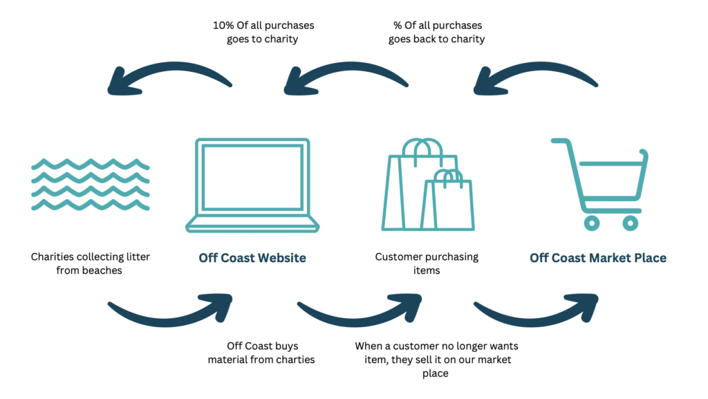
Off Coast's Solution
This infographic shows the simple cycle of how Off Coast is a sustainable company. At every stage of the process, I wanted to make sure the company was giving back to the environment and charities. Showing sustainability for a small business is important as it assists in making customers and other businesses aware of their impact on society and the environment, this also promotes the brand message and values.
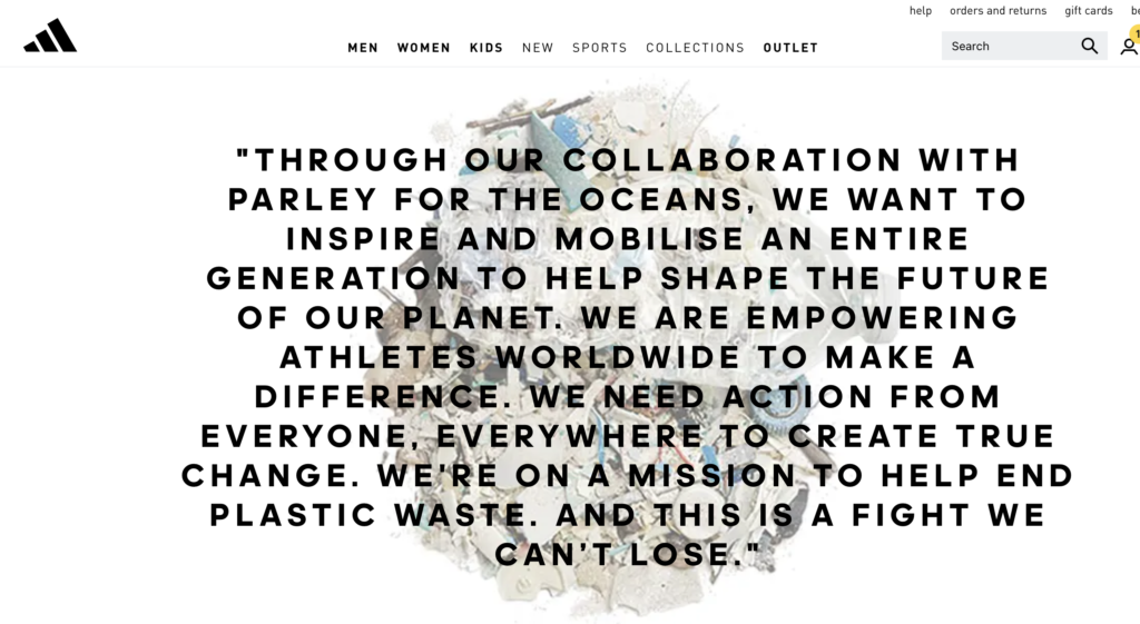
Adidas
https://www.adidas.co.uk/parley
After researching other well-known brands that promote sustainability, I found that Adidas is starting to develop some of its ranges into being sustainable. The image above was found on the Adidas website. The image is large and bold which assists in highlighting the message. More well-known brands promoting sustainability in the industry, allow the market to open up for smaller independent businesses to create more eco-friendly products and support charities in the process.
On the other hand, I found that there are alternative views in regard to larger companies promoting sustainability without actually partaking in it. When conducting my research I discovered this article on the topic in the New York Times
The article criticises companies’ sustainability reports and that a lot of companies allude that they have sustainable values. However, when you dive deeper there isn’t any substance behind their statements. Upon reflection, I noted in my written journal that throughout the company’s process, we need to ensure that we act on the statements that we are promoting.
The Competition
The main competitors in the industry are large, well-known clothing brands such as Patagonia. This band especially are well known and generates a lot of revenue from their loyal customers.
Patagonia
https://eu.patagonia.com/gb/en/home/
https://lp.similarweb.com/
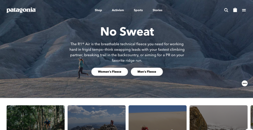
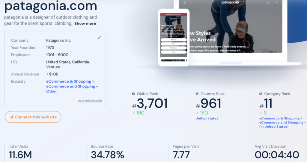
I decided to conduct in-depth research into the Patagonia website as this was one of my leading competitors which is evident form the statistics. The website has a simple yet clear website and ensures that customers know the brand’s message. This also helps in creating the narrative for the customers when navigating through the site, it is clear that the navigation menu on the home page is clear and easily accessible for the users. This enables the users to stay on the website and navigate though the product pages. Also, the website is mobile responsive which makes the website easy to access from any device. This is something that I would need to consider when I make my website. Such as how different laptops and devices scroll left to right.
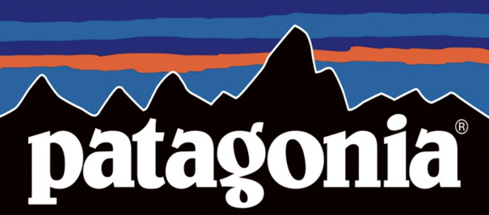
Logo analysis
I wanted to also analyse the company’s logo as well as the website and examine how well the brand when stretched across the platform. Their logo is eye-catching and very distinctive due to the bright colour palette and unique font choice. The style of the logo is very interesting as it creates a natural organic feel for the brand. This assists in promoting the company’s commitment to the environment.
The logo incorporates a variety of design theories such as balance and symbolism, which assist in creating a design that is memorable. The geometric mountains in the background are a good example of the logo using Gestalt Theory to create an image that is recognisable to customers, increasing brand recognition. Therefore, creating a logo that is original and unique is important as this will enable successful marketing.
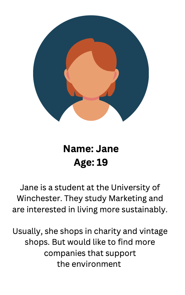
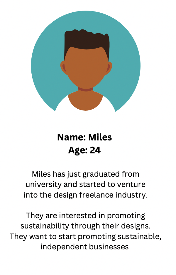
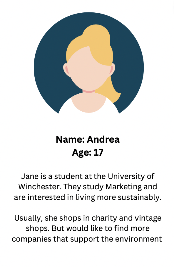
Target Personas
Initial Research into target audience
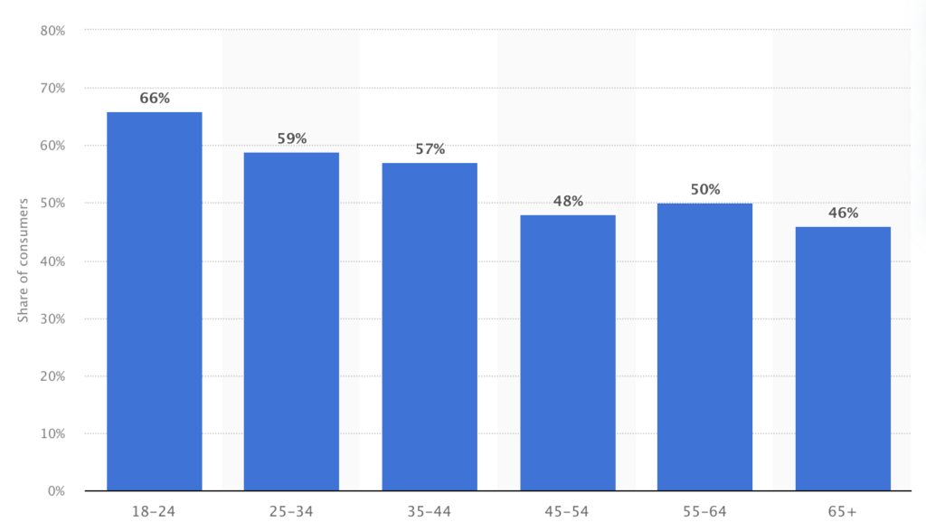
Share of consumers more likely to buy from a retailer or brand that has strong ethical and sustainable credentials in the United Kingdom (UK) in 2022, by age
https://www.statista.com/statistics/
This statistic shows that 18-24-year-olds are the generation that is most likely to purchase items from a brand that has strong ethical and sustainable values. This information, alongside the knowledge of how influenced the younger generation is by social media allows for the best target market for this brand. This shows that we can promote our website through social media and gain a following.
Initial Mindmap
After conducting my initial research into the brand, and competitors and a better understanding of the industry and the users, I moved on to start to create branding for the company. I created this mood board to assist in visualising my ideas. I started to focus on the branding which included Colour schemes, Logo ideas and possible merchandise. It was also important to create branding that would promote sustainability.
From my research into Patagonia, I wanted to incorporate the brand message into the logo. This is when I thought of the recycling icon. This is a well-known symbol in society so would work well showcasing what the brand is about. I also like the circular motion which the icon presents. I wanted to use the design theory of Semiotics as this would ‘Provide a framework for understanding how humans use signs to make meaning of the world around them.’ ( Semiotics Theory, 2021) which would assist in clearly showing the customers what the brand message is.
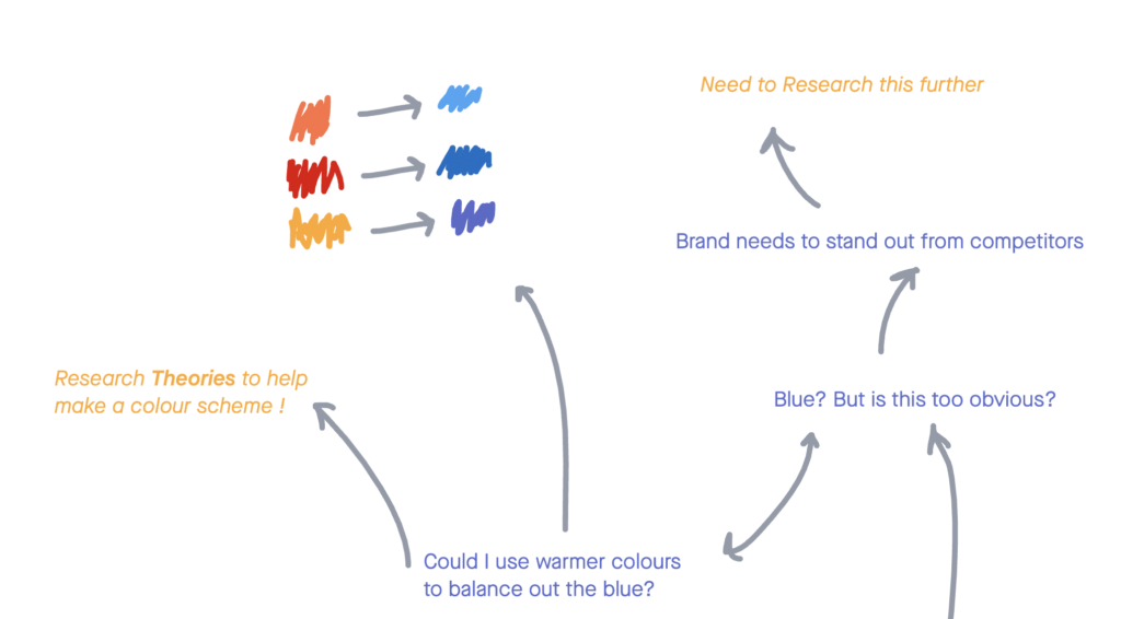
Within my mind map, I decided to consider colour schemes as this can be vital for businesses. My research showed that a lot of my competitors use variations of blue. I wanted the company to stand out and be memorable for customers. This is why I decided to experiment with cool and warm tones to stand out form competitors.
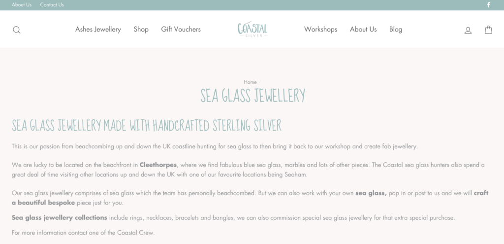
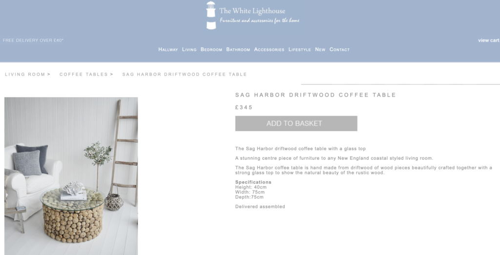
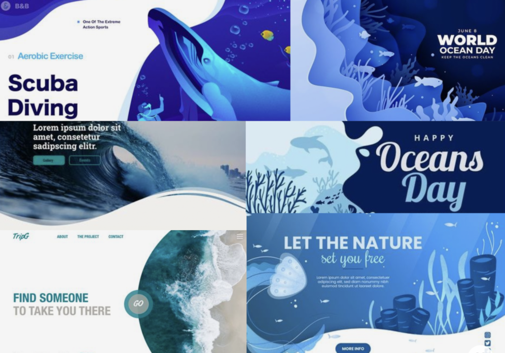
I decided to research smaller competitors and I found that many websites and brands use only cool colours as this resembles the ocean. Which allows the user to easily know what the company is about. Both websites have the same style and it is difficult to distinguish them. Including a brighter accent colour would enable users to notice the brand amongst competitors within the industry.
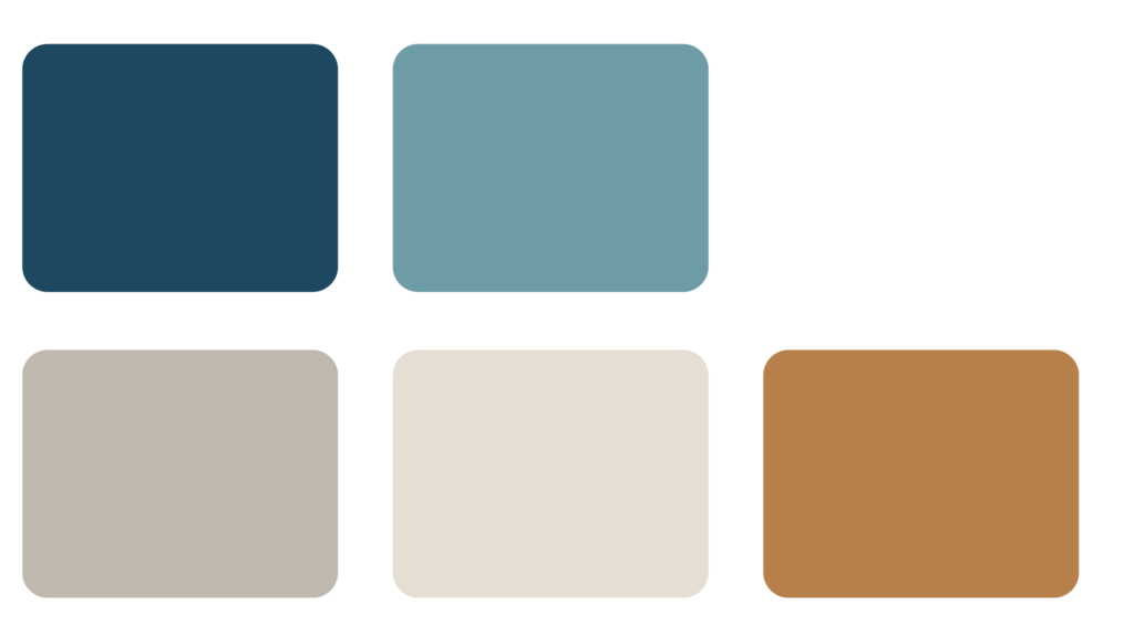
Experiment
The image on the left is the experimental colour scheme, I decided that four colours were enough to use without being overwhelming. I wanted to keep with the cool and warm tones, to have a combination of dark and lighter colours to enable a strong contrast for users. This would provide a distinctive colour scheme that users would be able to recognise in association with the logo and the brand, therefore standing out against competitors.
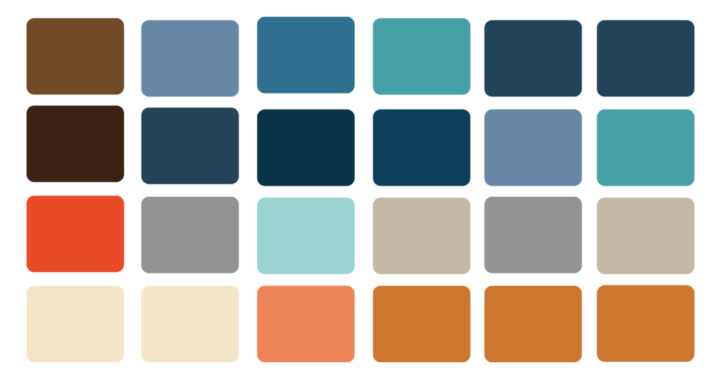
Final Colour Scheme
After experimentation, I decided on this combination. The cool blue tones contrast with the warm and exciting tones of the orange. Whilst the lighter tone colours show sophistication. These colours also allow flexibility within the branding and website design.
Logo 1
Understanding Gestalt Theory
Before starting to create a logo in week three, I decided to research Gestalt Theory. This theory states that the whole is better than the sum of its parts. This translated into design means that a combination of principles enables a better-finished product. With this in mind, I needed to consider a variety of techniques to create an effective logo. Such As
Typography
Proximity
Continuity
Order
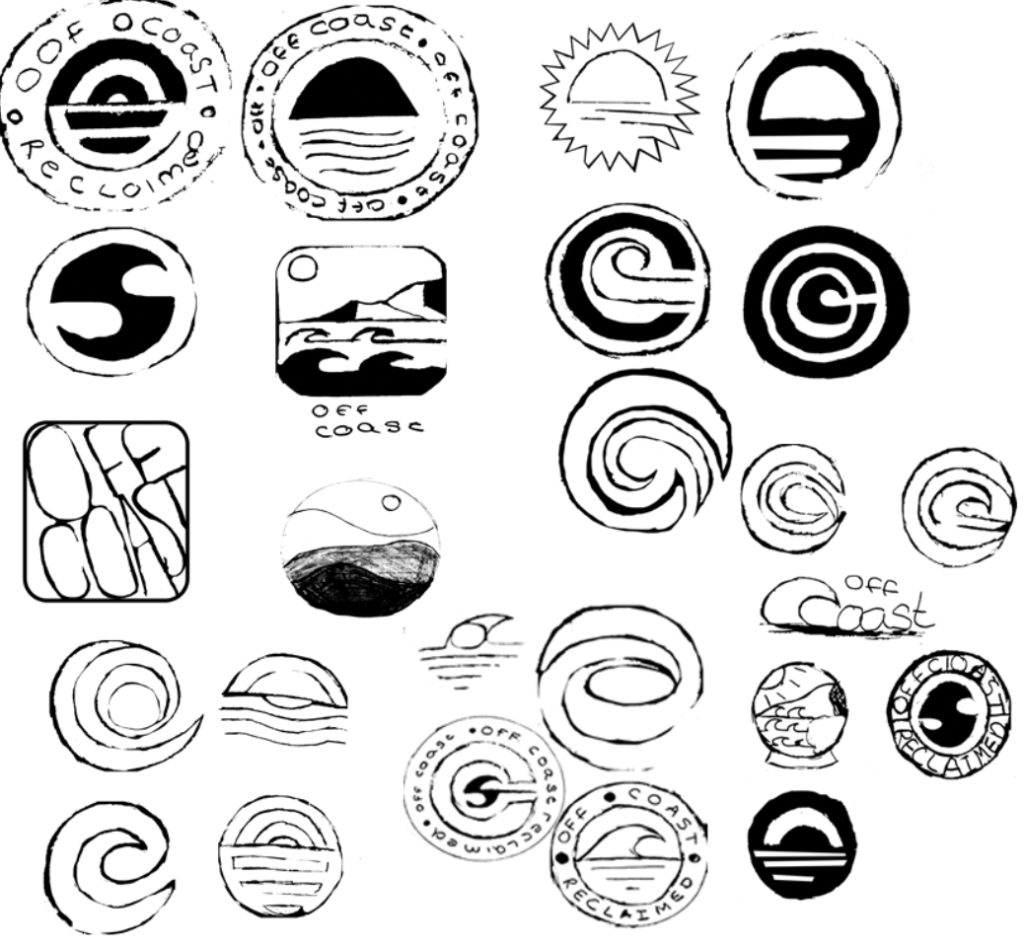
Sketches
Previous research into Gestalt theory and creating a checklist to stick too, allowed me to create a variety of sketches in my journal.
I decided to focus on a circular logo as I thought that this would allow for easier usage when implementing the logo into different settings such as packaging and website icons.
This would also allow for continuity throughout my branding which would also assist in promoting brand identity and ultimately a better final product.
With this in mind, I did experiment with other layouts of the logo and used typography to create a more modern style.
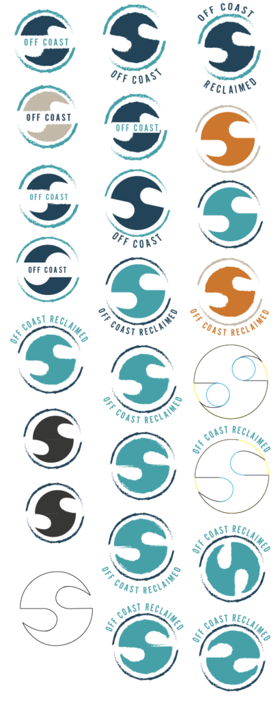
Development of Logo 1
This is the first option for my logo, The idea was developed from my initial sketches. I wanted to incorporate the motion of the recycling icon within the logo. I thought that using waves would assist in ensuring the logo still showed the brand’s values. I decided to incorporate the idea of the circular logo as I thought this would complement the icon.
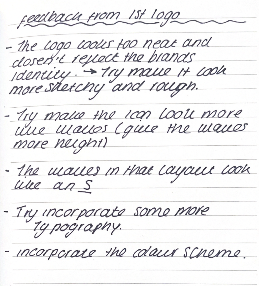
After my initial sketches and developments, I was not completely happy with how the logo was developing which is why I decided to gather feedback from my peers and lecturers. I made sure to note down my feedback in my written journal.
Feedback
This is a scan taken from one of the pages in my journal.
Feedback Write Up
” The logo looks too neat and doesn’t reflect the brand’s identity – Try to make it look more sketchy and rough.”
” Try to make the icon look more like waves ( give the waves more height )
The waves in that layout look like an S
Try to incorporate more typography.
Incorporate the colour scheme
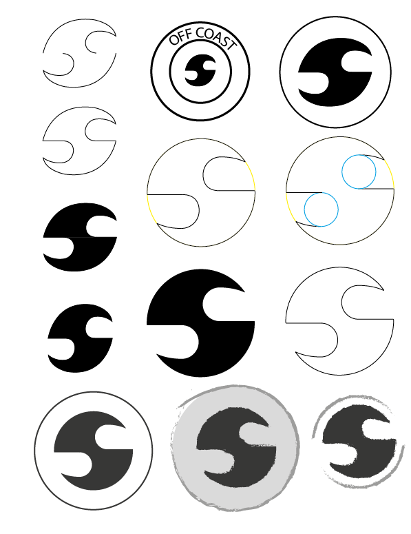
Utilising feedback to enhance designs
The image on the left shows the further development I took from acting on all the feedback I received. As you can see I worked on recreating the logo using brush strokes to give it more of a restive feel. I decided to experiment with the brush strokes in my journal to determine how thick I wanted the lines to be. This helped to complement the brand’s identity.
I also worked on making the waves look more prominent by stretching the height of the icon.
Finally, with all the corrections I decided to experiment with including the typography within the logo. I decided to use a font that would suit the style of the logo. Below is an example of the text within the company branding
I thought that the text assisted in the overall look of the logo and helped to promote the brand’s identity. After some experimentation with where the text would be placed, I decided that the text we more eye-catching at the top of the logo.
Even though I was pretty satisfied with how this logo came out, I decided to develop my other idea as this aligns with Gestalt’s theory.
Logo 2
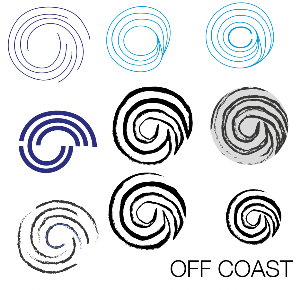
Initial Development of Logo 2
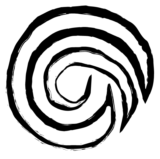
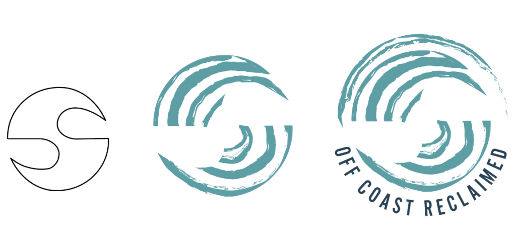
This was a simple sketched spiral inspired by the recycle icon. I thought that that would make a good icon logo for packaging as it also looked like a shell. I decided to make a few variations of the spiral but ended up sticking with the original sketch this was authentic and unique which aligned with the company values.
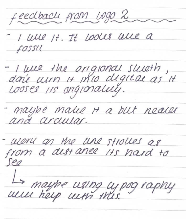
Feedback
This is a scan taken from one of the pages in my journal.
Feedback Written Up
“I like it, it looks like a fossil”.
” I like the original sketch don’t turn it into digital as it loses its originality.”
” Maybe make it a bit neater and circular.”
” Work on the line strokes as from a distance it’s hard to see.” – ” Maybe using typography will help with this?”
Using feedback to grow my designs
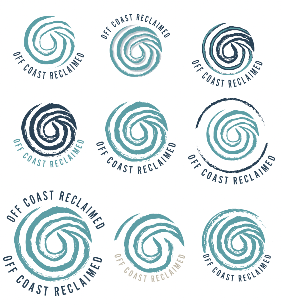
From the feedback I received on my initial logo design, I decided to develop the idea further by adding other elements such as a border and typography.
I decided to use the same font as my other logo idea. This is because the feedback received was positive as customers believed that it suited the brand well.
I decided to experiment with how the logo would look with the colour scheme. In order to minimise the detail within the logo and make it more visible from a distance, I decided that using just two colours made for a simplistic yet effective design.
Feedback
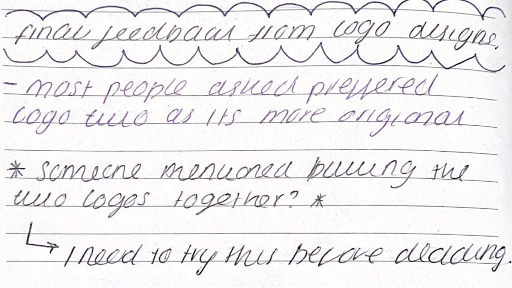
As you can see on the right, the majority of people preferred my second logo. However one of the points that I noted in my journal was possibly combining the logos together.
I found that this was an interesting idea but slightly over complicated and confusing.
This is a scan taken from one of the pages in my journal.
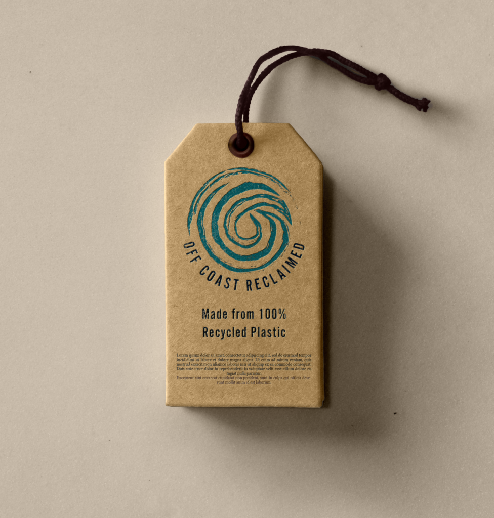
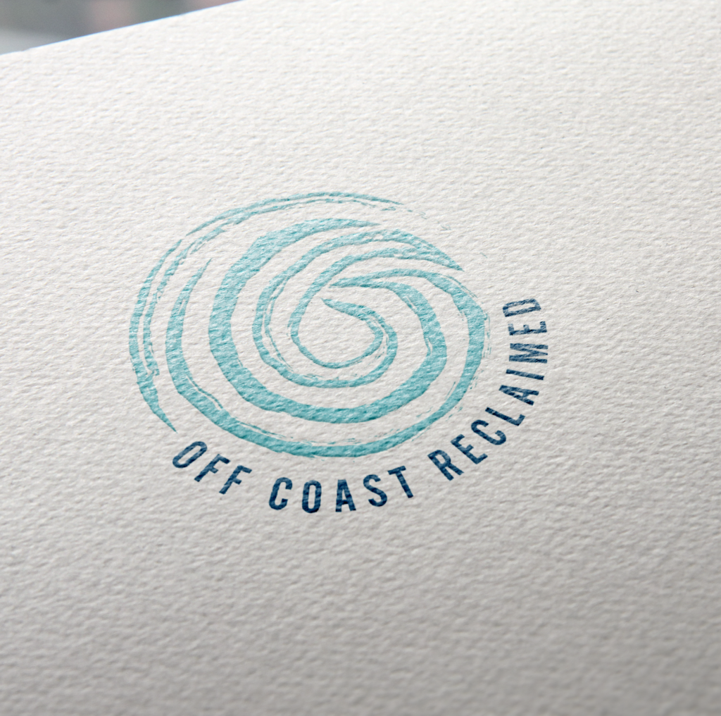
Final Logo - Including Moc-Up
These are the final designs for the Logo. In the end, I decided to go with my second logo idea. This is because I thought that I suited the brand’s identity the best as well as receiving positive feedback. The logo also works well with the colour scheme of the brand.
Furthermore, the circular shape of the logo complements how the logo will be visualised such as on labels and stamps which you can see in the mockups above.
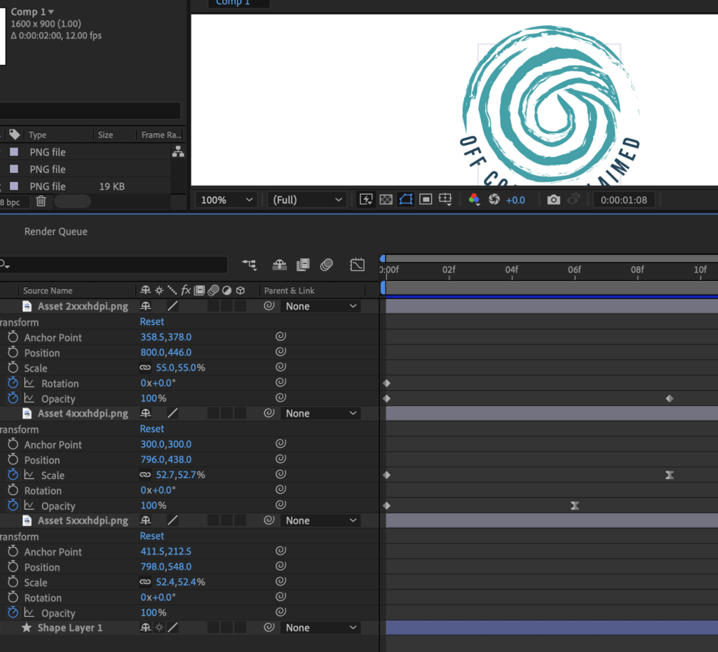
Logo Animation
I decided to push my design skills and develop the logo further in Adobe After Effects as this was one of my goals in my Study Proposal. I had only started teaching myself the After effects software so thought this would be a good opportunity to show what I had learnt. I thought that I could use this animation for the social media side of the branding as this could attract more user attention.
I really enjoyed working in Adobe After Effects and would definitely like to further my skill set and use the software more within my future projects.
Website
Research ( Theories taken from journal )
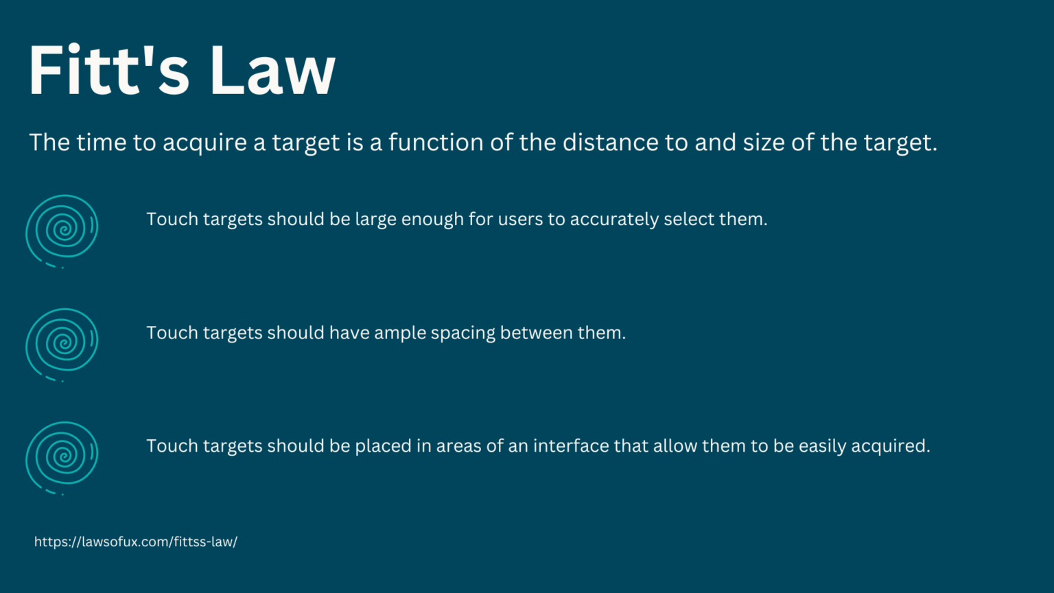
Fitt's Law
Before starting to create the website for the company, it’s essential to research theories surrounding the subject. In this case, I decided to do extensive research into UX and UI theories. One of the main laws that stood out to me was Fitt’s Law.
Fitt‘s Law is an important consideration when designing a website because it helps to ensure that users can quickly and easily interact with the website. It states that the time it takes to move to a target is a function of the distance and the target‘s size. By taking Fitt‘s Law into account, I can create websites that are easy to navigate and use, leading to increased user satisfaction and engagement.
Below are the notes I took from researching the law. I then decided to make a list which I can implement into my designs to increase user satisfaction.
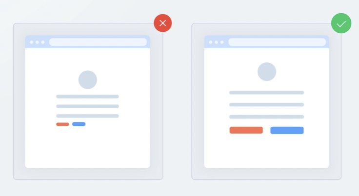
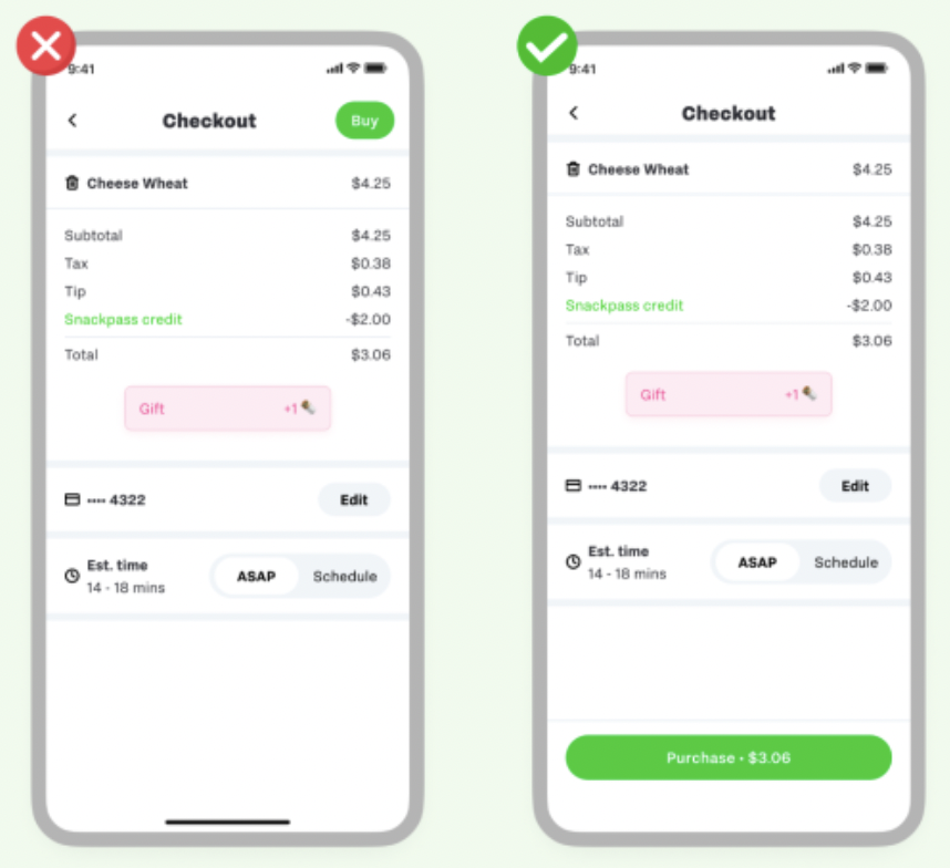
Above are some examples of Fitt’s law being used in user interfaces. As you can see the interfaces that implement the law are clearer and easier to navigate. This is because the buttons and action assets are better spaces and complement the rest of the design. I need to take this into account when creating the wireframes for the website. Additionally, I have noticed that the simpler design is more effective as the user docent has to search for the action they want. This can also help with user engagement and ensure that users will come back to your site.
Inspiration
I wanted to ensure that the website would be eye-catching and would stand out amongst competitors. As highlighted previously, the target audience is 18-24-year-olds. Creating a website that would be memorable, would assist in the marketing. users would share their experiences on their social media which would therefore attract more traffic to the website. This means that there would be less pressure on marketing campaigns.
I wanted to use colour theory to create an aesthetically pleasing website. I wanted the website to have a 3d element. To accomplish this I wanted to experiment with opacity and gradients to add depth to the design.
Wireframes
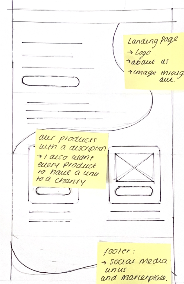
Initial Wireframes
This is a scan taken from my journal.
On the left is my initial wireframe sketch from my journal. I wanted to have a design that would incorporate the fluidity and relaxation of the brand. This would allow the users to have a calming and relaxed experience when visiting the site.
It’s evident that the leading e-commerce websites such as Amazon, use the strategy of overwhelming users with the number of products they are able to provide. Off Coast would optimise narrative and storytelling to attract customers to the website. I wanted to ensure that the website would highlight the process of how each product is created. I aimed to use relaxing shapes to do this.
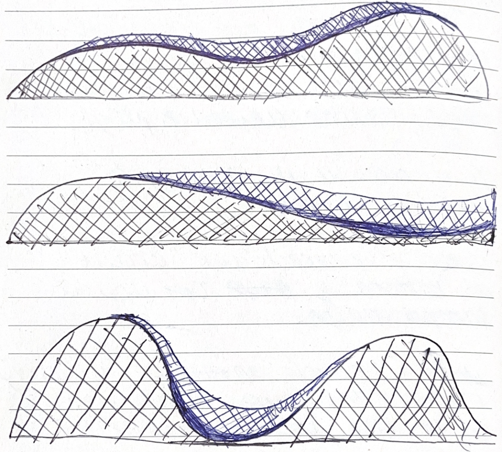
Experimentation
Before deciding to develop the wireframe, I decided to recreate it in XD to asses the usability aspect. Unfortunately, I found that overlaying the shape portrait across the whole page meant that there was limited space when inputting content.
Even when I worked out a way of inputting the content, the site felt cramped and off-centred. With this problem highlighted, I needed to start working on the solution. This meant that I needed to go back to sketching and creating wireframes to ensure that the layout worked well before inputting the designs.
This is a scan taken from my journal.
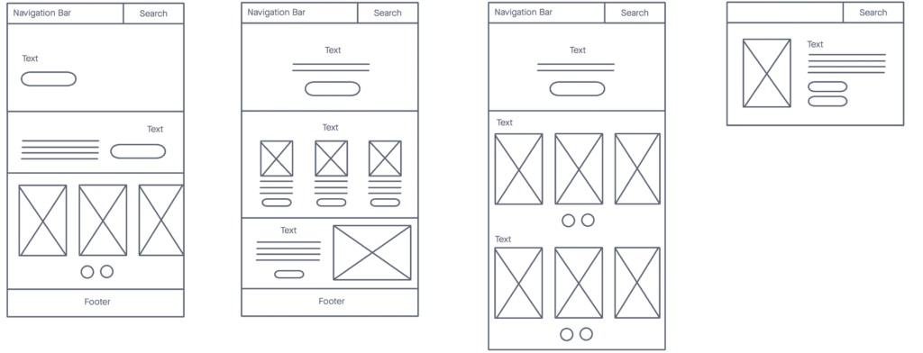
After the usability testing by asking a group of peers to navigate the XD document, I started working on shapes that would allow for better readability. One of the ideas I had was to rotate the shape to be landscape rather than portrait. This meant that I could allow for better spacing in my designs. This is evident in Fitts Law which would mean the users would be able to understand the navigation better.
Even though, changing the shape of the website meant better readability, I still wanted to experiment with adding depth and dimension. I felt like this would be easier to accomplish using the shapes on the left.
Initial Wireframes
After reviewing my initial sketch of what I wanted the theme to be throughout the website. I needed to make sure that the readability and the content wouldn’t be overlooked by users as this was the USP for the company.
This is why I decided to make a basic wireframe of how I wanted each page to look. Once I had a clear readable layout, I could then start implementing my designs. I optimised using Fitts law as I wanted the website to be easy to navigate. Ultimately I wanted the user to purchase the products. In order to accomplish this, It was a necessity that the process of the user first accessing the website to purchase the item was as simple as possible to minimise confusion whilst navigating the website. This is why I decided to use buttons on every page so the user could go back and explore at any point in the process.
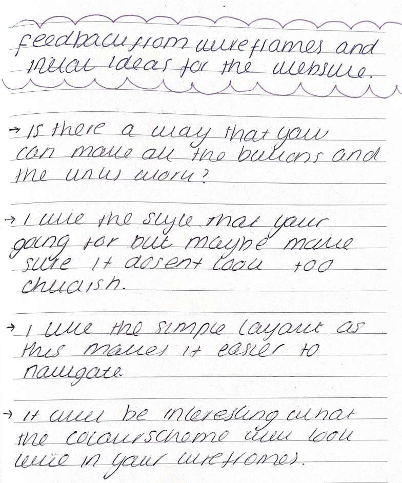
Feedback
This is a scan taken from my journal.
Feedback Write Up
” Is there a way that you can make all the buttons and links work?”
” I like the style that you’re going for but maybe make sure it doesn’t look too childish.”
“I like the simple layout as this makes it easier to navigate.”
“It will be interesting what the colour scheme will look like in your wireframes.”
Final Wireframe
After my feedback, I noticed that most of the comments were quite positive which meant that I had made the layout clear and readable. One of the points was that it would be better if I made the buttons and links in the navigation bar work.
With this information, I converted my wireframes into a scrollable XD document so the user would be able to navigate and get a feel for what the site would look like.
Feel free to scroll and navigate the wireframe below.
Development
Header Experimentation
I started to experiment with the header and the navigation bar.
I couldn’t decide if I should use a Hamburger Menu (Image on the right) or a navigation bar at the top of the page (image on the left). After researching and looking at other websites. I noticed that the hamburger menu was mainly suited to websites with a minimal style. Whereas the navigation bar was used more on e-commerce websites.
During my research, I found that there’s a reason for this. Jakob’s Law is a well-known UX principle that was made by Jakob Neilson ( one of the founders of the Neilson Norman Group ). Neilson states that websites that follow the same layout as other sites in the same industry mean that users won’t waste time trying to navigate their way around your website. Instead, there’s a higher chance that the user will reach the aim goal which the website intends to do.
With this information, I decided to go with the navigation bar as this is used commonly in other e-commerce websites. This would create a sense of familiarity within the user journey.
Details
After I had completed most of the layouts on the website and was close to finishing. I asked for additional feedback on the style of the site. The feedback I received was mainly positive. However, there were some interesting ideas. One of the ideas was that I should consider making the typography for headings should be different to the typography used in the logo. This would assist in ensuring the user would remember the brand.
On the right is one of the experimental fonts I used. It was important for the font to complement the logo and not make the website look overcrowded and confusing. This is evident in the image on the right. Ultimately I decided to use Helvetica as it was simple and wouldn’t distract the user from the logo.
One of the other comments I received from the feedback was that the background looked too neat and didn’t suit the logo and the branding.
I decided to experiment with making the lines more brush-stroked. However, I found that this made the site look unprofessional. Instead, I decided to add a texture to the background of the site as this would in keep with the branding as well as maintaining simplicity.
Usability for different devices
In the initial brief, one of the main aspects that the client was looking for was usability for different devices. I had to re-design the scrolling feature on the website. This is because some laptops and computers don’t have the side-scrolling feature. Whereas Apple Macs and phones have this built-in. On the left is a video that compares the different usability ideas I came up with and developed.
I decided to use side-scrolling arrows in the final design which the user can press to view more products. This accommodates all user devices rather than limiting the website to apple users. This means that the website will have more traffic which leads to more purchases for the company.
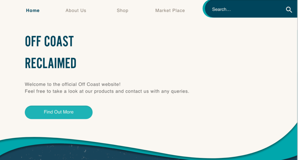
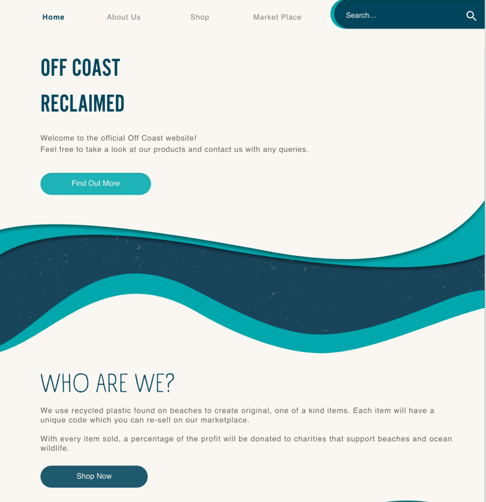
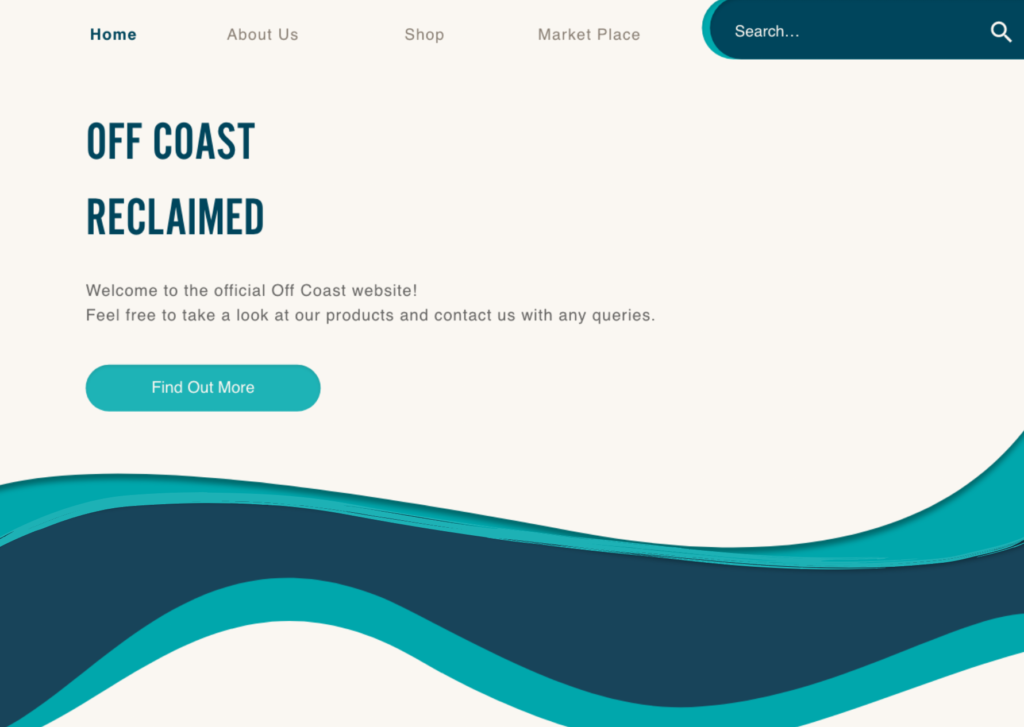
Final Website Design
Exposure Experiment
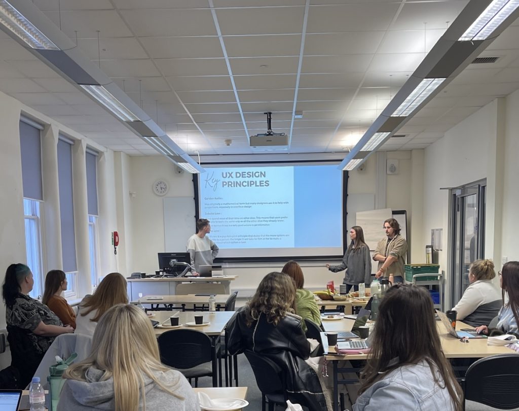
In Week 6 of the semester, I was asked to attend a Networking Event for fashion marketing students.
This event consisted of presenting the fundamentals of UX and why we decided to choose it as a possible career path.
Alongside this, we had the chance to listen to a professional in UX design called Serena Ripoli. In her presentation, she mentioned that she uses Exposure Experiments to gain feedback from designs and if the site is successful. This was really interesting and I decided to do some further research.
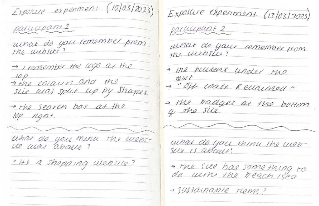
In the experiment, she showed us a home page of a website for one minute. Within that minute we were asked to understand what the website was asking us and what aspects we were focusing on. After a minute, she removed the image and we were asked to give her our answers. It was interesting to see how each person remembers different aspects of the site but we all managed to come up with the same conclusion about what the site was implying. This meant that the site was successful and the strategy worked. With this in mind, I wanted to test this out on my own website.
This is a scan taken from my journal.
I conducted the experiment with two of my peers. The experiment wasn’t official but as this is a career that I’m interested in I thought this would be a good opportunity.
On the left are the results I received. I conducted the experiment in the same way as Serena. Even though, this was my first time conducting the experiment I thought that it went quite well. The participants mainly remembered the colours and the layout of the website as well as the buttons which were beneficial as I used Fitt’s Law to help with placement and spacing.
Both participants successfully understood what the website was showing them.
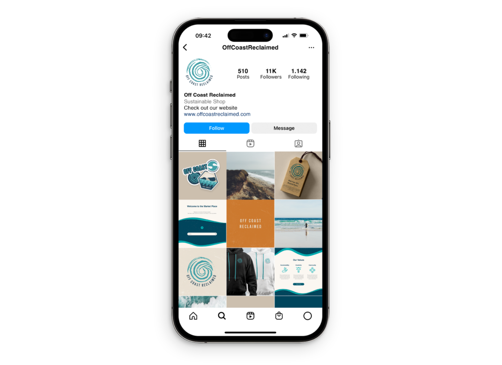
Social Media
Before I finished the project, I wanted to show the client how they could market the company to their target audience. I make an example of what Instagram would look like. The images keep to the colour scheme as well as share photos of beach clean-ups and products that customers can purchase on the website.
Branding Guidelines
Below is a flip book showing the branding guidelines. The client can access all the typography, branding and the brand’s tone of voice via the downloadable PDF link in the top right-hand corner.
Off Coast’s main goal is to clear the beaches of single-use plastic that negatively impacts marine biology. Clearing and maintaining the beaches supports life below water. Therefore achieving sustainability goal 14.
Sustainability Goal 13
Sustainability goal 13 is achieved by encouraging and promoting consumers to purchase recycled goods. As the intention is to educate customers and encourage them to take responsibility for their waste, this encourages good climate action.
Additionally, the business contributes to local organisations that support climate action.
Sustainability Goal 10
Ensuring that all the products are sustainable and are not overpriced, completes Sustainability Goal 10.Off Coast is a non-profit organization. So all the profits go back to charities and the people who make the products.
As previously shown, at every part of the process I have made sure that all designs are inclusive for all. As well as being sustainable to the environment.
Reflection of the project
Due to the development and research of this project, It is clear that the aim and objectives set out at the start of the project have been achieved. Research into how plastic pollution affects the environment and discovering how small companies can combat this issue achieves the main aim of this project. At the start of the project, I created an infographic of how Off Coast assists in providing the solution to the issues surrounding customers not thinking or buying sustainably. By ensuring that customers are aware of the brand message and the company’s values is achieved through branding such as the logo as well as the branding guidelines.
My year 3 study plan goals can be seen in my NLT form 2, where it outlines that I wanted to learn new software skills such as adobe after effects. I decided to develop the logo further and create an animation that will gain customers’ attention. Even though the animation is simple, It enabled me to gain motivation to incorporate motion graphics into my future projects and I feel more confident in using the software. Additionally, in my NLT 2 I mentioned that I would be maintaining a journal with initial sketches and feedback, pages of my journal can be seen throughout this project which has assisted in reflecting on the development which I have struggled with previously in my projects.
Upon reflection, this project has been the most exciting project I’ve created. I have enjoyed developing my skills and creating designs in the industry I’m interested in. The sustainability element behind the project allowed me to conduct further research with made for better, intuitive designs. I also gained a better understanding of the UX/UI industry and implemented some of the experiments used in the industry. Being able to network with a professional UX designer assisted in the development and usability aspect of the final outcome.
Alongside, developing my previous skills in branding design, I also learn new skills throughout this project. These include:
Researching UX and UI design principles and theories, in order to make sure all designs have effective usability.
Starting to use industry-standard software such as Adobe XD and Figma
Developing my logo design further in Adobe After effects. This will also assist in creating a brand that is engaging for customers.