Introduction
Alongside designing STRIVES website, my main focus will be to conduct the experiment that I initially planned in my research proposal: The Impact of Visual Perception and Memory Retention on User Interaction in Digital Design Interfaces. The aim of this part of my final major project will be to evaluate previous studies and conduct my user testing to fully understand the elements that influence how users perceive and remember interfaces.
To reflect on the design of the interface and gather enough secondary and primary research to make recommendations to future designers. This will be an important part of my master’s Degree as I have never conducted a user experiment, so by the end of this project I will be able to achieve one of the core aims that I went into my master’s with.
Competitor Website Analysis

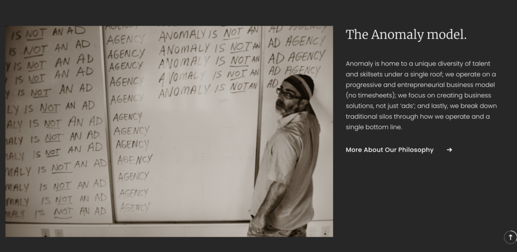
Anomaly is a very well known creative agency based in New York, with offices across the world such as London and Berlin.
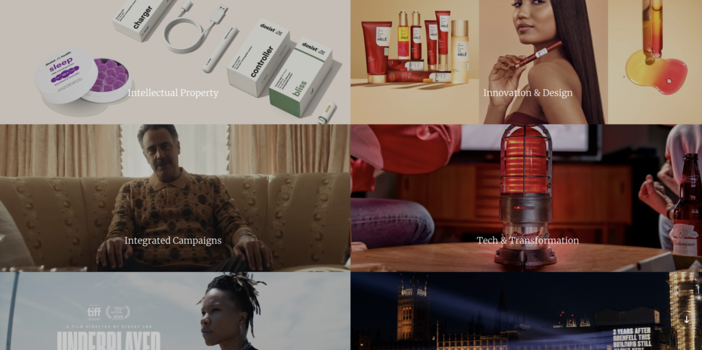
They have a very non-traditional approach to projects and focus on solving problems for businesses. They have worked on a variety of advertising campaigns and design projects with clients such as Bud Light.
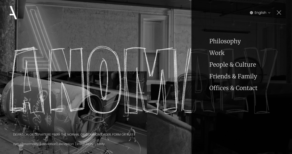
The agencies modern and unique style is replicated through their website which created a sense of cohesion and professionalism.
The website is simplistic yet effective as it uses a black and white colour scheme but with accents of red to assist users in easily navigating around their website.
Furthermore, the website integrates subtle animations and transitions, which enhance user engagement without overwhelming the user.


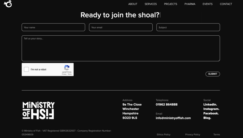
The Ministry of Fish is a small yet successful agency based in Winchester. They specialise in branding, design, strategic planning, and event management and have worked with a variety of well known brands.
The site is user-friendly, with a clean design and intuitive navigation that highlights their expertise across various industries. Even though the website is simplistic, the use of animation and videos still create a high engagement rate across their users.
Additionally, the colour scheme is also simplistic, however they accompany this by using memorable and unique illustrations which emphasise the agencies quirky brand image.
Understanding how to make memorable interfaces
Introduction to Visual Perception
The Interaction Design Foundation (2016, b) explains that visual perception is the ability to analyse and comprehend visual stimuli from the environment using sight. The process involves a variety of steps, which shows that visual perception is a dynamic cognitive process.
Sallehuddin Md Yusof (2021)
Hoffman (2008) provides further exploration of visual perception and discovers that visual perception enables people to understand the world. This indicates that the environment in which information is being presented to a user may influence how they interpret it. Therefore, suggesting that how much users will understand information, is based on how well the information is presented to them.
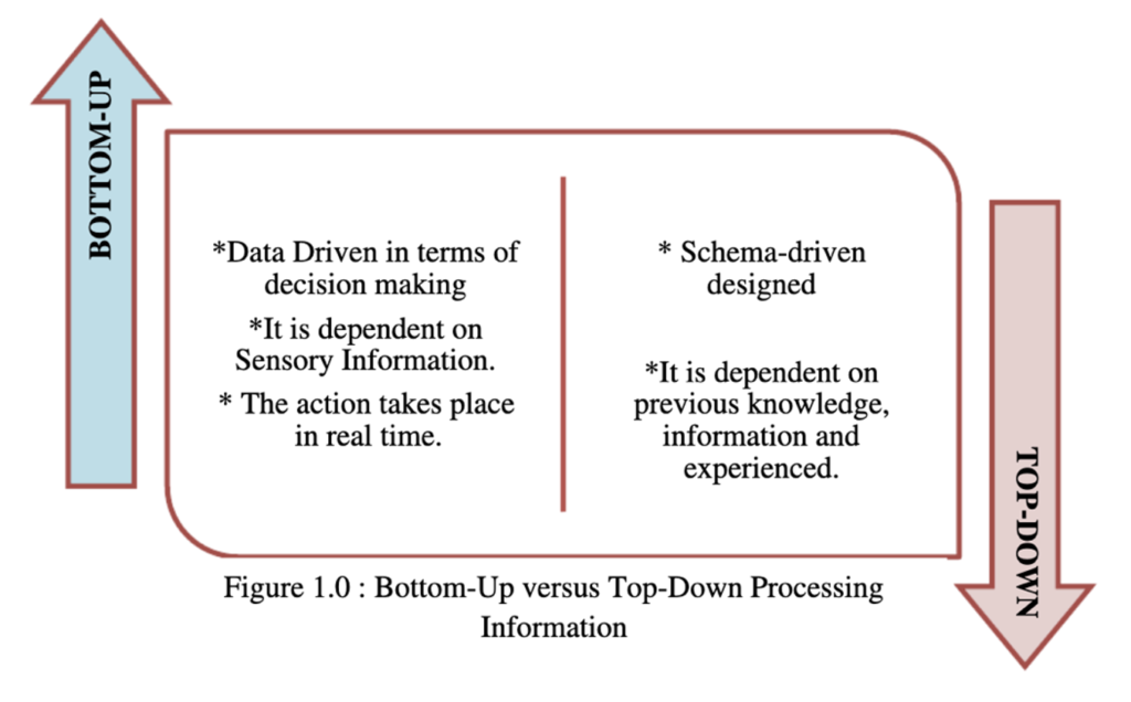
This concept is supported by Bradley (2011) who presents the idea that external environments such as prior knowledge, goals, and expectations influence how users perceive information. He describes the two different ways in which users can make sense of stimuli: Bottom-up and Top-down processing. It is evident in his article that both stages are needed for users to fully comprehend a stimulus, as they work in parallel with each other (Bradley, 2011). In cohesion with Bradley (2011), Yusof (2021) provides a diagram in Figure 1.0 of the differences between the two stages. This shows that Bottom-Up processing is constructed from present, sensory information. Whereas Top-Down processing consists of previous knowledge and experiences (Yusof , 2021).
Introduction to Memory Retention
Siu (2020) defines memory retention as the capacity to retain knowledge for a long time and, is the process of getting information back after it’s been saved and encoded (Siu, 2020). This definition of memory retention shows how users can remember visual elements within an interface.
In the publication ‘Memory in the Digital Age’ (Storm and Soares, 2021) highlights that as people increasingly use digital interfaces to retain information, they rely less on information stored in the biological memory. Therefore, showing how digital technologies are changing how people use the human memory (Storm and Soares, 2021). This makes it clear that as users are relying more on interfaces to store information, the need for internal memorisation is decreasing. Highlighting the value on understanding the elements that assist users in remembering information on interfaces.
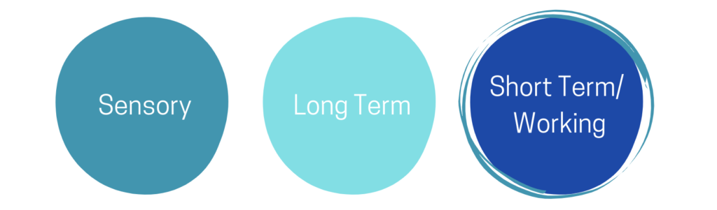
(Camina and Güell, 2017) explains that there are three sections of memory: sensory, short term and long term (Camina and Güell, 2017). This categorisation assists in simplifying the different ways in which users store information. The Interaction Design Foundation (2016,a) explains that when a user is interacting with an interface, they are using their short-term/ working memory. This provides a valuable insight to understand the mental state of users when navigating an interface, which can then be tailored to.
What is the relationship between visual perception and memory retention?
Even though Agam and Sekuler, (2007), explains that there has been significant debate between the relationship of visual perception and memory retention. They state that they share the same brain mechanisms. Agam and Sekuler, (2007), study concludes that attention was an occurring theme that influenced both visual perception and memory retention. The University of Cape Town (2010) explains that the core concept of attention, relies on the idea that users have limited capacity within the working memory. Which means that from a large amount of information, only a limited amount can be concentrated on.
On the other hand, Kohler (2023) states that it is unrealistic to assume that all users have the same cognitive abilities with the same attention elements. He argues that due to the diversity of users, it is important that digital products are accessible and inclusive. Even though, it is important to ensure interfaces are inclusive and accessible for all, it can create difficulty for designers to ensure their designs are inclusive.
Ultimately showing the importance of this final major project and conducting user testing in the development of the website design.
Card Sorting
Neilson defines card sorting as “a research method in which study participants place individually labeled cards into groups according to criteria that make the most sense to them.” (Neilson Norman Group, 2024) The concept of card sorting stems from the idea of uncovering a users mental model of the informational architecture (IA) from a digital interface. This will ultimately provide a designer, key information of how users navigate an interface. Which can be replicated to create an efficient, and positive user experience.
Before
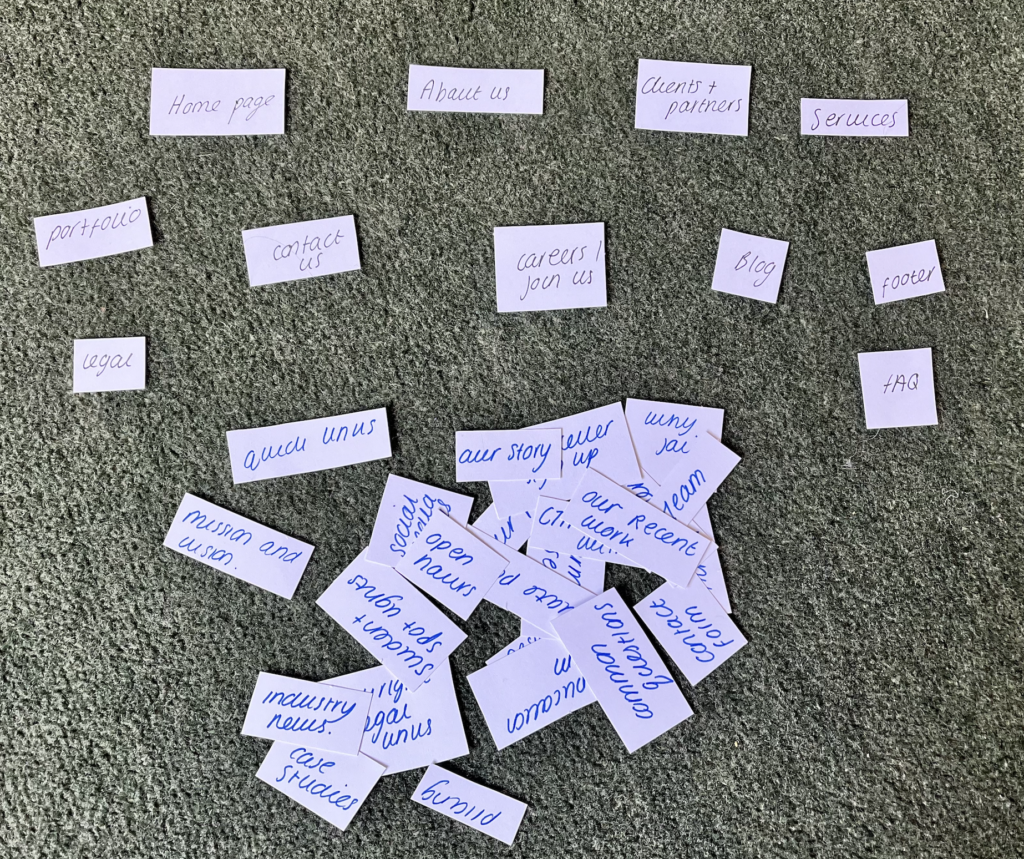
Based of the competitor analysis of their agencies websites, I created a list of pages that are commonly used. Then I created a variety of categories in which these pages could be put into. By physically cutting up the categories rather than doing it digitally, assisted in enabling participants to freely move the pages around into the categories they thought would work best.
After
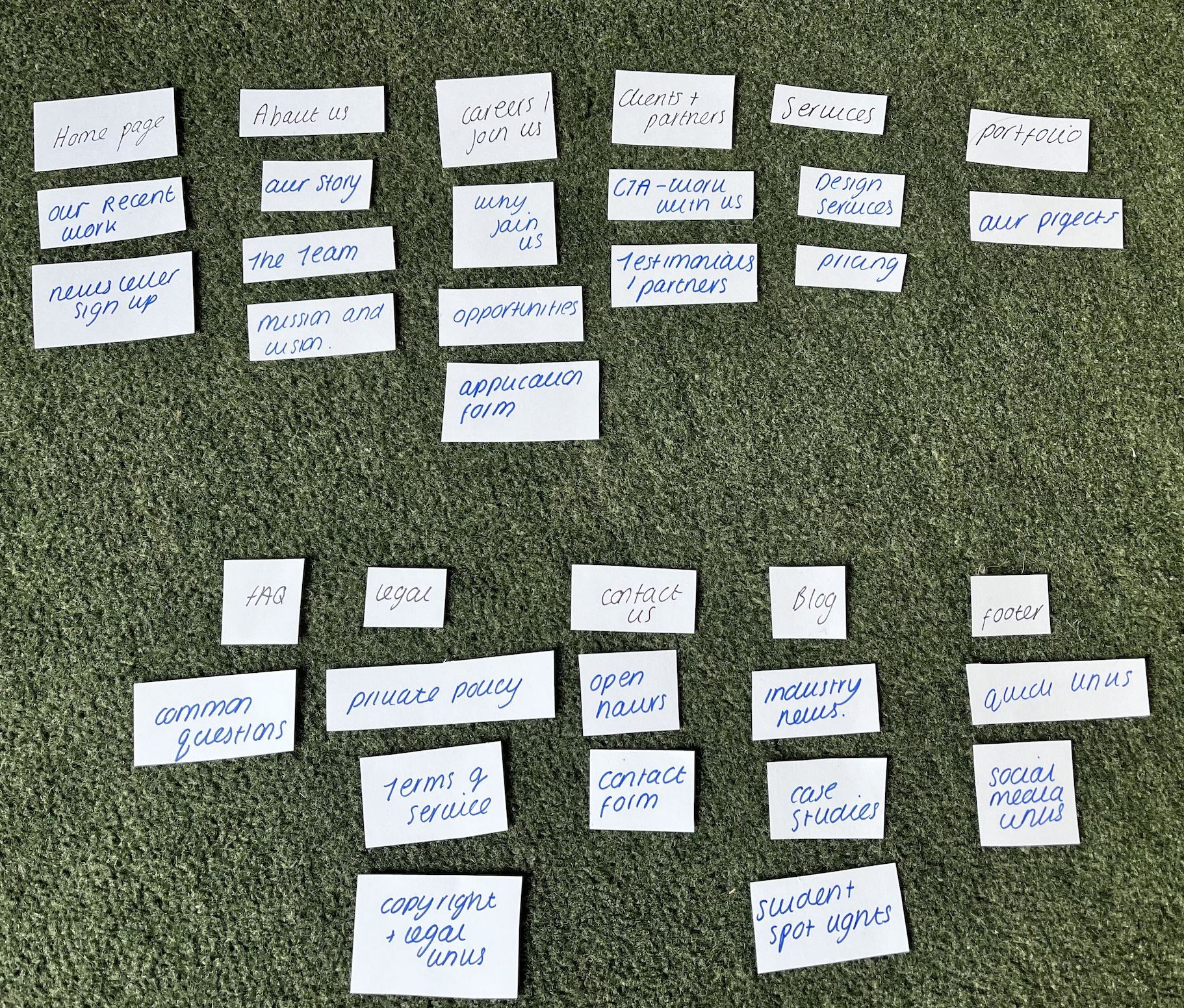
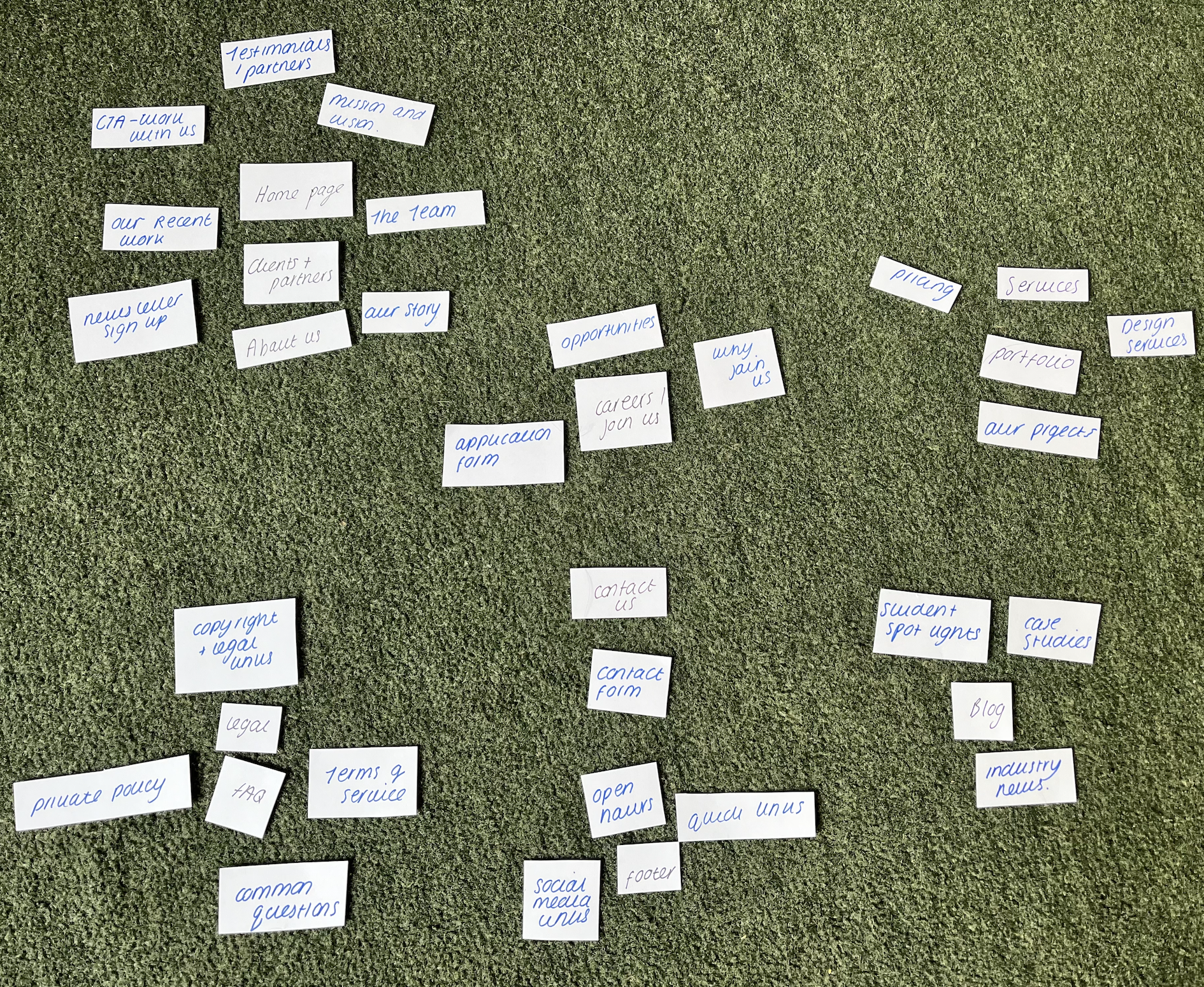
Heres are the results of what two participants came up with. It is clear that every heading was used to separate the pages. However, Participant 2 showed that some headings could be combined, which I thought was very interesting as this could simplify the navigation process for users.
Upon reflection, this exercise provided an insight into how users navigate through creative agencies website. Doing this experiment at the start of this project enabled me to receive an initial understanding of how I could organise the website to create an effective and memorable user experience. This provided a valuable base to build upon in and develop the next part of this project.
Site Mapping
Feel free to use the + and – on the right to explore the site mapping for STRIVE’s website design
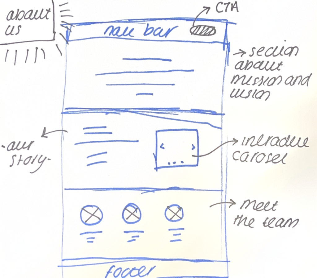
Wireframing
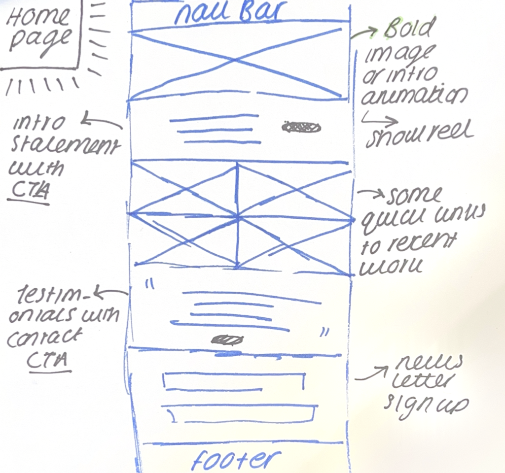
Below, are some of the initial wireframe sketches of the core pages that will be included in the website. Secondary research highlights that in order for an interface to be memorable for the user, ensuring the design grabs attention is highly important. From the research we know that the working memory has limited capacity so, ensuring a user is interested and understands the interface will increase the memorability of the website.
With this in mind, the homepage will have a bold image or a showreel that summaries the brand and what we do. The explanation of what we do and why we are different form competitors will also be replicated into the “About Us” page. Further down the Home Page, will be some of the companies most recent work as this catches attention and is also used amongst other agencies websites. However to ensure the originality of the website a testimonials section will be needed. This is because the aim is to show companies that student designers are trustworthy and reliable.
Throughout the agencies website “call to action (CTA)” buttons will be essential to direct users to the contact and pricing pages where visitors can find out more.
Inital Development
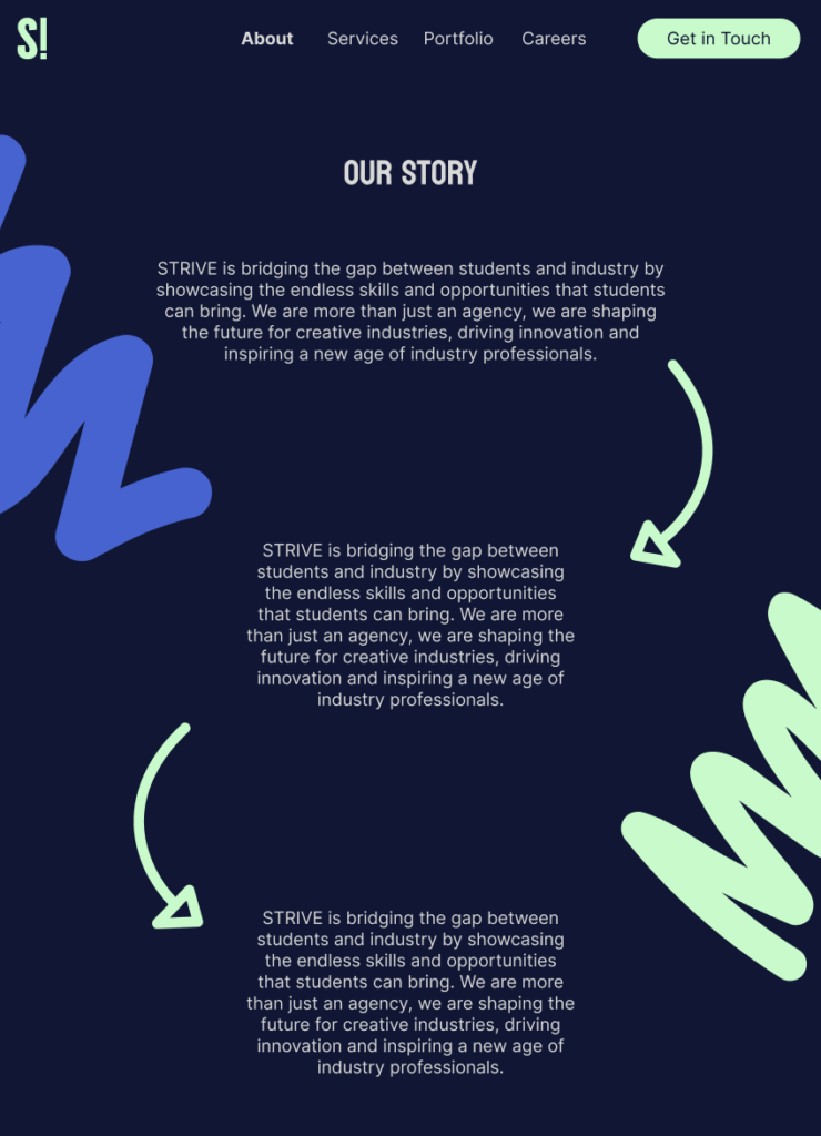
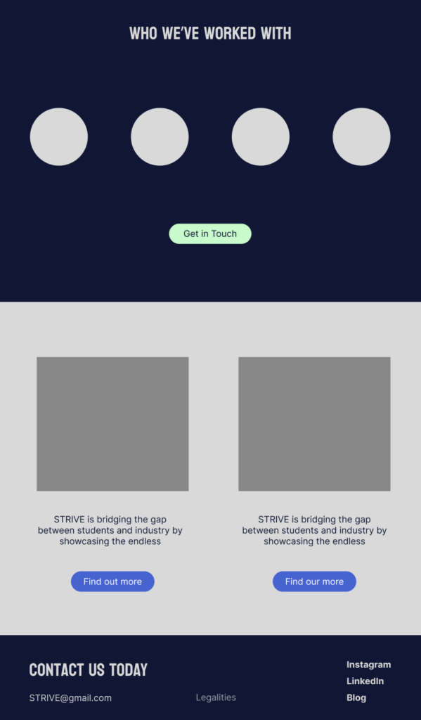
For the Initial design of the website, I decided to keep the layout simple as this would assist in the user testing. However, it was important to ensure brand cohesion from the Branding Bible, this is why I decided to add the pops of colour alongside the statement squiggles. Not only would this promote a unique image (incorporating the unique concept of the brand agency) but would also be interesting to see if it would influence how users would remember the website in the experiment below.
User Testing (From Methodology)
The Experiment
In previous studies, eye tracking is commonly used technique that researchers use to understand how users navigate a website. However, It consists of using software such as ‘Gazepointer’ to compose the experiments, which would result in hiring a software developer to use the software effectively. Eyewear (2022) explains that eye tracking software can cost between 15,000- 25,000 EUR. This highlights a limitation of this technique, especially for this project due to the expenses and complex components.
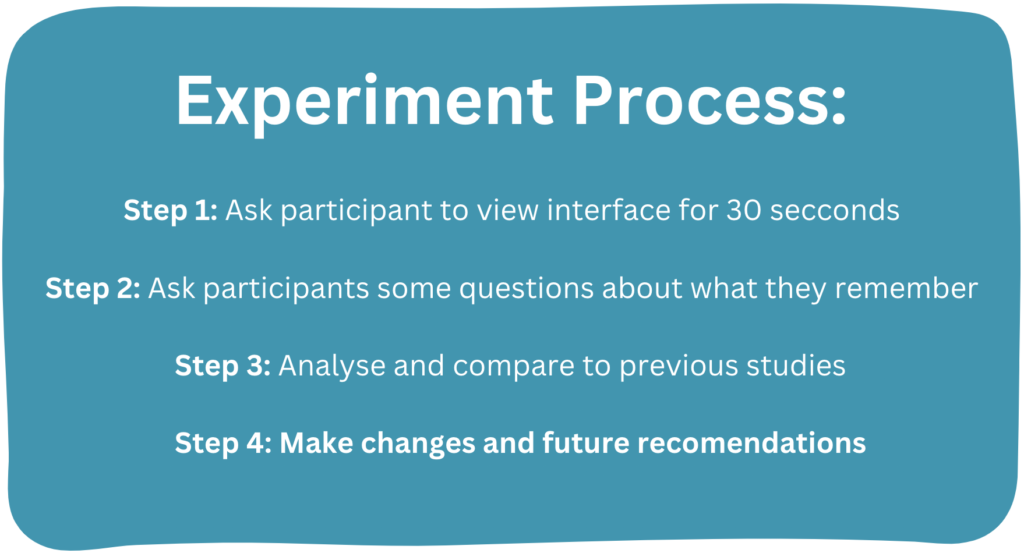
The aim is to create a cost effective experiment that can provide similar results. Previous research has shown that memory retention relies on the working memory which scholars such as Waterman (2022) and Mcleod (2023) have argued tends to decrease after about 30 seconds. This research has provided a base for the experiment where users will be asked to view STRIVES home page for 30 seconds. Straight after, I will proceed with asking open questions such as: What was the interface about? What elements do you remember from the interface? What stood out to you? These questions will provide an overview of what the participant experienced whilst looking at the interface. By asking the participant questions straight after the 30 seconds, will complete the goal of ensuring that the working memory is being used. Rather than allowing the participant to have time to recall and store information into the long-term memory
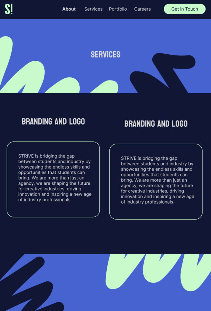
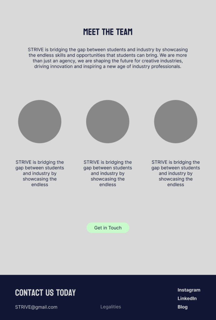
The Interface
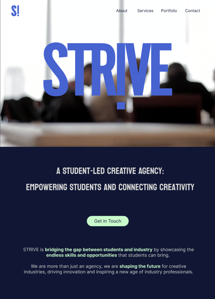
Below is the interface which I showed the participants. The interface was designed to incorporate a variety of assets that may promote memory retention. The core aim of the interface was to ensure that it was accessible and inclusive as this would ensure a ‘fair test’, alongside adhering to Kohlers’ (2023) theories.
The interface includes:
- Video
- Bold colours
- CTA (call to action) buttons
- Images
- Information about what STRIVE does
- Recognisable Logos
My Predictions (Based off previous studies)
The study: Usability research of an online store using eye tracking: a comparison of product specification formats conducted by Mateja (2023). Found that users pay attention to headlines and titles written in larger font sizes. Therefore, suggesting that a lot of text on the page can negatively affect users’ attention.
However in the study: Getting the message across: Visual attention, aesthetic design and what users remember. Sutcliffe and Abdallah Namoun, (2008) found that product images and animations were the top elements that users remembered, showing that they attracted the most attention from users. Overall, suggesting that images/ videos have an influence on visual perception and memory retention.
With this in mind, my predictions for this experiment are:
- Videos and images will be the most memorable
- Users will remember some text but not the larger paragraphs
- The information at the bottom of the interface will not be as memorable as the information at the top.
- The CTA “Call To Action” will draw attention (due to the contrasting colour) which might affect memorability
Results
The transcripts were important, as they provided an efficient way of visually being able to examine the specific themes which I then translated into note form. I decided to colour code the notes from the transcripts because as a designer I find that this is the most effective way of translating information. This strategy enabled me to easily identify common elements and precisely understand how the participants viewed and remembered the interface.
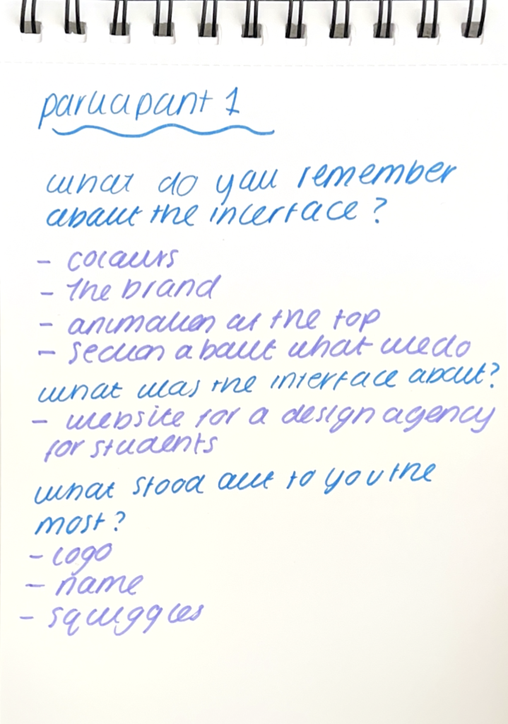
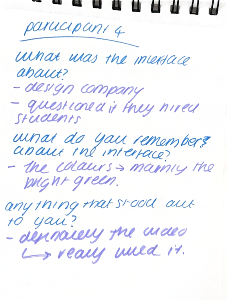
It is clear from the experiment that a common theme of ‘motion’ was prominent in all interviews. The video at the top of the page was commonly addressed and was remembered the most. This was predicted due to the secondary research from previous studies. However, my predictions were slightly off as “images” we not commonly brought up which was unexpected. Isola (2013) provides as insight and argues that not all images are memorable. Brown (2018), reviewed and concluded in his study that semantic images are the most memorable. Highlighting that users remember familiarity, as the study found that 82% of participants remembered the photos that included people (Brown, 2018).
This concludes that animations/ videos can instantly draw the user’s attention, therefore increasing the memorability of the website. However images need to have a sense of familiarity to become memorable.
On the other hand, one theme I had not predicted from secondary research was how the colour scheme influenced how the participants remembered and perceived the interface. Although, I had expected that the ‘call to action’ may have an impact due to the contrasting colour. The general colour scheme was also mentioned. This may be due to the uniqueness and originality of the colour combination. Which was interesting, as it is common in branding to create a unique colour scheme to increase brand identity and to stand out among competitors. However, I was unaware of how this might translate to an interface as well. The experiment has shown that colour combinations in websites may have an impact on memorability and visual perception, providing an interesting research topic that should be explored.
Reflection from experiment and Recommendations
Upon reflection, the experiment went well as a lot of the predictions I made were based on secondary research and previous studies. Furthermore, this strategy assisted in creating an accessible and inclusive interface for the experiment. The participants all responded well to this as there was minimal confusion about what the interface was about.
Although my predictions were correct, some elements I had unforeseen such as the influence of a colour scheme. As stated previously, one of my future recommendations would be to investigate the influence that colour combinations have on visual perception and memory. This would assist in fully understanding the influences that may impact a user when navigating an interface, which may support future designers.
Further Development
After conducting the experiment, I decided to develop a couple of elements on the interface based of user feedback.
Just below the header, I decided to add a clear and direct strap line that encompassed exactly what STRIVE is and the core aim of the agency. I think that research has shown that users tend to skim over text when they are navigating an interface, so making the text accessible would increase the chances of memorability.
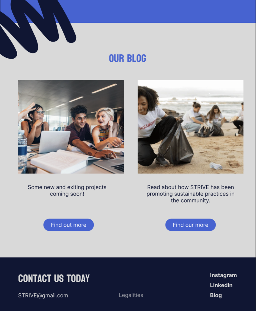
Additionally, I decided to update the images in the ‘Blog” section to be more semantic, as this would promote a sense of familiarity. I thought that as the section is at the bottom of the interface, it was important to use familiarity to increase the chance of a user remembering what STRIVE is doing for the community and is much more than just an agency. The aim is once the agency is up and running, the stock photos would evolve into actual photos of the agency.
Final Outcome
Website Design: References
Anomaly, W. (2014). Anomaly. [online] Anomaly. Available at: https://www.anomaly.com/work
Bradley, S. (2011). What Designers Should Know About Visual Perception and Memory – Vanseo Design. [online] Vanseo Design. Available at: https://vanseodesign.com/web-design/visual-perception-memory/
Brown, N. (2018). How to Give Your Content Marketing a Visual Identity with the Right Imagery. [online] Skyword. Available at: https://www.skyword.com/contentstandard/how-the-give-your-content-marketing-a-visual-identity-with-the-right-imagery/
Camina, E. and Güell, F. (2017). The Neuroanatomical, Neurophysiological and Psychological Basis of Memory: Current Models and Their Origins. Frontiers in Pharmacology, [online] 8. doi:https://doi.org/10.3389/fphar.2017.00438.
Eyeware. (2022). Eye Tracking Costs & ROI: Making It Worth It In Research – Eyeware. [online] Available at: https://eyeware.tech/blog/eye-tracking-costs-roi/
Hoffman, D. (2008). The Interface Theory of Perception: Natural Selection Drives True Perception To Swift Extinction. [online] Available at: https://sites.socsci.uci.edu/~ddhoff/interface.pdf.
Isola, P., Xiao, J., Parikh, D., Torralba, A. and Oliva, A. (2013). What Makes a Photograph Memorable?
Kohler, T. (2023). Accessibility and Inclusivity: Study Guide. [online] Nielsen Norman Group. Available at: https://www.nngroup.com/articles/accessibility-inclusivity-study-guide/
Mateja, A. (2023). Usability research of an online store using eye tracking: a comparison of product specification formats. Procedia Computer Science, [online] 225, pp.3233–3242. doi:https://doi.org/10.1016/j.procs.2023.10.317.
McLeod (2023). Peterson & Peterson Experiment 1959: Duration Of STM. [online] Simply Psychology. Available at: https://www.simplypsychology.org/peterson-peterson.html
Ministryoffish.com. (2024). Hampshire | Creative Marketing Agency & Events. [online] Available at: https://www.ministryoffish.com/
Neilson Norman Group (2024). Card Sorting: Uncover Users’ Mental Models for Better Information Architecture. [online] Nielsen Norman Group. Available at: https://www.nngroup.com/articles/card-sorting-definition/#:~:text=Card%20sorting%20is%20a%20research,navigate%20to%20on%20your%20website.
Sallehuddin Md Yusof (2021). BOTTOM-UP AND TOP-DOWN PROCESS IN COGNITIVE PSYCHOLOGY. [online] ResearchGate. Available at: https://www.researchgate.net/publication/374924026_BOTTOM-UP_AND_TOP-DOWN_PROCESS_IN_COGNITIVE_PSYCHOLOGY
Siu (2020). CuriouSTEM. [online] CuriouSTEM. Available at: https://www.curioustem.org/stem-articles/memory-retention
Storm, B.C. and Soares, J.S. (2021). Memory in the Digital Age. [online] ResearchGate. Available at: https://www.researchgate.net/publication/355038642_Memory_in_the_Digital_Age
Sutcliffe, A.G. and Abdallah Namoun (2008). Getting the message across: Visual attention, aesthetic design and what users remember. [online] ResearchGate. Available at: https://www.researchgate.net/publication/221441329_Getting_the_message_across_Visual_attention_aesthetic_design_and_what_users_remember
The Interaction Design Foundation. (2016a). What is Human Memory? [online] Available at: https://www.interaction-design.org/literature/topics/human-memory
The Interaction Design Foundation. (2016b). What is Visual Perception? [online] Available at: https://www.interaction-design.org/literature/topics/visual-perception
The University of Capetown (2010). Attention. [online] Uct.ac.za. Available at: https://www.cs.uct.ac.za/mit_notes/human_computer_interaction/htmls/ch05s07.html
Waterman (2022). WORKING MEMORY: A Practical Guide for Teachers. [online] Available at: https://caer.org.uk/wp-content/uploads/CAER-Working-Memory-Guidance.pdf.
Yigal Agam and Sekuler, R. (2007). Interactions between working memory and visual perception: An ERP/EEG study. NeuroImage, [online] 36(3), pp.933–942. doi:https://doi.org/10.1016/j.neuroimage.2007.04.014.