For this part of the project, I decided to make a Brand Bible. Inspired by my semester two project, EVE Magazine. The brand bible that I previously made was highly successful and I really enjoyed making it. Not only does a brand bible provide a deeper insight into the strategy of where the company is positioned in the market but, It helps protect the integrity of the brand by ensuring that all communications and visual elements align with the brand’s core values and objectives.
Brand Bible
Below is the final Brand Bible for STRIVE. The aim of the brand bible is to provide a precise overview of what the brand is and how it is positioned within the market.
Making of the Brand Bible
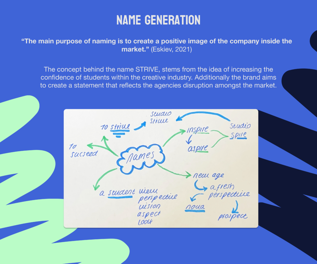
Name Generation
When it came to the Name Generation of the brand, It was important to stand out amongst competitors as the design agency market is heavily over saturated. However, this companies USP of it being a student-led design agency sets its aside within the market. This needed to reflect within the name.
The company itself, is making a statement and standing our against the crowd. With this in mind, I wanted the name of the company to be bold and confident. This is why decided to start brainstorming doing words such as “Aspire”. However after receiving feedback, I decided to further develop some other ideas. The idea of inspiring a new age and promoting change within the industry led me to the name “Nova” and ‘Prospect”.
Whilst these names promoted a sense of freshness I still wanted something that would make a statement as this would complement the mission and vision of the company. After some deliberation I decided to go with STRIVE. The Cambridge Dictionary describes “Strive” as “to try very hard to do something or to make something happen, especially for a long time or against difficulties” (Cambridge Dictionary, 2024)
From understanding the struggle that students face, trying to enter a creative industry. The name ‘Strive’ aligned with the reality that students have to do in order to become successful.
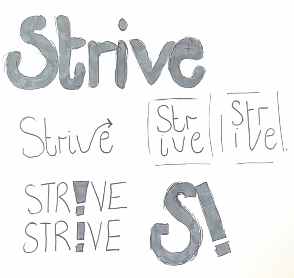
Logo Development
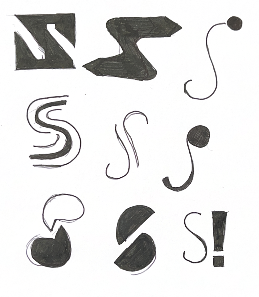
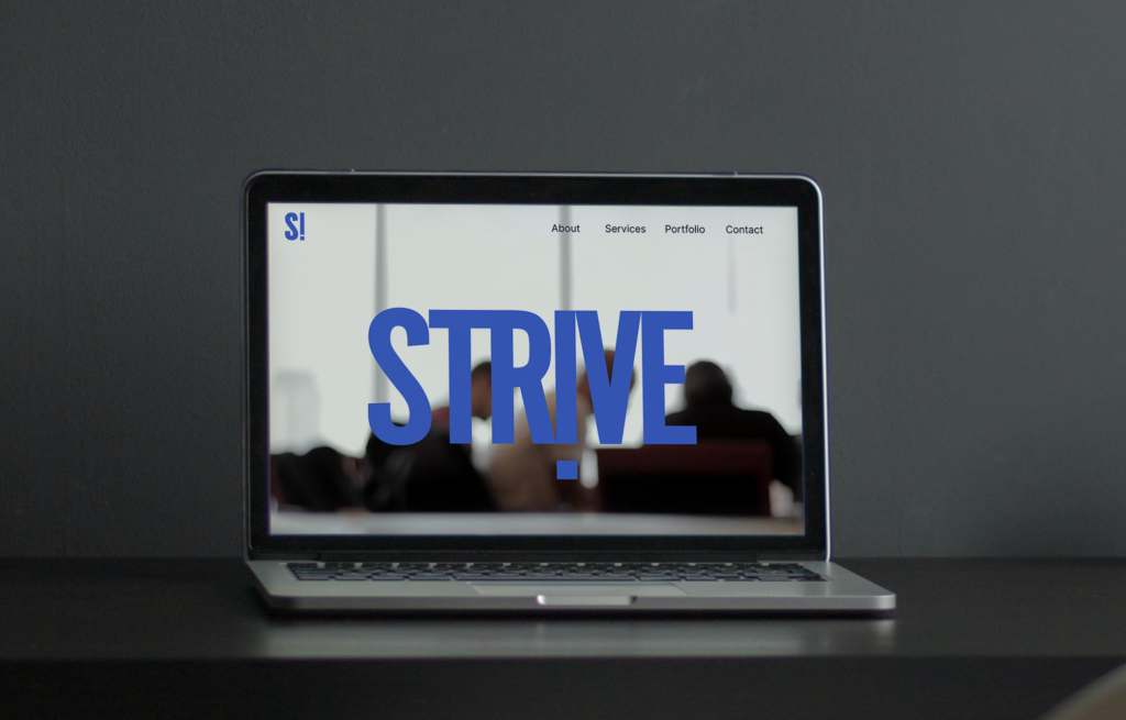
For the first stage of the logo development, decided to to experiment with possible icon logos. This was because I knew that the logo would be used on a website, so needed to be versatile. When designing the brand image of STRIVE, I wanted to create a modern and fresh feel, as this would resemble the market positioning of the company.
I decided to experiment with some bold, abstract style which would aim to create a sense of excitement and interest. However, after some peer review it was clear that the logo can be abstract but also needed to be legible. Expecially if it will be used across different mediums.
Other Design Agency Logos
After receiving the feedback, I decided to develop some bold yet simplistic primary logos. that would encompass a fun and exiting style. I wanted the design to be easily recognisable, whilst following the trends of the industry. Even though, it was important to create a logo that was unique to reflect the companies USP, it was also important to show a sense of professionalism amongst the industry.
The logos above are examples of some other successful design agencies logos. They all have simplicity and professionalism, but also have some unique qualities. I think that this combination will be perfect for where STRIVE is positioned in the market.
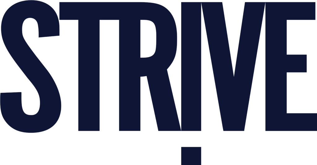
Final Logo
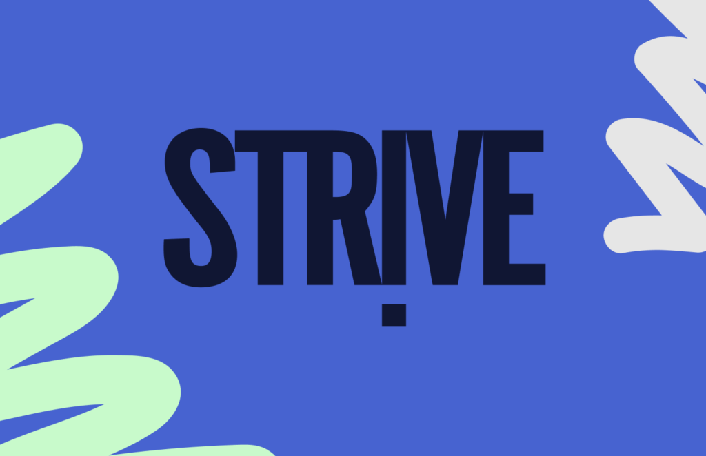
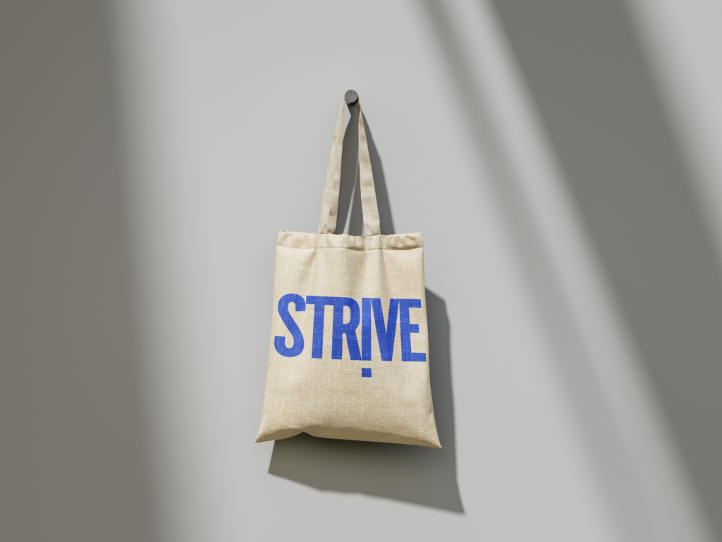
This is the final logo design for SRTIVE. After feedback and experimentation I landed on a simplistic yet bold logo with a some unique qualities such as an upside own ‘i’ that also looks like an ‘!’. This is to represent the bold USP of the company, aiming to change the perception of student designers.
Colour Development
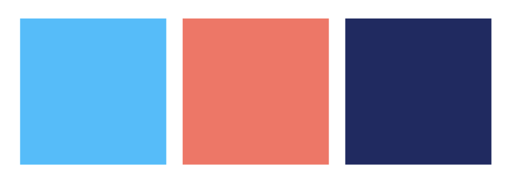
Primary
Seccondary
It was important for STRIVES colour pallet to balance creativity and innovation with professionalism. This is why id decided to experiment with some primary and secondary colour schemes. This initial colour scheme provided a strong direction for contrasting lighter secondary tones with deeper primary colours, to create a contrast that is bold and exiting.
After creating the first iteration of the colour scheme, found that even though bold colours would stand out and compliment the simplistic logo. I found that some of the colours clashed so I decided to add some more neutrals to ensure it would be versatile.
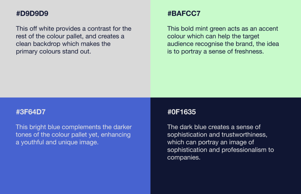
I decided that I would primarily focus on RGB rather than CYMK due to the fact that the majority of projects that will be produced will be digital. Not only does this align with the brands sustainability goals but also promotes cost effective digital project’s rather than expensive print projects. However as the agency grows, the need for a CYMK colour scheme will increase which is why I chose a colour scheme that can easily be converted into CYMK.
Final Colour Scheme
Ultimately, the final scheme provides a balance between youthful energy and professionalism. The bold blues provide confidence and trust, while the mint green and grey add a modern and creative essence. This results in a versatile, visually engaging, and reflective of the fresh talent and innovative spirit of the agency.
Promotion
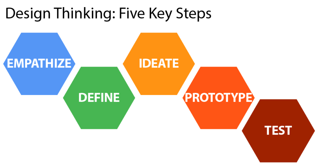
Methodology of reflection: Stanfords institute of design thinking
It was important for this part of the project to ensure that I was reflecting on each part of the process. In order to do this I decided to use the Stanfords Institute of Design Thinking model.
The aim of the model is to prioritise a human centerd approach to the design thinking process to elevate designs. I believe that using this model throughout making the Branding Bible allowed me to dive deeper into the positioning and strategy of how STRIVE could be successful within the current industry.
References: Branding Section
Cambridge Dictionary (2024). strive. [online] @CambridgeWords. Available at: https://dictionary.cambridge.org/dictionary/english/strive
Eskiev, M. (2021). Naming as one of the most important elements of brand management. SHS Web of Conferences, [online] 128, p.01028. doi:https://doi.org/10.1051/shsconf/202112801028.
Fripp, G. (2023). Why Use Perceptual Maps? –. [online] Perceptual Maps. Available at: https://www.perceptualmaps.com/why-use-perceptual-maps/?utm_content=cmp-true
Lerch, T. (2021). Visual Communication – A Designer’s Guide to Reaching Target Audiences. [online] Digital Commons@Lindenwood University. Available at: https://digitalcommons.lindenwood.edu/theses/47/
Plattner, H. (2010). An Introduction to Design Thinking PROCESS GUIDE. [online] Stanford University. Available at: https://web.stanford.edu/~mshanks/MichaelShanks/files/509554.pdf.