Project Title: Eve Magazine
Introduction
In this semester, we were tasked to create a unique, interactive concept that stems from the importance of HCI (human-centred Interaction). My core aim for this project was to modernise the magazine industry as there are many examples of print magazines decreasing in purchases. I wanted to create a concept that would disrupt the industry and highlight the potential to create a new and exciting way of sharing stories. Further on in this project, I explain how haptics and vibrations can be the solution to the gap in the magazine industry. Additionally, by creating a platform that assists people in sharing their stories, this will create a community in which collaboration will be promoted. Therefore, creating more job opportunities which will achieve Sustainability Goal 8.
The idea for this project stemmed from the summer before starting my master’s degree. I discovered that creative job opportunities for a junior designer were either highly competitive or expected a vast amount of experience in the industry, which meant that the process of finding a full-time job was long and exhausting. I found this highly demotivating which inspired me to create Eve Magazine. The idea behind Eve was to showcase exciting projects and work by women who are thriving in the industry. Therefore creating this sense of community alongside increasing inspiration for people in the industry who might need a bit of a pick up.
The topic of the magazine originated from my research into successful women within the design industry. My research found a noticeable inequality of women in leadership roles such as Creative Director. You can read what I found in the blog below
Understanding Interaction Design
Qualtrics (2021), explains that Interaction Design (IxD) “involves examining and defining the interactions (via an interface – UI) between a system and its user (UX). As a practice, it strives to create more meaningful relationships between people and the products and services that they use.” With this in mind, most designers understand what UI and UX but it’s crucial to understand the bridge between them as this ensures that users are at the front of all design choices.
Figure 1 shows how user experience acts as an umbrella within the industry, encompassing all other elements such as Information architecture and Visual design. The diagram highlights the complexity of what goes into creating an effective user experience and how all elements overlap. Ultimately, showing the importance of understanding and examining all elements when creating a project.
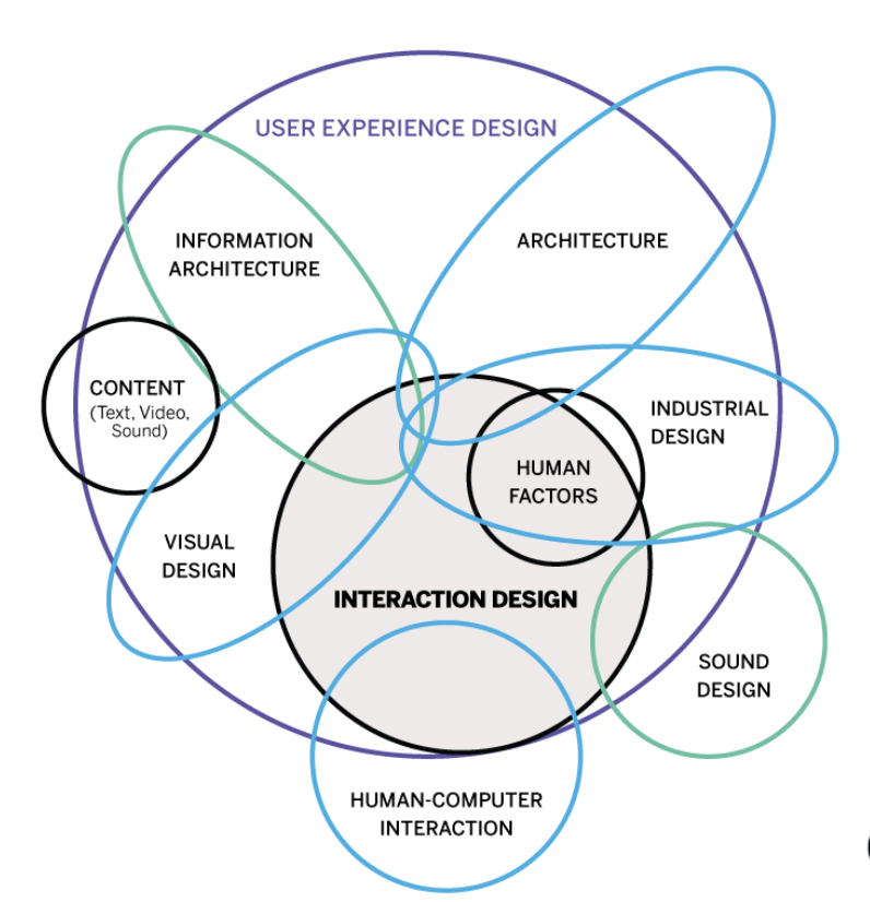
Figure 1 – Interaction design
Human Centred Design : An overview
Mandrelle (2022), defines HCI as “a design structure that centralizes human needs, behaviours, wants, contexts, and analyzes the potential issues that users might encounter when using a particular product or service.” The methodology is the idea that you are designing a device that focuses on prioritising user-centred design. By doing this, designers will then be able to create seamless user experiences which ultimately create successful designs.
Figure 2 – HCD design process
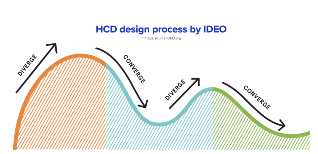
In the article, Mandrelle (2022), sets out the diagram above. Figure 2 shows the process of HCD design, where it is clear that there are three stages within the process. The first stage starts with inspiration, then moves on to ideation and finishes with implementation. However, it is important to understand from this article that there isn’t a different end to the process and it should be more of a cycle as this will ensure that the users are getting the best experience possible from the design.
Understanding this diagram lays out a structure to which this project can adhere – this will be considered when creating the time management diagram for this project.
History of HCI
The Interaction Design Foundation (2016) states that since the 1980s HCI has grown rapidly. This is due to users’ personal use of the internet which started in the 1970s. Before this computers were only used by professionals but as more people started to use devices and interfaces the importance of understanding their experiences increased. Hsiao (2023), explains that “Human-Computer Interaction (HCI) is not attributed to a single individual as its creator. Instead, HCI emerged as a multidisciplinary field that evolved from the combined efforts of researchers and practitioners in computer science, psychology, design, and other disciplines.” This shows how HCI is constantly evolving and assisting in shaping the UX industry.
The Brief and Objectives
Objective 1: To research and understand HCI and interaction design
Objective 2: To research into haptics and usability to understand how this will influence Eve Magazine
Objective 3: To create a working prototype to showcase on my portfolio website
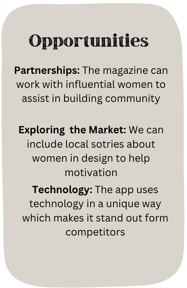
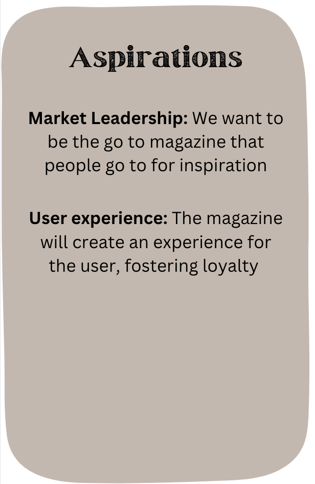
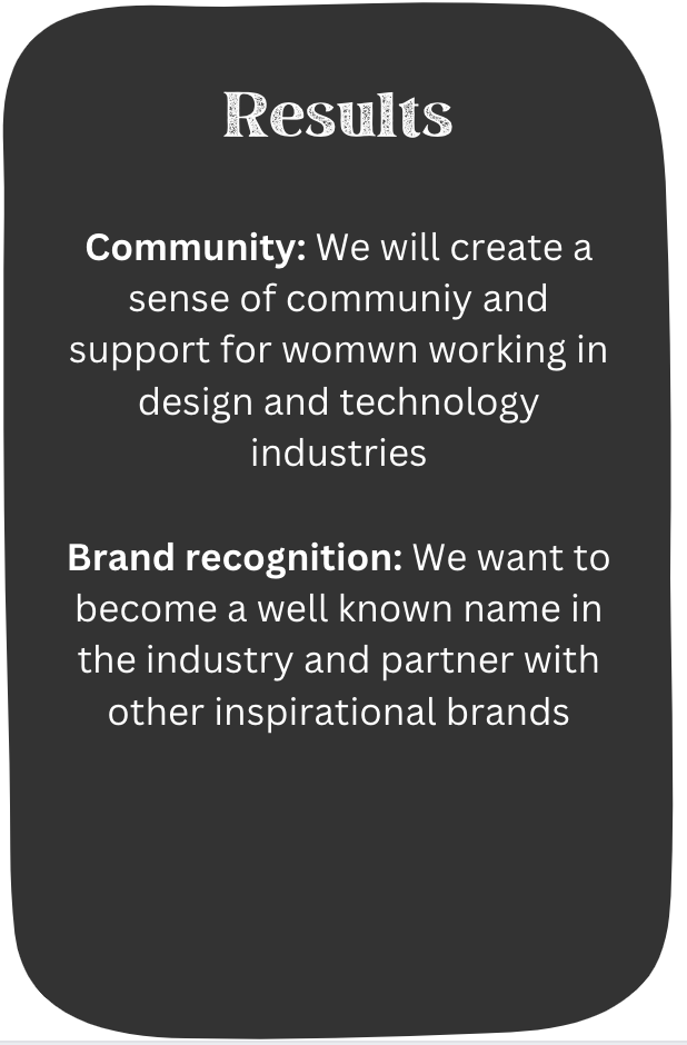
SOAR Analysis
Time Management
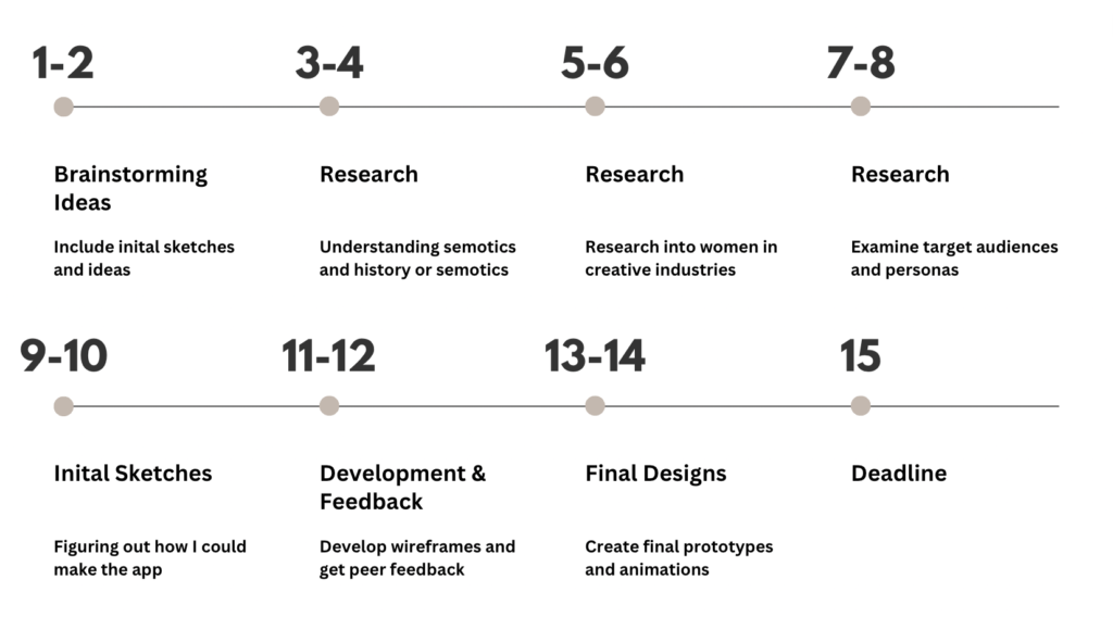
Here is the time management diagram of how I completed this project. The structure of this time management diagram was influenced by Figure 2: The HCI process. In weeks 1 and 2 the aim was to brainstorm ideas and create fig jam boards to visually show ideas. Weeks 3 – 8 then consisted of ideation and researching methodologies that could be utilised to create a product that had the potential to work successfully. Lastly, weeks 9-14 consisted of the implementation process where the prototype of the device will be created and developed. This leaves one week before the deadline to gather user feedback and ensure everything is uploaded onto my portfolio website correctly.
Key milestones in this project:
- Week 6 was reading week where I wanted to upload all research onto my portfolio
- Week 9 was where I wanted to start to sketch and create the idea
- Week 14 is when I wanted to finish the project which would leave plenty of time to upload and submit the project.
Brainstorming
Here is my initial brainstorm on fig jam. By using the plus and minus on the right you can navigate around the different ideas.
Target Audience
Competitor magazine target audience
A recent document from Statista shows that subscribers to online magazines are commonly younger and fall into the Millennial category at 56%. This provides a stable base for who my target audience may be which informs my user personas.
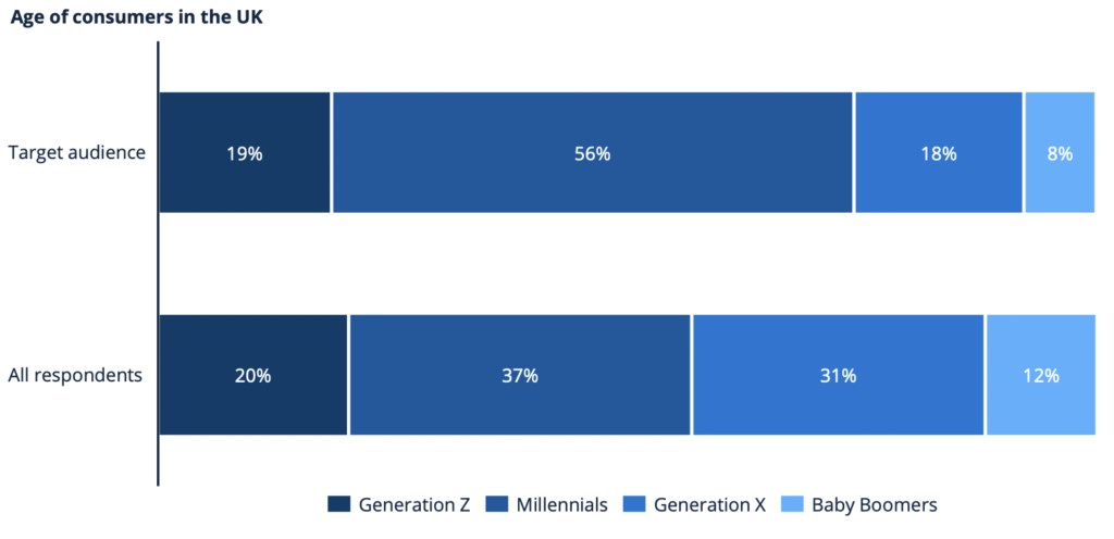
Figure 3 – Age of consumers in the UK (Statista, 2021)
Target Attitudes
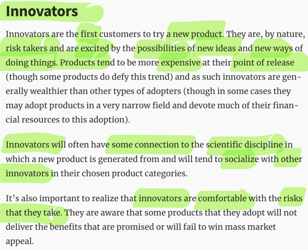
The next stage of understanding my target audience is to asses customer attitudes. The Interaction Design Foundation (2016) explains the importance of customer attitudes. They refer to a scholar called Everett M Rogers who lists several categories that customers could fall into. After reading the characteristics of each category and comparing them to my competitor’s strategies, I decided that the two categories that the customers fall into are the “Innovators” and the “Early Adopters”. To analyse the groups further I highlighted definitive aspects of each section, this assisted in comparing the similarities and differences to determine the attitudes of my target audience.
Below is a Ven Diagram of my process.
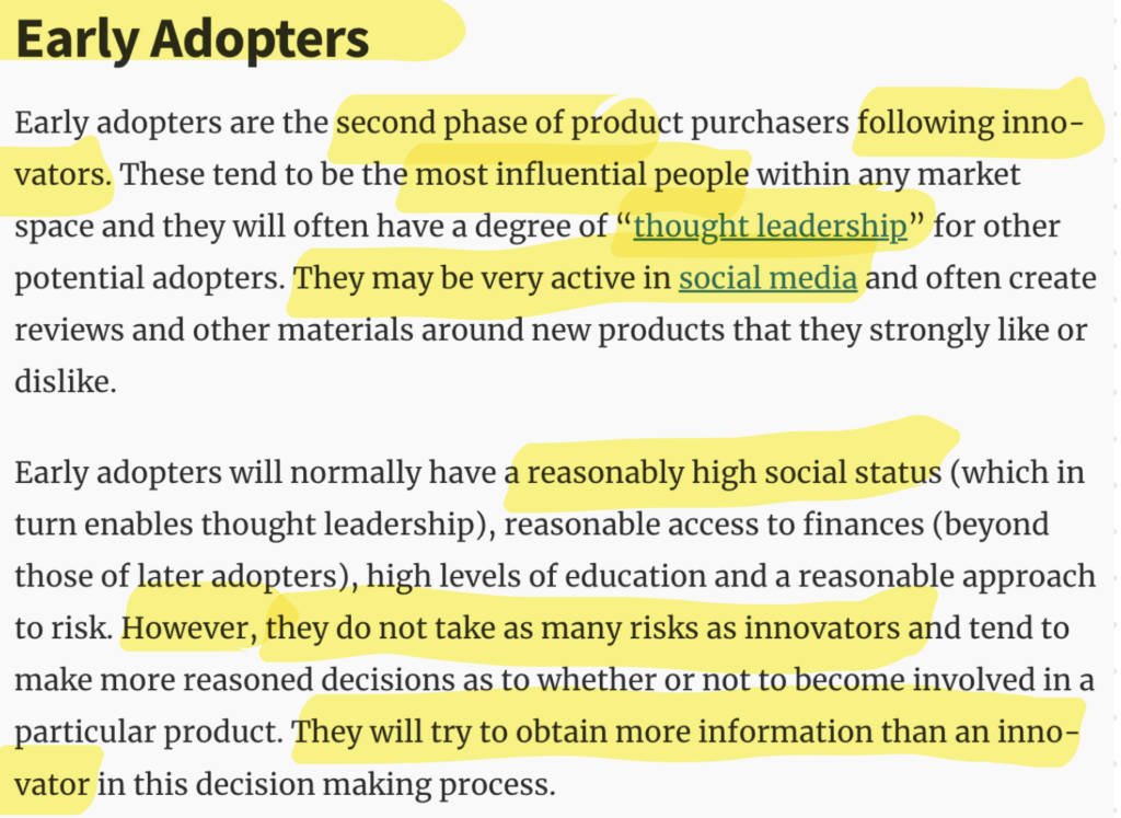
By creating this Ven Diagram I was able to distinguish the differences and similarities of the attitudes of my intended target audience.
This means that I can further my research into these two groups and start to create some initial brand strategies and designs that will be effective in creating a successful relationship between the brand and the customer.
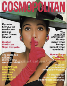
HCI Challenges in the magazine print industry
“Magazines, as we know them, are dying,”
(Renard, 2006)
Abrahamson (2015), refers to Renard (2006) in his recent publication, explaining the magazine industry. He explains that the digital age has brought significant changes to the magazine industry, impacting production processes, delivery platforms, editorial content, and economic sustainability.
This provides a strong foundation to understand the common issues that the magazine publishing industry is facing and how the industry is adopting the digital age. It is clear in the publication that there are many issues however, the print industry relies on customer loyalty which has evolved from the very first days of print. Abrahamson’s (2015) overarching message was that despite technological advancements, the appeal of magazines lies in their ability to connect with readers through narrative and storytelling. Even if it involves digital versions.
The importance of interaction within the magazine industry
In 2018, UAL: London College of Communication published an interview with Kelly Verdonk. Kelly is a Marketing & Communications Researcher who has an abundance of knowledge of magazines and digital publishing. She explained that the future of the magazine industry will become more digital due to a variety of factors. One of the main factors includes the customer’s constant need for new and exciting content that is created daily rather than having to wait a period for the latest edition. An example of this is companies such as Buzz Feed which regularly produce a variety of content which instantly attracts customer attention as content is new and intriguing.
She explains that this could be due to patience and the need for interactivity within the current day society. However, when asked “What do you think is the factor that decides whether a digital magazine is going to be successful or not?” her instant response was revenue. Explaining that “it has to make money. If it cannot find revenue streams it will not be able to succeed. In addition, it needs to be well-designed, have rich media, and use social media. You must strive to create media that uses the full potential of tablet technology. It has to be far more exciting than a printed magazine – it must entertain and provide a value proposition to its readers.” (UAL: London College of Communication, 2019). This supports Abrahamson’s (2015) belief that the content and topic of the magazine are incredibly important when attracting customers while building brand loyalty.
– This interview led me to research the affordance and cost-effectiveness of an interactive magazine.
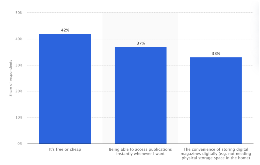
Figure 4 – Affordance of magazines (Statista, 2021)
To understand the reason why more customers are gravitating towards digital versions of magazines, I managed to find this bar graph on Statista that shows the leading reasons for reading digital magazines in the United Kingdom (UK) as of May 2022.
From this graph, it is clear that the main reason is the affordance of the magazine at 42% in comparison to other factors regarding accessibility and convenience. However, there isn’t a significant difference which means that the other reasons are important to consider when deciding on the platform of my magazine.
Initial Inspiration
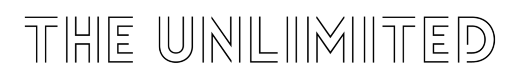
The Unlimited magazine showcases fashion and art through a digital interface with interactive elements. They define their magazine as an interface “Designed with features that encourage readers to swipe, push, tilt, listen, watch, and participate in, The UNLIMITED is a complete interactive media source.”(The Unlimited, 2014) The user can freely navigate around the magazine at their leisure which creates an innovative and creative way to promote an exiting user experience. They hold value on creating an individualised and personal experience for the user which contributes to the uniqueness of this company.
When I came across the company I was inspired and mesmerised by the interactive elements that were available to the user and I wanted to create my own version of this concept. I like how they collaborate with a variety of creatives to build each issue as this idea promotes the idea of promoting local and up-and-coming creatives which assists in completing Sustainable Goal 8: “Promote sustained, inclusive and sustainable economic grown, full and productive employment and decent work for all.”
Other interaction inspiration / Competitors
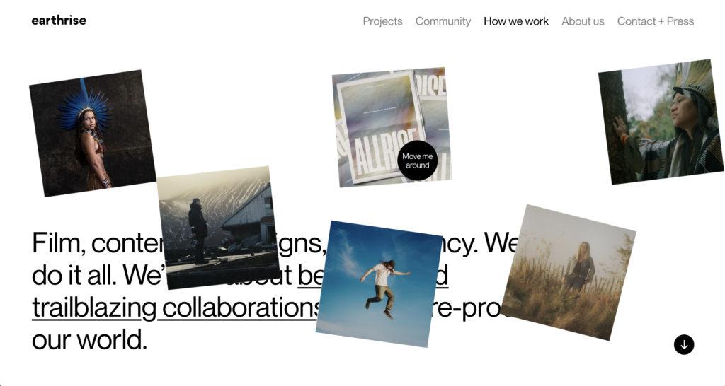
After I had decided on what my initial idea was, I decided to conduct some more in-depth research into how other companies are using interaction to gain user experience. I found a company called EarthRise Studio which is a media outlet that promotes environmental issues.
On their website, they have a very clever way of allowing the user to navigate their website. The image on the right is taken from their “How we work” page where you can drag the images around. This creates a unique and personalised experience. (If you click on the image you can try it out for yourself)
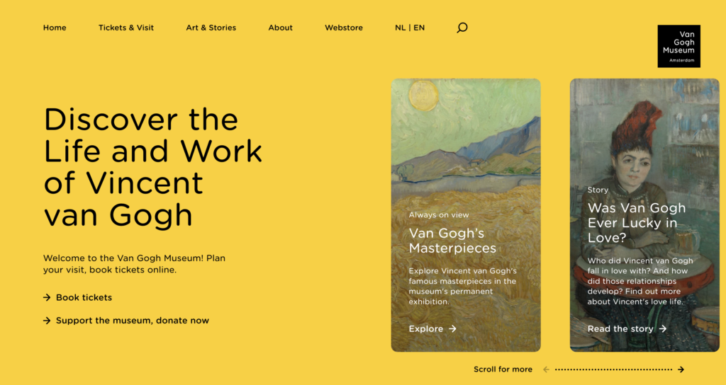
Additionally, The Van Gough Museum shows how subtle interactivity is also effective. On the homepage of the website when the user scrolls to find out more, the background changes from yellow to orange. This creates a very simplistic yet satisfying experience which creates a sense of interest in what the website has to offer.
These two examples show how interactivity can also be effective though a website as well as an app – I will need to do some user testing to decide on the right interface.
Key Concepts of Interaction Design
Kanade (2022) explores the key components of HCI:
- The user – The idea behind the user component is to be able to create a seamless design, understanding the user’s cognitive capabilities when navigating an interface. This is vital when creating an interaction between the user and the interface.
- The goal-oriented task – This concept explains that when users are navigating an interface they normally have a goal or task that they want to complete. By understanding the complexity of the user’s goal interfaces are then able to provide elements/ assistance. This will therefore create a seamless experience.
- The interface – The interface component is vital as it enables interaction to be customisable to each user audience which will allow for each user to have a unique experience. Such as if the user is accessing the interface on a mobile, the interface can then adapt to the device which will result in the user feeling comfortable when navigating.
- The context – The context such as the environment in which the user is accessing the interface is also important for the design aspect as this can influence how when the user views the interface.
By setting out the key components of HCI creates a strong base when creating the interface, as this sets out a basic checklist to ensure high user engagement and satisfaction.
History of Semiotics
Semiotics, as defined by Roland Barthes, refers to the study of sign systems and how cultural artefacts are interpreted as signs. This provides an initial understanding of what semiotics are and can analyse how they are used within society. Barthes (2015) views signs as having both denotative and connotative orders. Overall this study of sign systems is based on the idea that all cultural artefacts are signs, and these signs express specific values that are usually overseen within society but are impactful on the self-conscious mind. Therefore, we can see that the basis of semiotics examines how signs convey meaning within culture and society. Barthes’ study has become the basis of the research on semiotics
This provides a strong basis for how I can implement “artefacts” and “signs” to assist the user in navigating and interacting with the digital magazine. Barthes’s initial definition of semiotics influenced Ferdinand de Saussure’s interpretation of semiotics.
Saussure’s interpretation focuses on the relationship between signifiers and signifieds, and how they work together to create meaning. He introduced the concept of signs in semiotics, suggesting that each sign is made of two parts; the signifier and the signified.
- Signifier – The word, image, sound, or gesture representing a concept or meaning.
- Signified – The interpretation of the meaning of the signifier.
These two parts of a sign are always connected and cannot be separated.
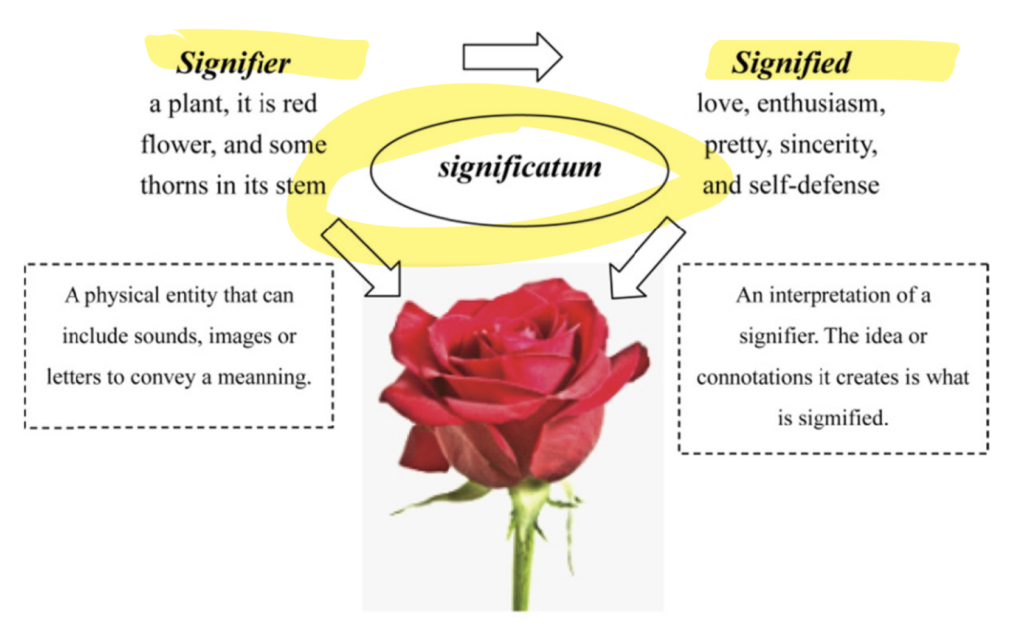
Figure 5 – sifnifier (StudySmarter UK, 2019)
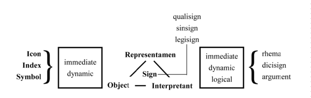
Figure 6 – Saussure’s interpretation (Yang and Hsu, 2015)
By understanding Saussure’s structuralist semiotics, we gain insights into how signs function and interact to convey messages. This influenced Charles Peirce’s Sign Categories (media-studies, 2020) who was an American philosopher writing in the 1800s. He categorised the signs we use to communicate ideas with each other into three types: icon, index and symbol. The image on the left summarises the sign theories proposed by Perice.
Lastly, Hall (2009) looks into semiotics differently in comparison to the previous scholars and examines the theory of representation. He believed that representation “process by which members of a culture use language… to produce meaning”(media studies, 2021). This is very interesting for my project as the aim of my interactive magazine is to be viewed globally by a variety of cultures, which creates the question of how I can ensure that the semiotics that I will use to assist the user in navigating the interface will also work across different cultures.
This means that I may need to create different versions of the magazine for different countries to uphold accessibility for all.
Affordance in HCI
Browne (2021), explains that “An affordance is a compelling indicator as to how an item operates and includes both its perceived and actual functions.” The idea behind affordance is that users know how to use something based on their previous experiences, which is very similar to the concept behind signifiers.
Browne (2021) identifies the different types of affordances:
- Explicit
- Hidden
- Pattern
- Metaphorical
- False
- Negative
After researching affordances, in the context of this topic, I think that utilising signifiers alongside hidden affordances will create the best outcome for the interface as this would mean that users would be able to navigate the interface without being overwhelmed by instructions which would create more of a fee experience for the user.
Haptics and Accesibility
The Interaction Design Foundation, (2016) suggest that “The effectiveness of haptic feedback depends on the context in which it is used.” (The Interaction Design Foundation, 2016). In the article, they set out the three main haptics and the context in which they are most successful:
- Vibration Feedback: these are most effective in digital devices. They are small motors or actuators that mimic real-life vibrations.
- Force Feedback: Uses motors to resist pressure when they interact with digital objects. They require precise control over physical interactions, such as surgery simulation
- Tactile Feedback: This provides a sense of real-life texture which can be useful in product design.
Additionally, they explain that haptics are used within a variety of industries, not just in design. They describe haptics as a way for users to interact with computers through vibrations to “simulate tactile sensations like texture and movement.”( The Interaction Design Foundation, 2016).
Natural haptic feedback during VR surgical simulations. [online] Available at: https://www.youtube.com/watch?v=1sAGv_8gnbA
An example of how haptics are successfully being used within other industries is a VR simulation for surgical simulations to assist in training medical professionals.
The company WEART Haptics created this simulation so “Medical teams can then test their skills in a virtual environment, without the risk of harming real patients and consequently learn at their own pace. ” (WEART Haptics, 2023)
This example proves the positive impact that haptics can have on digital interfaces and improve user interest. The simplicity and adaptability of haptics are the main reasons why I would want to use this in my interface to engage users with the content.
User Journey
Eve Magazine - Homepage
Wireframing options
When designing the home page for the magazine, I initially created three possible layouts. It was important to consider how the user would navigate and interact with the device as the design would need to encompass the user’s instincts. On the right is a key to assist in understanding the wireframes. Most wireframes would include text and images however with this project I decided to include the interactivity in red to assist with the development process. In regards to deciding which wireframe was the best, I created a list of the positives and drawbacks of each one to make a precise decision.
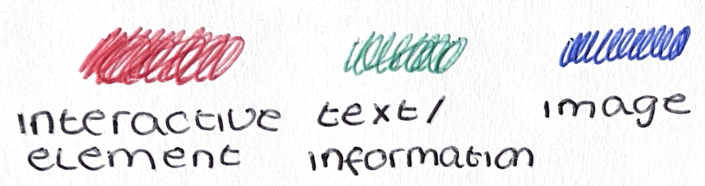
Key
Side Scroll
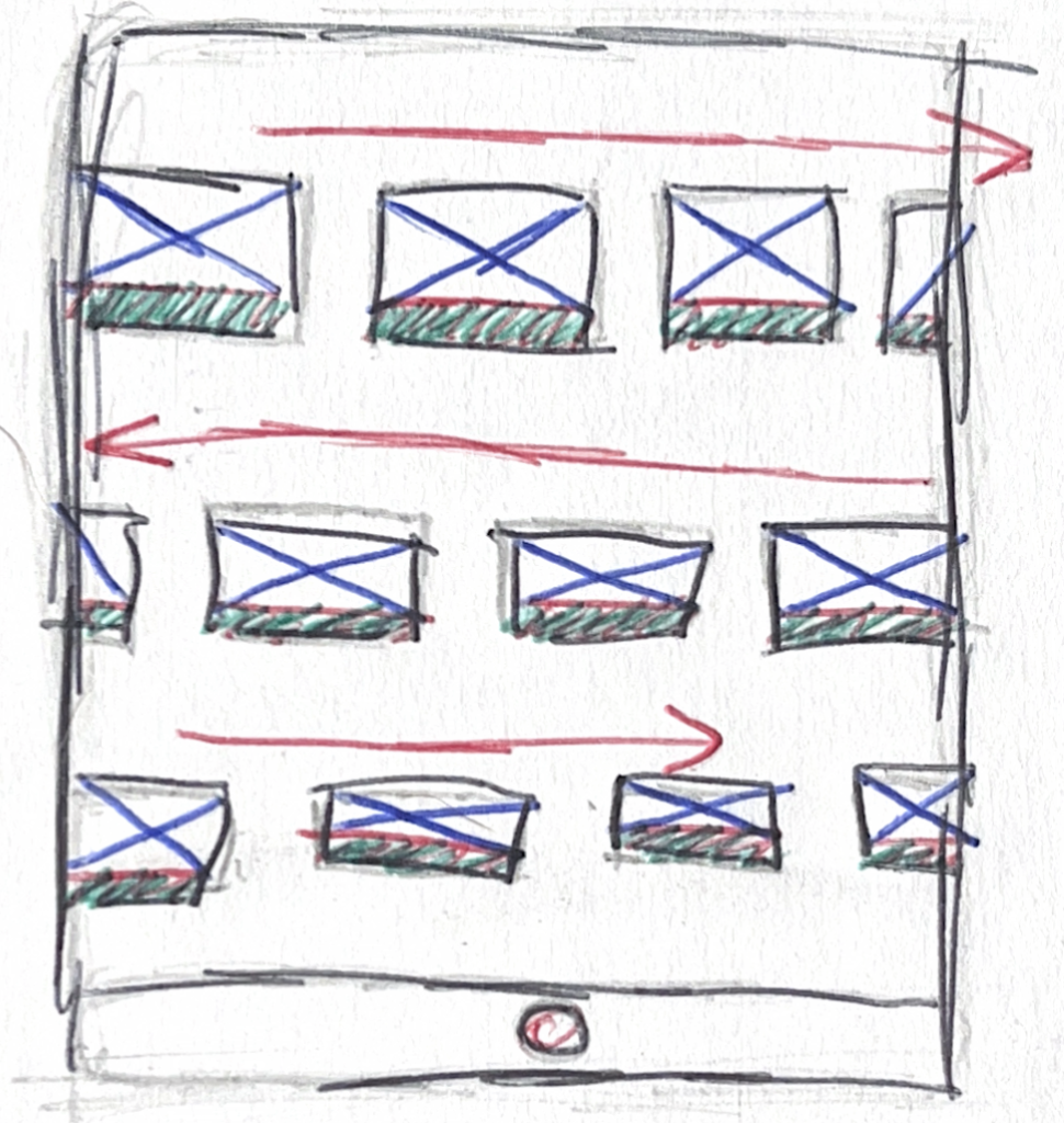
Positives:
- Can show multiple issues
- Commonly used in interfaces
- Interesting and highly interactive
Drawbacks:
- Too much going on
- Images and text are too small
Up and Down Scroll
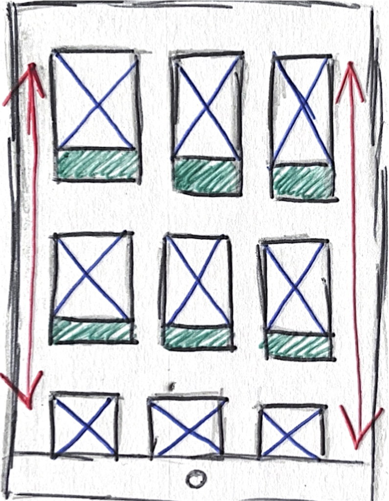
Positives:
- Users naturally use scrolling in social media apps
- Simplistic but effective
- Everything going in one direction
Drawbacks:
- Might be a bit boring as not very interactive
Two finger touch
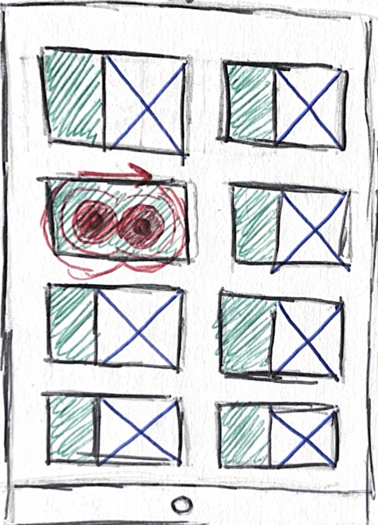
Positives:
- Unique and new to use
- Possible option of using haptics to assist users
Drawbacks:
- Users might find it confusing to use
- Will need to add additional instructions to navigate
Final Homepage Wireframe
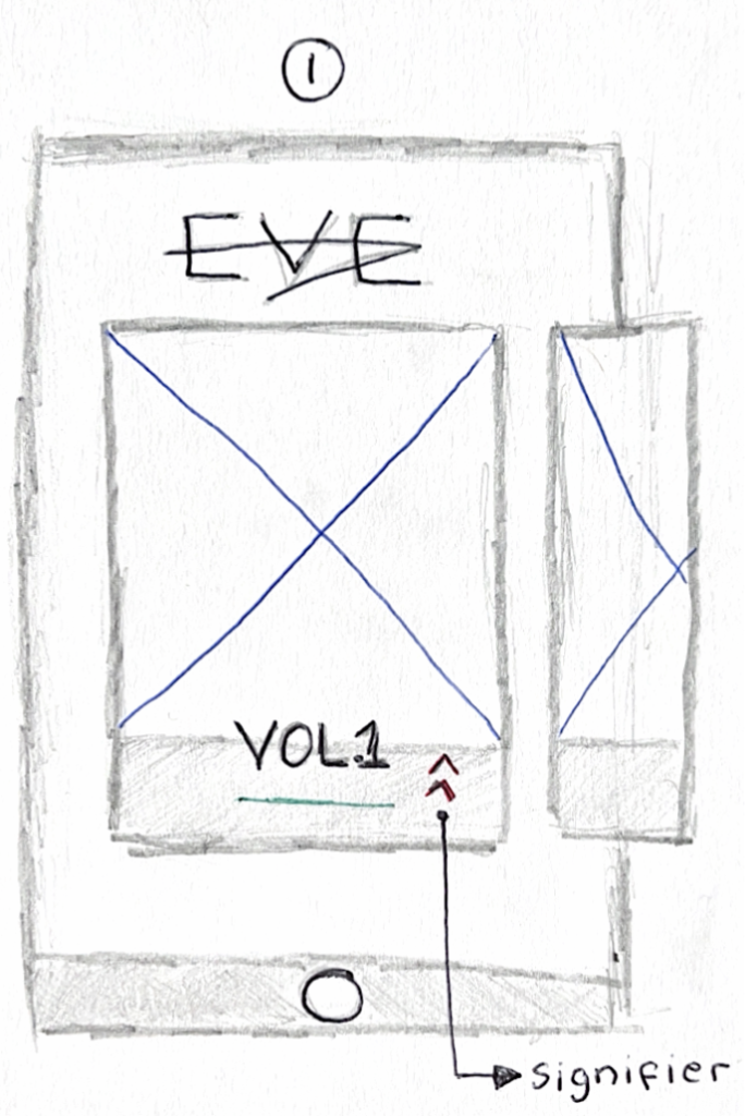
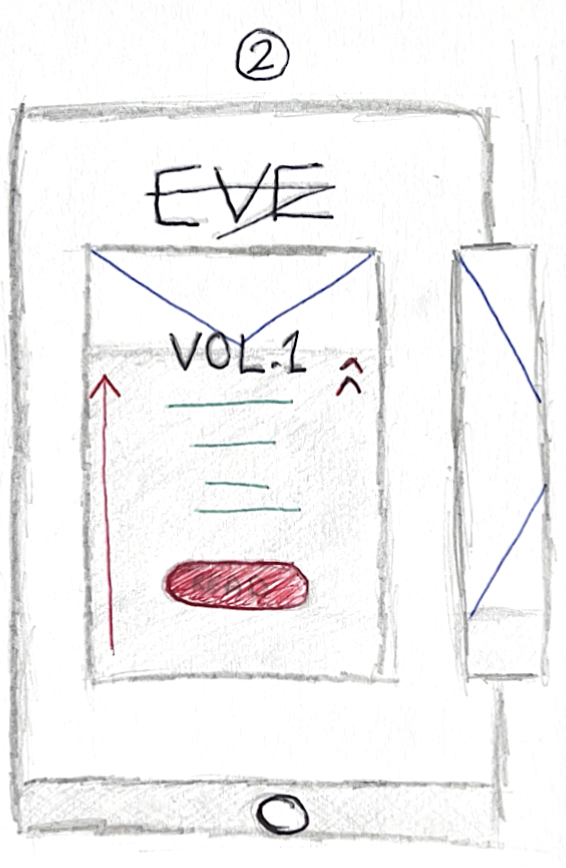
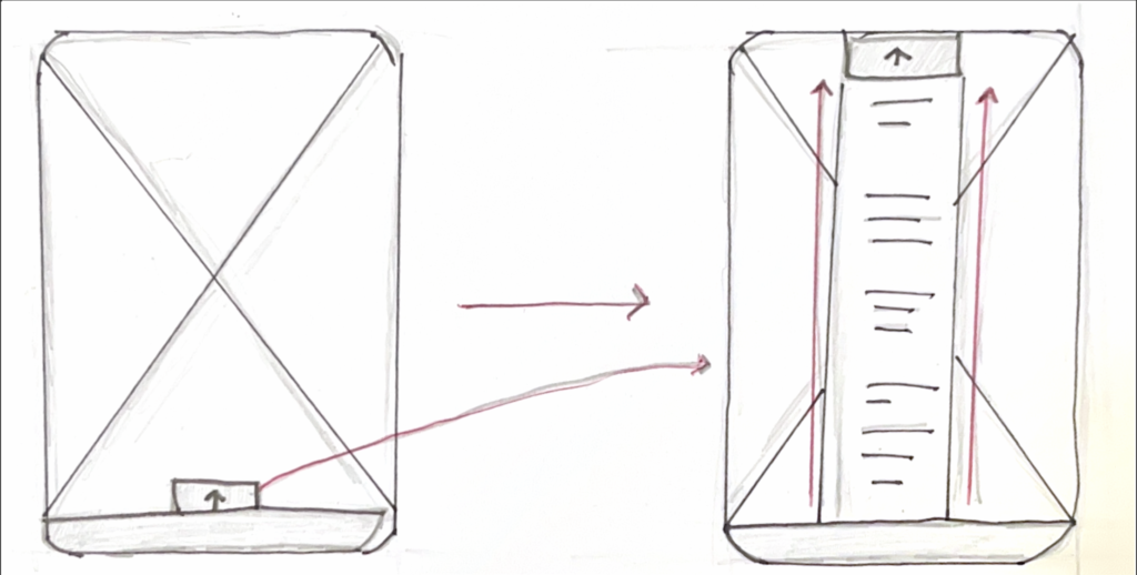
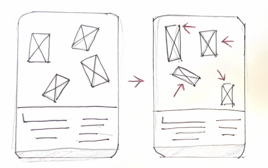
After considering the positives and negatives of the three wireframes above, I wasn’t completely happy with a specific one. This led me to further develop the wireframes and incorporate different assets of each one. Ultimately, I ended up on two interactive elements, a side scroll and a drag. One of the main issues with the previous wireframes was that the images and the text would be too small and overcrowded. By using the drag feature, the user can choose if they want to see more of the image. or read more about the volume. With this in mind, I would add a simplistic signifier on the right to help the user know how to find more information.
Secondly, I ended up deciding to use a side scroll to navigate between the different magazine volumes. I was influenced by physical magazines and wanted to replicate the sensation of flicking through pages as this would create a sense of familiarity for the user. With this interaction, I didn’t intend to use a signifier as showing a part of the next issue would enable users to understand that they need to scroll to see more. I thought that this would be more effective than overcrowding the design with typography or more arrows as there would be a possibility of creating confusion for the user.
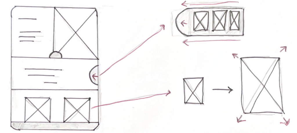
Developing wireframe into initial concept
Side Scrolling
Drag
The next step of developing the home screen was to replicate the wireframe in Figma and add the interactivity elements to ensure that they would work with the device. My aim this year was to become more confident in Figma and I believe I have achieved this goal as I was able to replicate my idea with ease. It was clear that the design needed to be developed more to become an effective prototype but at this stage in the project, I was happy with how the interactive elements would work on the device which would then allow me to move onto the next step of the development process.
Examples of screens in the magazine
Example 1 - Low Fidelity
This example consisted of the idea that the user could pull up a tab over the image/ video background. This would mean that they could read extra information if they wanted to.
Development - Mid Fidelity
Here I was experimenting using the drag feature in Figma. The idea came from sliding one rectangle over the other to create a tab that can provide information.
After I was happy with the with the drag feature I decided to add some text to show how information could be displayed.
Development - High Fidelity
Here’s an example of how the interface would look over a video on repeat. As you can see the user would be able to read the information whenever they wanted. Additionally, as the user is interacting with the tap they would experience haptic feedback to assist in user engagement.
Example 2 - Low Fidelity
This example is an idea of what a profile of a designer would look like. I took inspiration from paper magazines with the idea of separation of images and text. I thought that this would be the best way to show a profile of a creator in an aesthetic, eye-catching way.
Development - Mid Fidelity
As you can see on the right I decided to add interactive elements to the design. I thought that I would add a side sliding tab which would have images on.
Development - High Fidelity
I then developed the idea further and used an exemplar profile. This included graphics, alongside an explanation of how the graphic was made.
Here is the final design for what the profile interface would look like. When scrolling down the user would have an opportunity to tap on the screen through a signifier which would then bring up more assets such as a sicker design in this case.
Example 3 - Low Fidelity
The last example was inspired by The Earthrise Studio website where the user can drag around images and rearrange what the interface would look like. This unique idea would then allow the user to feel like they are receiving a personalised experience
Development - Mid Fidelity
This example was the most complicated to develop in Figma, as the images had to use the drag feature in a sequence to create a sense of fluidity. This would then create a realistic prototype of what the design would actually do.
Development - High Fidelity
As you can see form this final design, the images would also be able to move over the typography. I decided to do this to create some depth and interest within the design.
Final Prototype Design
User Feedback
The feedback for this project was collected from 5 random participants. The participants were asked a series of questions about the concept of the project alongside the final prototype of the idea. Some examples of the questions consisted of:
Do you like the idea?
Do you think that this idea is unique?
Is there anything you think needs work?
The infographic bellow shoes a summary of feedback collected.
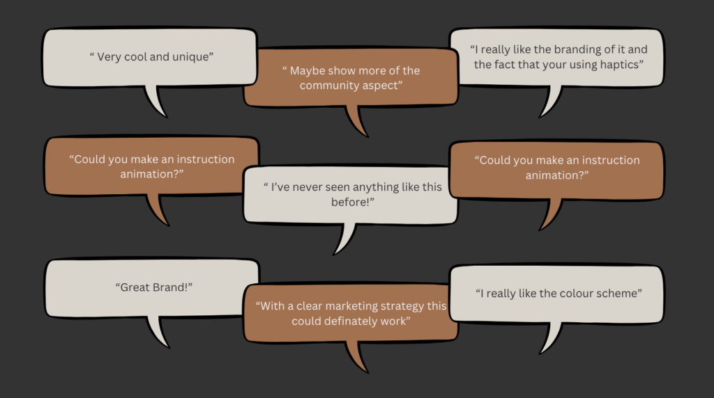
From this feedback its clear that people like the concept of the idea and the branding. However, as this idea is very unique and there isn’t anything like this on the market, a clear marketing strategy will be needed. Furthermore, I think that a possible advert that explains how to use the idea will assist in user experience.
Sustainability Goal 8

This project completes Sustainability Goal 8 via:
- Skill development: The app provides opportunities for individuals to feel inspired to develop their technical skills. By learning and developing their skills, users will have more opportunities in the job market alongside building a community that can provide knowledge and support.
- Driving innovation and enhancing creativity: By encouraging experimentation and creativity, the magazine supports innovation and enhances competitiveness in the global marketplace, ultimately fostering sustainable economic growth and development.
Reflection
Upon reflection, this project enabled me to fully understand HCI and Interaction design. It lead me to create a unique concept that has potential to modernise and disrupt the magazine industry. By understand the challenges that are clear in the digital magazine industry I was able to notice that through the use of semiotics and haptics the potential of increasing user experience. The completion of SDG8 enabled me to consider how the concept could assist future creatives to feel empowered, confident and develop their creativity skills. Alongside this, the user feedback made it clear that the community aspect is definitely a USP with this idea. This could possibly be a strong core value for the marketing strategy.
What went well:
- I was proud that i managed to create a high fidelity prototype that could be used to show future investors
- I believe that my initial SOAR analysis created a solid foundation and plan fpr the overall project, which lead to a high completion of the prototype
- I am happy with the overall brand and colour scheme as It brings a sense of elegance and empowerment.
What didn’t go well:
- I would have liked to create some posters and promotional adverts
- I think that i could have gone more in-depth into the community factor of this project
Future Recommendations:
If I decided to carry this project on I would definitely create an advert that shows how to use the app. Also I would also conduct more user testing that would identify gaps in the user experience. Lastly I would create a variety of promotional posters and adverts that could be put on build boards to promote the concept.
References:
Abrahamson, D. (2015). The Future of the Magazine Form: Digital Transformation, Print Continuity. Journal of Magazine Media, 16(1). doi:https://doi.org/10.1353/jmm.2015.0004.
Barthes (2015). roland barthes centenary. [online] Oxford Academic. Available at: https://academic.oup.com/fs/pages/roland_barthes_centenary [Accessed 8 May 2024].
Browne, C. (2020). What Are Affordances In UX Design? [With Examples]. [online] CareerFoundry. Available at: https://careerfoundry.com/en/blog/ux-design/affordances-ux-design/ [Accessed 28 Apr. 2024].
Hsiao, E. (2023). The Origins of Human Computer Interaction and Its Impact on UX. [online] Medium. Available at: https://bootcamp.uxdesign.cc/the-origins-of-human-computer-interaction-and-its-impact-on-ux-2ba8db34f105 [Accessed 28 Apr. 2024].
Kanade, V. (2022). What Is HCI (Human-Computer Interaction)? Meaning, Importance, Examples, and Goals. [online] Spiceworks. Available at: https://www.spiceworks.com/tech/artificial-intelligence/articles/what-is-hci/.
Mandrelle, G. (2022). What is human-centered design? [online] Adplist.org. Available at: https://blog.adplist.org/post/what-is-human-centered-design [Accessed 28 Apr. 2024].
Media-studies (2020). Charles Peirce’s Sign Categories. [online] Media Studies. Available at: https://media-studies.com/peirce-sign-categories/ [Accessed 24 Feb. 2024].
Media-studies (2021). Stuart Hall and Representation. [online] Media Studies. Available at: https://media-studies.com/stuart-hall-representation/ [Accessed 24 Feb. 2024].
Music, A. (2014). THE UNLIMITED Magazine, Interactive Quarterly for Art, Music and Fashion. [online] THE UNLIMITED Magazine, Interactive Quarterly for Art, Music and Fashion. Available at: http://theunlimitedmag.com/ [Accessed 24 Feb. 2024].
Qualtrics (2021). What is Interaction Design? | Qualtrics. [online] Qualtrics. Available at: https://www.qualtrics.com/uk/experience-management/customer/what-is-interaction-design/?rid=ip&prevsite=au&newsite=uk&geo=GB&geomatch=uk [Accessed 8 Feb. 2024].
Renard, D. (2006). The Last Magazine. [online] Universe Publishing(NY). Available at: https://books.google.co.uk/books/about/The_Last_Magazine.html?id=4cUxAQAAIAAJ&redir_esc=y.
Statista. (2021). Frequency of digital magazine consumption UK by age 2021 | Statista. [online] Available at: https://www.statista.com/statistics/1302498/frequency-of-digital-magazine-downloading-and-access-uk/ [Accessed 8 May 2024].
StudySmarter UK. (2019). Semiotics: Meaning, Examples, Analysis & Theory | StudySmarter. [online] Available at: https://www.studysmarter.co.uk/explanations/english/semiotics/ [Accessed 8 May 2024].
The Interaction Design Foundation. (2016). What are Haptic Interfaces? [online] Available at: https://www.interaction-design.org/literature/topics/haptic-interfaces#what_are_haptic_interfaces?-0 [Accessed 8 Mar. 2024].
UAL: London College of Communication (2019). Magazine Publishing // ‘the future of publishing will be digital’ (and we’re ready!). [online] London College of Communication. Available at: https://www.arts.ac.uk/colleges/london-college-of-communication/stories/magazine-publishing-the-future-of-publishing-will-be-digital-and-were-ready! [Accessed 8 Mar. 2024].
WEART Haptics (2023). Natural haptic feedback during VR surgical simulations. [online] www.youtube.com. Available at: https://www.youtube.com/watch?v=1sAGv_8gnbA [Accessed 8 Mar. 2023].
Yang, C.-M. and Hsu, T.-F. (2015). Applying Semiotic Theories to Graphic Design Education: An Empirical Study on Poster Design Teaching. International Education Studies, 8(12), p.117. doi:https://doi.org/10.5539/ies.v8n12p117.