This week we learned about accessibility and how to ensure that our designs would cater to all users. I found it interesting to learn that the concept of accessibility doesn’t just apply to people with disabilities and it’s important to understand that users have different needs at different times in different circumstances.
We looked into the difference between Cognitive and Functional disabilities. A cognitive disability is where a person struggles with mental tasks such as Dyslexia or Dyscalculia. Whereas a functional disability has difficulty in memory such as recalling what they have learnt over a period of time. With this in mind, it’s important to understand how different users expect a website to work. For example, for people with a functional disability, it might be hard for them to understand large amounts of text, therefore text on a website should be simple and easy to read.
Other disabilities that are important to consider when designing a website are:
- Neurological disabilities
- Visual Disabilities
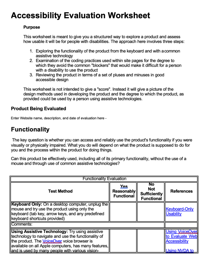
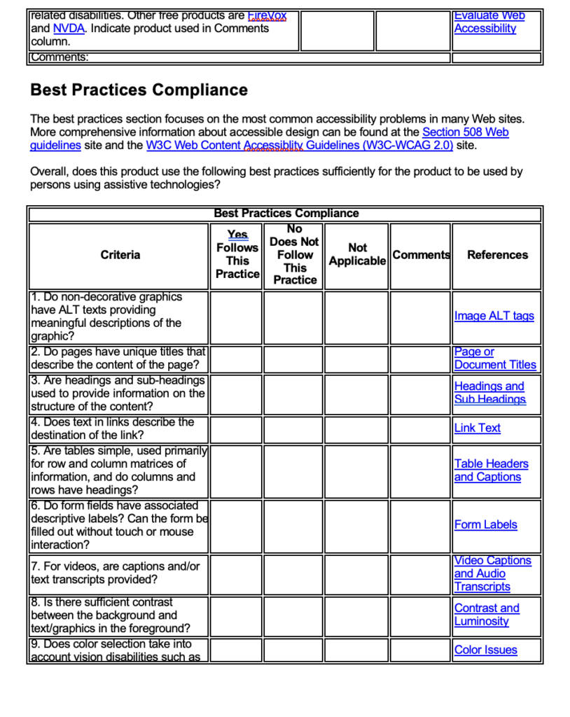
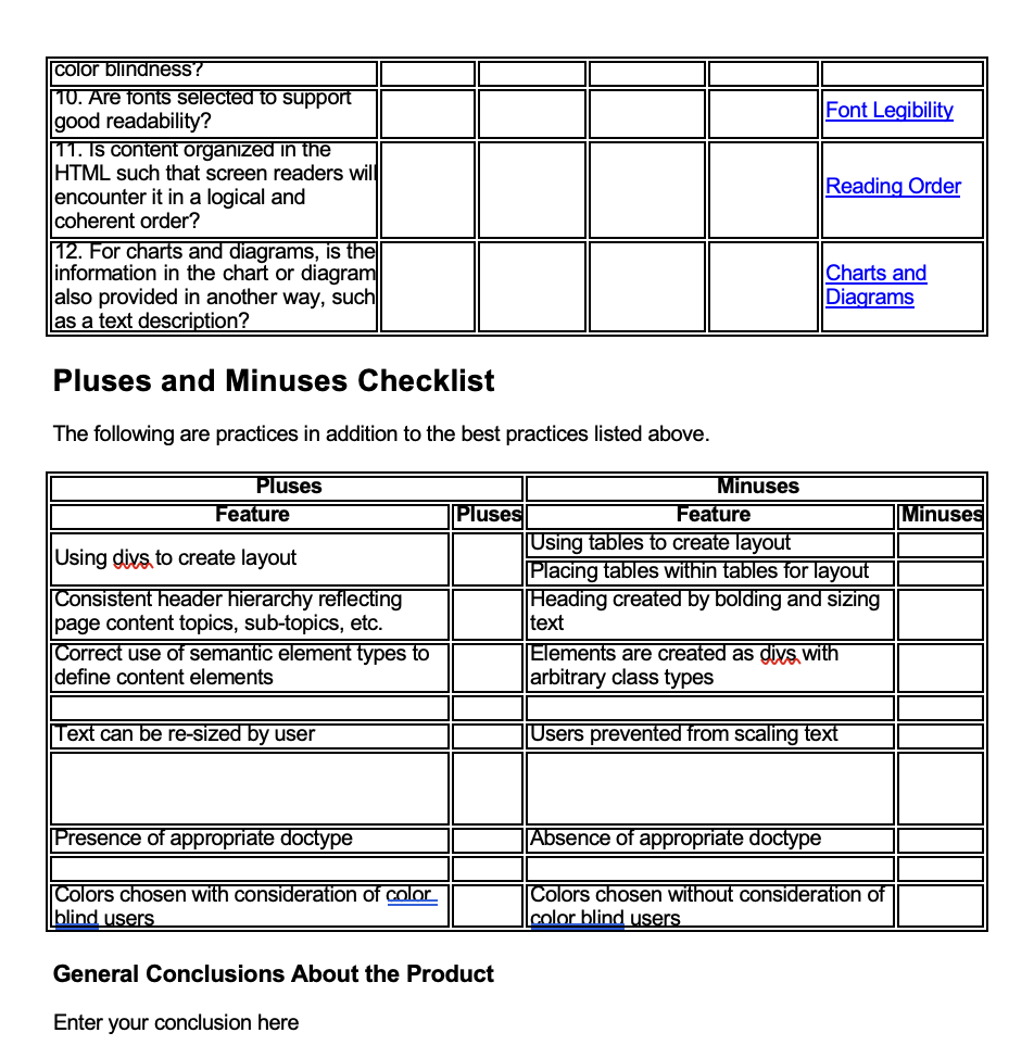
Accessibility Evaluation Worksheet
We were asked to fill out this Accessibility Evaluation Worksheet on a website of our choosing. I decided to do the British Red Cross.
After completing the worksheet if found that the website was very accessible and ticked a lot of the boxes:
- All pages had a clear description of what was on the page
- The text on the page was clearly set out by a heading, sub-heading and then a paragraph text
- There was a good contrast of colours on the webpage which would make it easy to read for people with visual disabilities
- The websites assistive technology worked well by ready what the pictures were


How can I incorporate this into my projects ?
We were given some links to check the accessibility of some of our previous projects, I decided to experiment with the Web Accessibility Evaluation Tools List
Here, I found a really good website called Userway . This website identifies any accessibility issues and suggests how to improve the website. I liked how it was easy to use and quick at pointing out any accessibility issues a website might have.
I decided to use it in some of my freelance work and the client was happy with the amount of information I was able to provide her with, and the developer is working on some of the issues now.
To conclude, this lecture made me more aware of how important it is to ensure that website design is accessible to all users which I didn’t realise in my previous projects but now I will be using the websites to ensure effective accessibility.