Figma
Many professionals in the UX/UI industry class Figma as the “Leading web design tool” (Linkedin.com, 2023) as it has many tools that are easily accessible and provides a variety of features. that other softwares don’t. After initially downloading the software and getting familiar with it I noticed a few features that stood out:
- Prototyping and Interaction Design: Figma provides robust prototyping features, allowing designers to create interactive prototypes for user testing and stakeholder presentations. It supports transitions, animations, and interactions, making it a powerful tool for creating realistic user experiences.
- Plugins and Integrations: Figma has many plugins that extend its functionality. These plugins cover a wide range of tasks, from design enhancements to workflow automation.
- Community and Resources: Figma has a large and active community of designers and developers. This community shares resources, tutorials, and design assets, making it a valuable resource for learning and staying updated with industry best practices which aligns with my learning objectives
Figma and companies
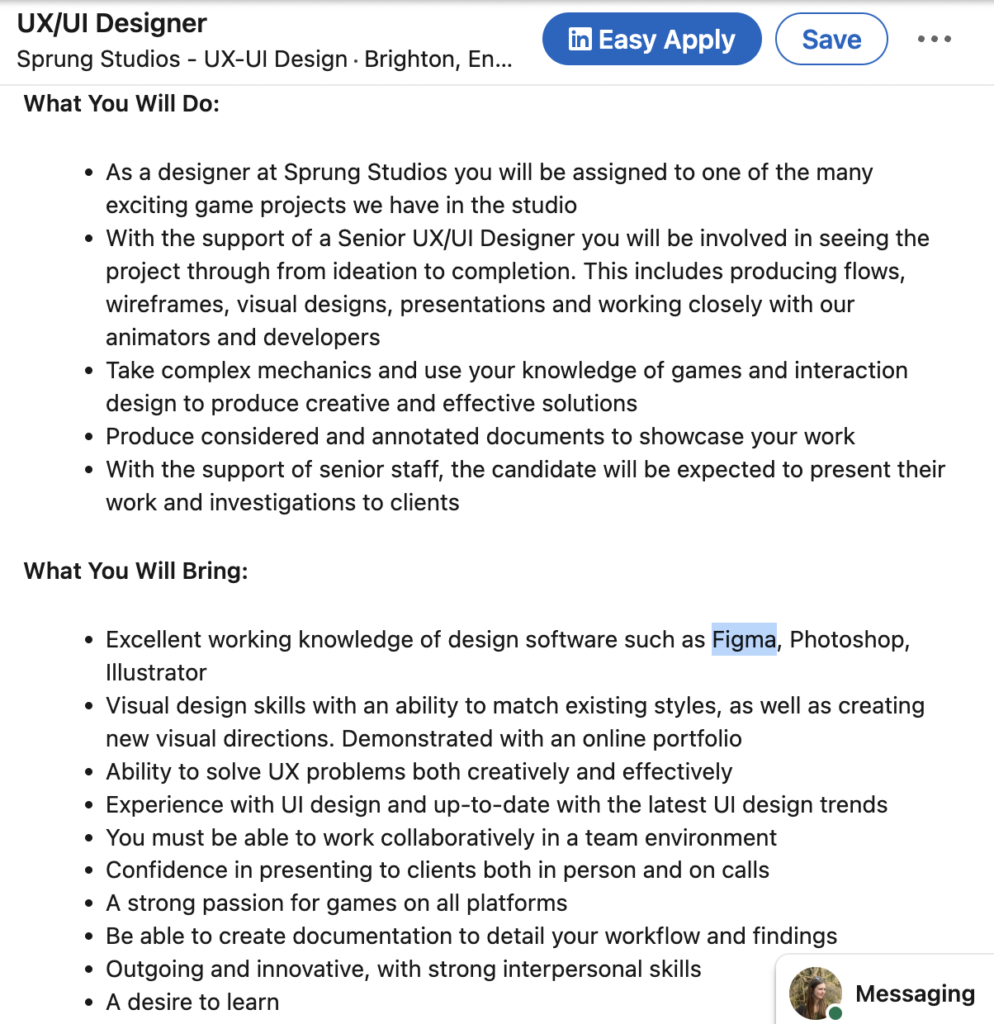
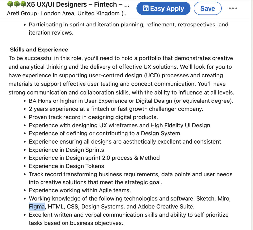
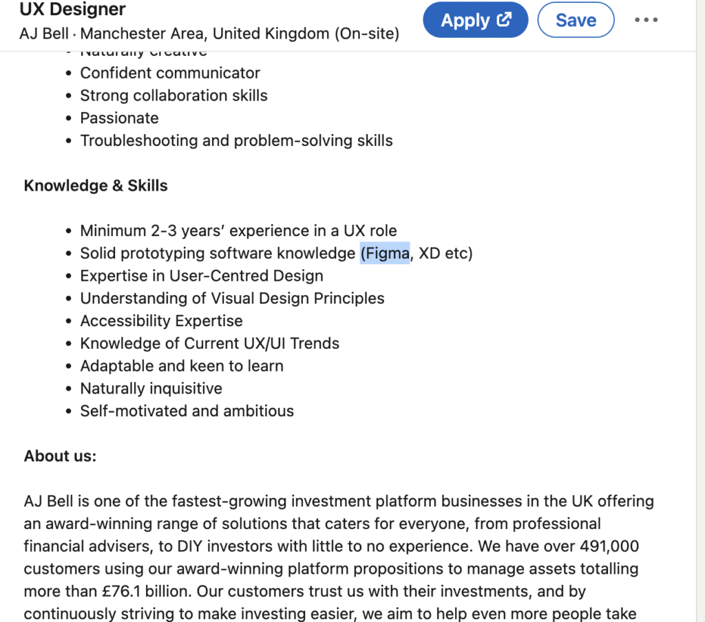
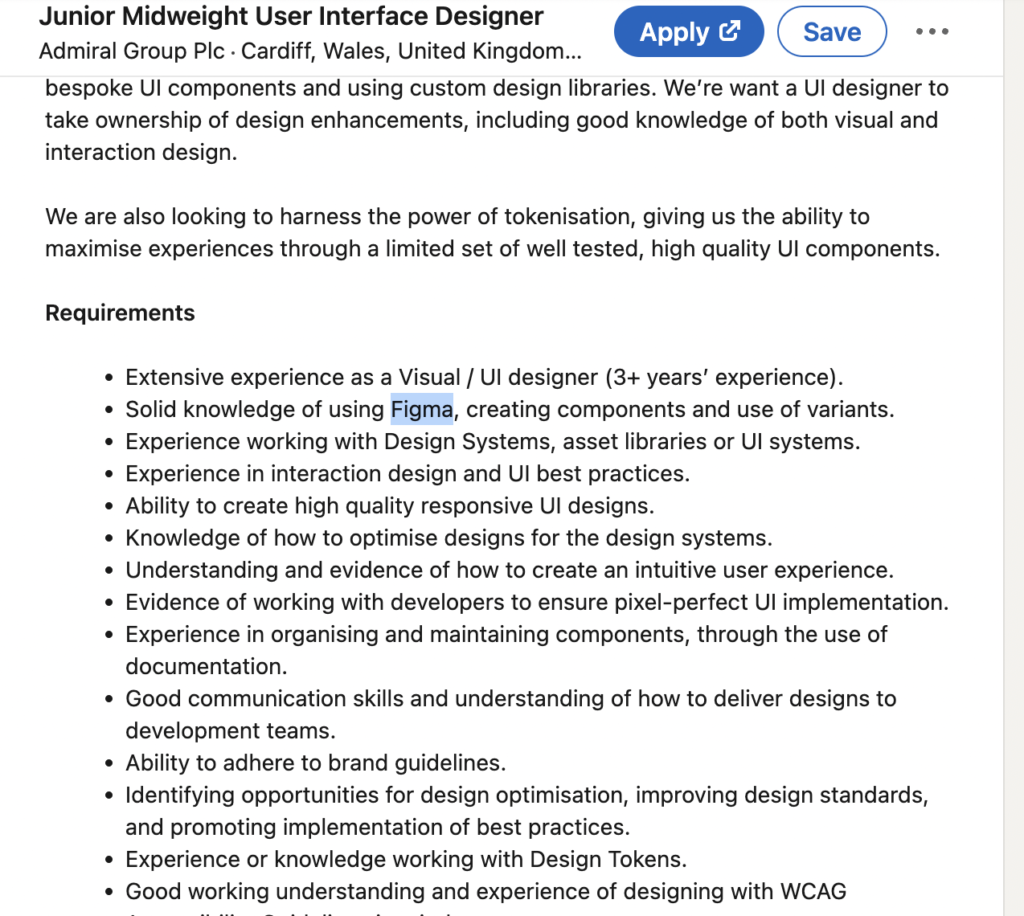
As one of my Learning objectives is to do research and keep up to date with industry trends and softwares, I decided to look into the skills and experiences that companies are looking for in applications. As you can see below the majority of companies expect ux/ui designers to have sufficient skill in Figma. This hilights how important it is to learn the software and show on my portfolio that I know how to use it properly.
Learning Figma
I decided to do the course on Figmas’ website to learn the fundamentals of the software you can access the 4 part course here
The first part of the course I learnt the basics of the software such as finding my way around the dashboard, learning frames, creating shapes, copying and duplicating layers and learning about components. When creating interface design in my previous projects I was using Adobe XD which is also an industry standard software so I already had knowledge about the basics but thought it would be useful to refresh my memory.
The second part of the course was about creating designs and wireframes. We also went over grids and margins and learnt how to align designs.
Half way through the course, I realised that I needed to practice what I learnt in my own project to help me to remember everything. So I decided to develop my low fidelity wireframes for my project Quick Give. I started with the website and used what I had learnt in the course to ensure all my designs fitted within the margins and also used Auto-Layout. Once I gained confidence in what I carotid I moved onto designing my inital idea for the widget.
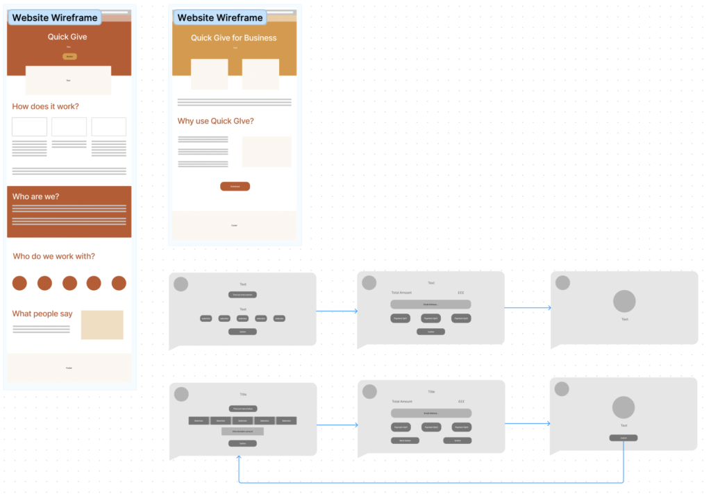
The third part of the course was about bringing the designs to life and incorporating prototyping into the wireframes. The button aspect of the software was very similar to adobe XD so I decided to push myself and make a separate menu component where the underline would animate to each property when the mouse was hovering.
Once I was happy with the animation I moved onto making transitions in website pages. I thought I would look elsewhere for tutorials at this point as what I wanted to do was very specific I used this video to help me. After I decided to try it out on the website. Below is a video of all the prototyping animations together.
In conclusion, I decided not to do the fourth part of the course as I felt like I needed to practice what I had learned before I needed to learn how to send over Figma files. However, practising the components and putting this into my project allowed me to feel more confident and to keep looking up more tutorials to make my designs successful.
Linkedin.com. (2023). LinkedIn. [online] Available at: https://www.linkedin.com/pulse/figma-leading-web-design-tool-brett-long/ [Accessed 4 Nov. 2023].