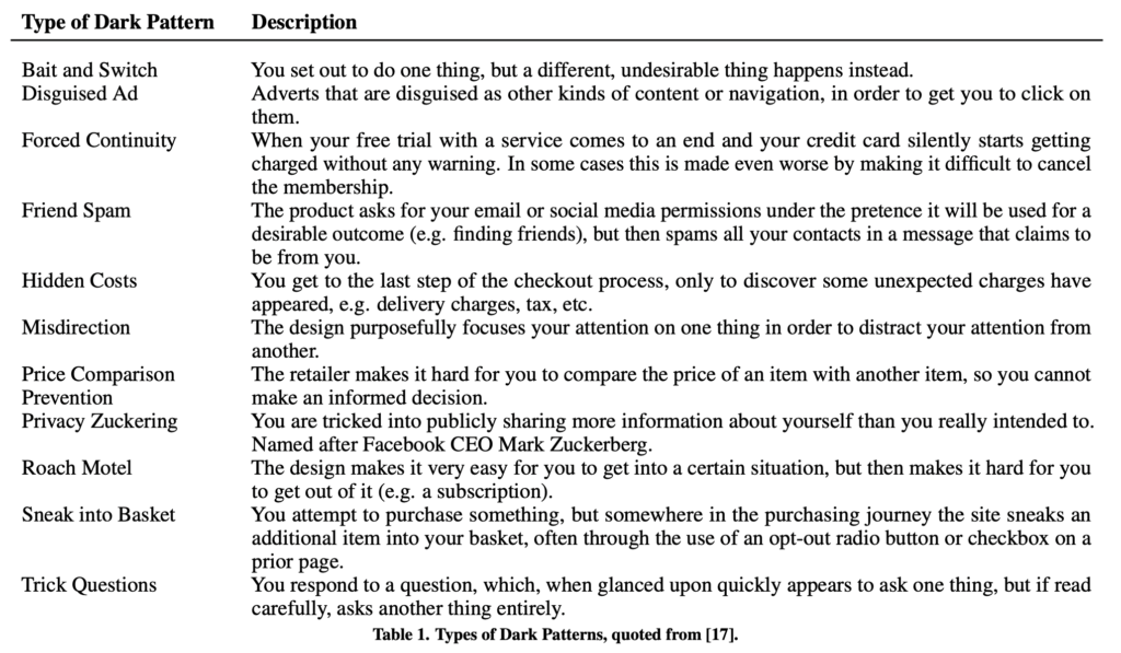
Gray (2018) defines “Dark Patterns” as “instances where designers use their knowledge of human behaviour (e.g., psychology) and the desires of end users to implement deceptive functionality that is not in the user’s best interest”. The overall theme of dark patterns is this idea of deception and persuasion. As the user’s aim isn’t to do what the dark pattern is showing can cause some concern for ethical issues. Dark Patterns can come in various forms which Gray lists below.
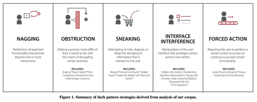
As you can see here, many forms of Dark Patterns are very subtle and that users would even notice. This can hinder the trust between users and interfaces which can affect usability. Within the article, The Dark (Patterns) Side of UX Design Gray also distinguishes separate strategies that Dark Patterns fit into.
Gray, C.M., Kou, Y., Battles, B., Hoggatt, J. and Toombs, A.L. (2018). The Dark (Patterns) Side of UX Design. Proceedings of the 2018 CHI Conference on Human Factors in Computing Systems – CHI ’18, [online] pp.1–14. doi:https://doi.org/10.1145/3173574.3174108.
Examples of Dark Patterns
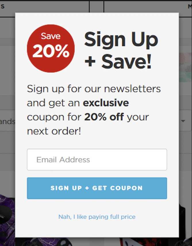
Shopify provide examples to their customers to avoid using when trying to sell products below are some of the most common ones :
Shopify (2019). Dark Patterns: 12 Tricks You Should Never Use in Your Products. [online] Shopify. Available at: https://www.shopify.com/partners/blog/dark-patterns [Accessed 13 Dec. 2023].
Bait and Switch
Confirmshaming
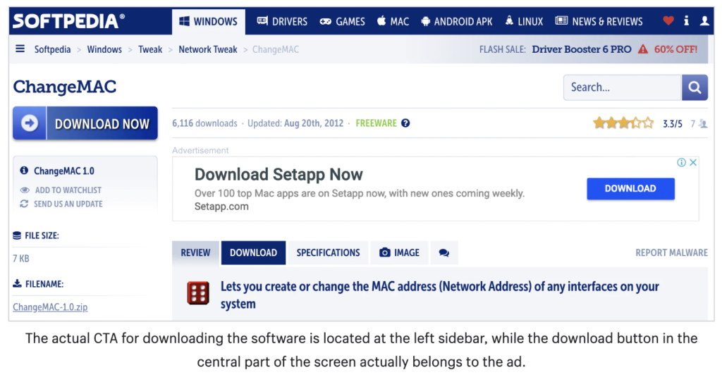
Disguised ads
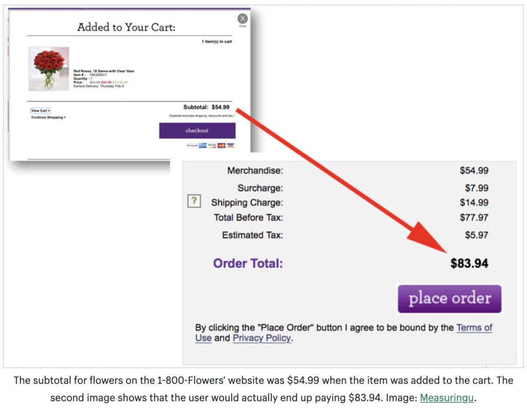
Hidden costs
How can I combat this?
Neilson (2023) sets out a list of questions for UX designers to consider when designing an interface as he believes that designers should call out an try to consider ethical ways to reach an end goal without having to use deception.
Below are the questions that I will consider when i design my interfaces in my projects:
Could users spend more or provide more of their data than they intended or needed?
When users consent to something in exchange for a capability, product, or experience, is the exchange fair and appropriate?
Is the information presented about each choice factually correct?
Given how the information or options are presented, could users easily misinterpret the choices (or availability of choice)?
Could users miss another choice in the interface (for example, because it is obscured or in a location the user might not expect)?
Could users miss an essential piece of information that would assist them in making a choice?
Can users access all the information regarding each choice available to them quickly?
Can users quickly implement a choice they want to make (or do many unnecessary steps block them)?
Are users rushed into making a decision?
Are users unfairly pressured or emotionally manipulated when making a choice?
Could users feel ashamed, nervous, or guilty when declining a choice?
Nielsen Norman Group. (2023). Deceptive Patterns in UX: How to Recognize and Avoid Them. [online] Available at: https://www.nngroup.com/articles/deceptive-patterns/ [Accessed 13 Dec. 2023].