Project Title: How can I create an app and a recognisable brand that aims to reduce stress and anxiety through simplistic yet effective techniques?
Introduction
This project aims to utilise the ancient techniques of Shinrin-Yoku ( Forest Bathing ) and Sensory Modulation Intervention, which are proven to have effective results in reducing stress and anxiety and replicate the techniques into a portable digital app. Creating a digital app increases the reach of people who live in cities and towns to have a similar experience as people who live in the countryside.
Therefore improving the mental health issues that arise mainly in urbanised locations. The project will be fueled by in-depth research to fully understand the scientific aspect of the techniques which will allow me to create an accessible interface in which users can reflect and journal their walks. To make the app as effective as possible I will be researching developing technologies such as IoT (Internet of Things) to increase the sustainability of the application.
Insight
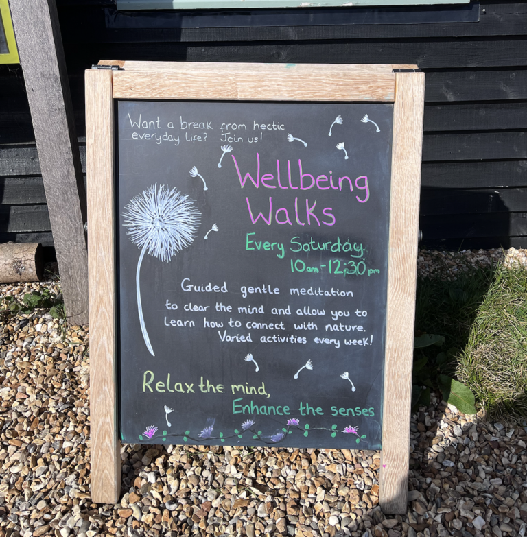
Over the summer before starting the masters course, I went on this “Wellbeing Walk” on the Isle of White.
Whilst on the walk I noticed a significant change in my state of mind, I felt relaxed and a stress reduction. The walk consisted of a variety of exercises such as:
- Meditation practices
- Concentrating on senses
- Breathing exercises
I decided to practice these techniques and noticed a significant difference which inspired me to find a way that teach people how to do the same.
RSA Brief
After reading all the RSA briefs, I thought that Brief 5: How might we create sustainable, nature-based solutions which use trees to protect the environment and strengthen communities? would be the closest to my initial idea. My first action was to highlight the parts that stood out to me within the RSA document. The main thing that stood out to me was a study by Oxford University about Nature-Based Solutions and how they benefit society. This topic led my initial research in understanding how people can learn from nature to improve society.
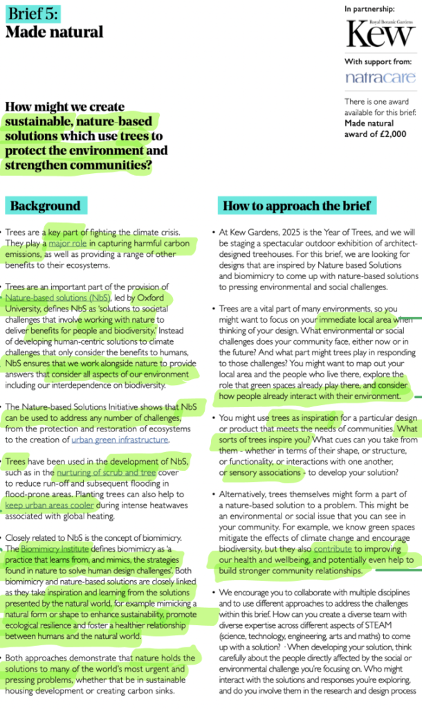
https://www.thersa.org/student-design-awards
Below is my Figma board where I started to collect research about different aspects of the brief. This allowed me to fully understand the topic and visually brainstorm what I wanted to produce from this project. I found some interesting academic sources and scientific studies about nature’s benefits and effects on mental health.
Below, is my interactive Figma board where you can navigate by using the plus and minus buttons and the cursor to drag.
Creative Action Toolkit
In the first few weeks of the semester, we were asked to complete this workshop to assist in creating ideas for this module whilst developing any initial ideas we may have had. Below is a button to my blog post where I documented the different stages.
Adapted objectives from RSA briefs
Aim: To create a user-friendly app and recognisable brand that adopts techniques to enable users to reduce stress and anxiety.
Objective 1: Research forest bathing and sensory modulation intervention to understand the topic fully.
Objective 2: To create a unique and recognisable brand that promotes the brand values
Objective 3: To create a prototype that is user friendly to enable users to reduce their stress and anxiety whilst on a walk
Time Management
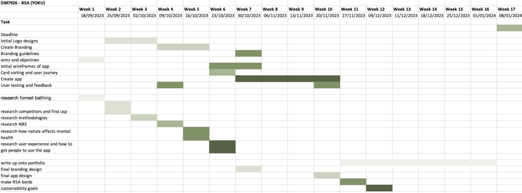
I decided to separate my gannt chart into three sections to ensure that I could complete the project to a high standard before the deadline in week 17. The first section was branding which included initial sketches and development of the final design. The second section was the research which I wanted to complete within the first six weeks of the semester, so I could know about the topics while I was creating the initial designs. The third section consisted of creating and developing the final app prototype.
After setting out the sections that I wanted to complete, I decided to focus on the research and the brand within the first six weeks as I was confident in my research and design skills as these were my strengths in my undergraduate degree. However, I knew that I wanted to put aside more time to focus on the app prototype as I needed to understand and learn the software that I needed to create the prototype.
My main milestones:
- To complete the branding and research by week 6
- To make the final app by week 11
- To complete the project before week 17
SWOT Analysis
Strengths
- Innovative Idea: research shows that by creating an app based on a theory such as forrest bathing allows for a refreshing and unique approach to mental health
- Data backing: The research around forrest bathing shows how effective it is in releasing stress and anxiety which means that if the app is well designed there is a good chance that it will work
- User engagement and well-being: The app promotes well-being and gets users to explore nature and be active in nature
Weaknesses
- Getting customers to use the app: The app relies on users’ motivation to continually use the app in order to reduce stress and anxiety
- Subjective success: As previously shown, mental health is a wicked problem and each person has their own individual experience with mental health which means that the app may not work for everyone.
Opportunities
- Collaborations: The app could work with psychologists who can provide resources and guided meditation
- Global target audience: The app has the potential to be adapted to a variety of cultures
- Integration with wearable tech and voice recording: the app could link to a smart watch which means users wouldn’t need to keep getting out their phones.
- Education: The app will assist in getting people to learn about their mental health which will assist in providing a long term solution
Threats
- Competition: there are a variety of successful mental health apps such as Headspace
- Data Security: As the app wants users to reflect on their experiences there is a possibility of a concern over data security
The Problem
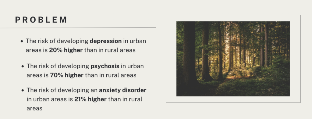
https://www.kcl.ac.uk/cities-increase-your-risk-of-depression-anxiety-and-psychosis-but-bring-mental-health-benefits-too#:~:text=More%20recent%2C%20however%2C%20is%20the,who%20live%20outside%20the%20city.
When I started to do some initial research into mental health in built-up areas, it was clear that there was a huge problem. The statistics above highlight the contrast between people living in rural areas and people living in urban areas. This inspired me to question if there was a way for people who don’t have a lot of outside space can still emerge themselves in nature through techniques and education. This led me to research what a wicked problem was.
What is a Wicked Problem?
Wong (2016) defines a wicked problem as “a social or cultural problem that’s difficult or impossible to solve because of its complex and interconnected nature”. The complexity of a wicked problem means that there are probably many independent problems relating to a specific overall issue such as mental health, poverty or education. In the article, Wong also explains that most of the time wicked problems intertwine with each other, this highlights the depth of complexity that these problems hold. Horst W J Rittel and Webber (1973) provide “Ten distinguishing properties” of wicked problems. Understanding each principle of what a wicked problem is will assist in finding solutions to my project. After examining the principles I do believe that my project problem does fall under some of the principles which is shown below:
- There is no definitive formulation of a wicked problem – Mental health is different for every individual, therefore there isn’t an overall formulation to it
- Wicked problems have no stopping rule – It is impossible for the problem of mental health to disappear which means that we can only manage the problem
- Solutions to wicked problems are not true- or-false, but good-or-bad – By creating a resource that assist in the management of mental health I will be providing a good solution
- There is no immediate and no ultimate test of a solution to a wicked problem – There is no exact solution to mental health but the is an opportunity to manage it
- Every solution to a wicked problem is a “one-shot operation”; because there is no
opportunity to learn by trial-and-error, every attempt counts significantly – By attempting to create an app that can teach people about forrest bathing and reduce stress and anxiety will hopefully provide inspiration for future research and innovation - Wicked problems do not have an enumerable (or an exhaustively describable) set of
potential solutions, nor is there a well-described set of permissible operations that may
be incorporated into the plan – There are many possible solutions to mental health, forrest bathing is just one theory that has been proven to help - Every wicked problem is essentially unique – Mental health is unique to every individual
- Every wicked problem can be considered to be a symptom of another problem – There are many causes for people to suffer from mental health such as poverty or environmental issues
- The existence of a discrepancy representing a wicked problem can be explained in
numerous ways. The choice of explanation determines the nature of the problem’s
resolution- Every person sees mental health in a different way depending on their past experiences - The planner has no right to be wrong – By creating this project I must take full responsibility for the design which is why I have to do extensive research
Katelyn Yoh highlights that mental health is classed as a wicked problem as history has shown that “Although it has improved, there are still many problems that exist currently” (Yoh, 2021). This research is vital in this project as it allows me to make an effective SWAT analysis which will assist in creating an effective final outcome.
Target Personas
Annie lives and works in a big city, some days she feels overwhelmed and on the weekends wants to explore more but wants to also reduce her anxiety.
In his free time, Andrew likes to spend time in nature and enjoys meditation. He is looking for a new app that can do both and help him to reflect more about being in nature.
Jeff enjoys practising meditation techniques and has come across forest bathing but wants to be able to remember what he felt on these walks to assist him in reducing his stress levels.
Archetypes
Merlo (2023) explains that “Archetypes are universal patterns that everyone is familiar with, or mental images present in the collective unconscious”. This definition of archetypes assists in understanding the importance of categorising target audiences to complement their needs and wants from an application and brand.
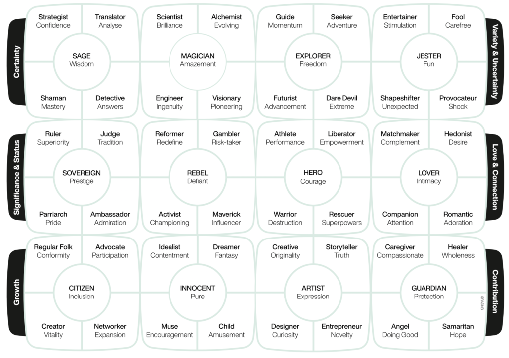
Merlo, O. (2023). Exploring the Changing Role of Brand Archetypes in customer-brand relationships: Why Try to Be a Hero When Your Brand Can Be more? [online] Available at: https://www.sciencedirect.com/science/article/pii/S0007681322001355 [Accessed 13 Dec. 2023].
After assessing the different archetypes and comparing them to my target audience, I think that the Yoku target audience would fall under the Explorer as the characteristics of the target audience are adventure, advancement and an overall sense of freedom, which aligns with similar values of the explorer. This exercise allowed me to fully understand my users and create a brand and application that would connect with the users.
Competitor Analysis
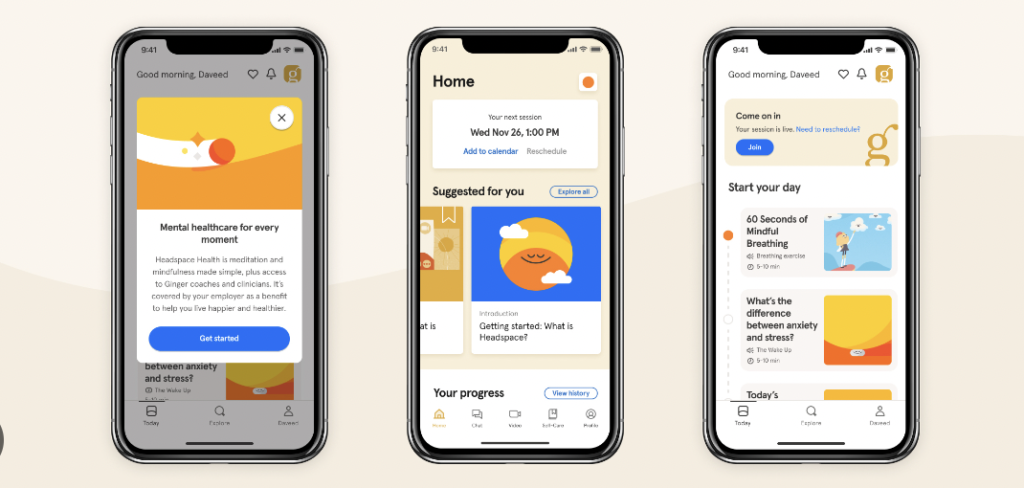
Headspace stands out in the mindfulness and meditation app market with its high-quality content, user-friendly interface, and strategic partnerships. The brand specialises in guided meditation and mindfulness practices, offering a wide range of sessions for different purposes such as stress reduction, better sleep, and improved focus. The app is user-friendly, therefore making it easy for users to navigate. It is clear that Headspace is the leading application within the industry, however, the app does have some limitations such as:
- Subscription fees
- Limited free content
- Mainly focusing on just guided meditation
Headspace does offer competition to my project but the main unique feature of my app is that even though there is a meditation feature, the app also promotes exercises that can allow users to journal and reflect on their previous sessions
Nature Based Solutions
Even though, I decided to adjust the RSA brief to my personal insight. I still found the idea of Nature Based Solutions (NBS) very interesting and wanted to know if using nature to reduce anxiety and stress could be a form of NBS
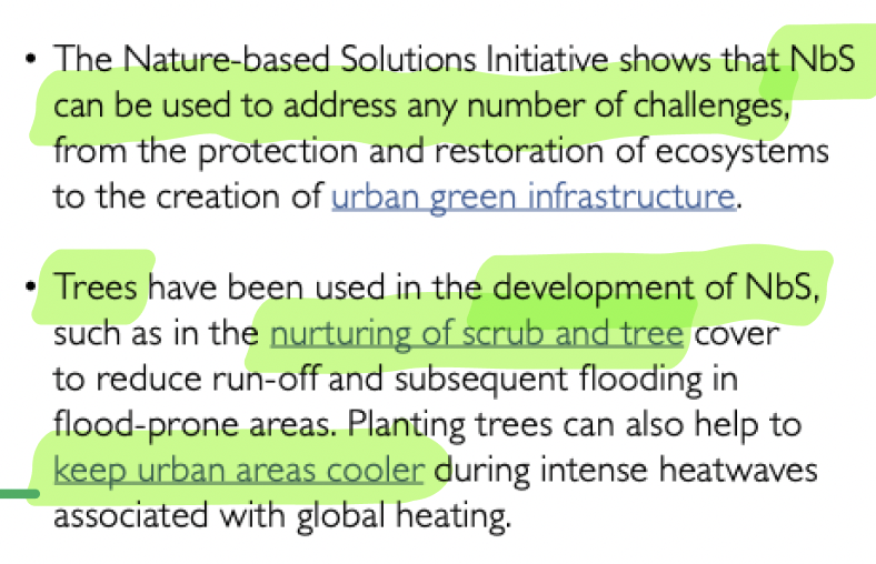
https://www.thersa.org/student-design-awards
In the RSA brief, there was a link to Oxford University’s research about nature-based solutions where they define that “Nature-based solutions involve working with nature, as part of nature, to address societal challenges, supporting human well-being and biodiversity locally. ” (Nature-based Solutions Initiative, 2022) This is an interesting concept as it introduces the idea of using nature as a learning tool to improve issues in society.
It was clear from the website that NBS focus on physical elements such as restoring ecosystems. However, mental health does come under the category of NBIs ( Nature Based Interventions ). Tambyah describes NBIs as where individuals “engage with natural environments with the aim of improving their health and well-being” (Tambyah et al., 2022). Furthermore, Tambyah conducted a qualitative experiment where they interviewed 15 mental health clinicians about NBI and if they thought it was effective. Results showed that the majority of clinicians viewed spending time in nature as “relaxing, refreshing, and therapeutic” (Tambyah et al., 2022), therefore concluding the importance of using nature to reduce stress and anxiety. Tambyah concluded the experiment by suggesting that mental health services should consider using NBIs in their practices.
Forest Bathing
What is Forest Bathing?
After initially researching Nature Based Solutions and how nature impacts mental health, I came across this theory called Forrest Bathing. Dr Qing Li is considered to be the founder of forest bathing which originated in Japan in the 1980s (UW-La Crosse, 2022). In Japan, it is known as:
Shinrin-yoku
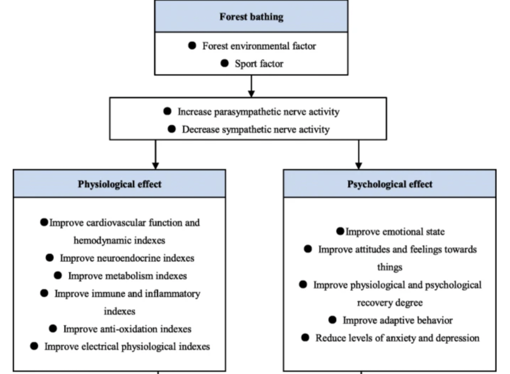
Over the years there have been numerous experiments and studies to understand and evaluate if this idea can improve mental health. An interesting systematic review conducted by Wen et al in 2019 found that forest bathing produced a variety of positive outcomes which can be seen in the future below.
Figure 1.

https://pubmed.ncbi.nlm.nih.gov/31787069/
Figure 1 shows that the review produced three main categories in how forest bathing produced positive outcomes in the experiment: Physiological effect, Psychological effect and Comprehensive influence.
Within the categories, it is clear that a lot of the outcomes are solutions to what is seen in people who live in society today. Such as in the article written by Andrea Mechelli a Professor of Early Intervention in Mental Health, she highlights that “The risk of developing generalised anxiety disorder a state of mind characterised by feeling anxious and a sense of impending danger or panic, is also 21% higher in urban than rural dwellers.” (Mechelli, 2019) This information shows that mental health is a common issue for people living in big cities. However, the data from Wen et al shows how forrest bathing could be a good solution to combatting mental health.
Additionally, Farrow, M. R., & Washburn, K. support Michelli in highlighting the issues surrounding anxiety and believe that it is the most prevalent psychiatric disorder. Furthermore, they also indicate that “According to epidemiological surveys, one-third of the population is affected by an anxiety disorder during their lifetime.” (Farrow, 2019). Within the review Farrow provides a guide to how to use forest bathing, they say the process includes being in a forrest for 2-4 hours and in that period you should be practising activities such as deep breathing and being aware of your surroundings. – I want to find a way that I can easily teach people how to do this in their walks
How can I teach people how to use forrest bathing to reduce anxiety and mental health?
Figure 2. My Journal
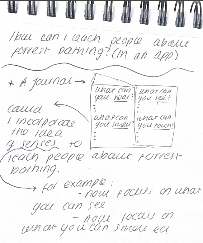
After researching what forest bathing is, I learnt that it’s the promotion of being still and taking in nature to lower blood pressure and ultimately reduce anxiety and stress. In my journal, I wanted to explore how I could convert this idea into a practice that people could easily do on their walks without ought having to understand what forrest bathing is.
This is where I looked back on what inspired me on my mental health walk and I realised that I found it useful to focus on my senses in nature as this allowed me to be calm and focus on certain aspects and senses.
With this in mind, I decided to do more research into this idea of senses as if it worked for me there may be a possibility that it could work for other people. My research brought me to this idea of Sensory modulation intervention
Sensory modulation Intervention
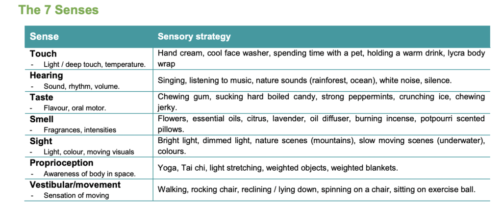
Wallis (2017) describes Sensory modulation intervention as “aiming to use calming sensory input to manage the hypersensitivity and physiological arousal associated with anxiety. ” She explains that focusing on certain sensory inputs can help in managing the overwhelming feeling that can trigger anxiety. Additionally, there are strategies called Sensory Approaches which have also been seen to combat anxiety and stress. The Mental Health Occupational Therapy Sensory Approaches Clinical Group explain that sensory approaches can help to regulate people’s emotions which can result in alteration of alertness and relieving anxiety. In their fact sheet, they show what the seven senses are and their individual sensory strategy.
Figure 3. The 7 Senses The mental health occupational therapy sensory approaches clinical group 2019
https://insight.qld.edu.au/file/485/download
The research that I conducted led me to my final idea and the overall aim of this project: To introduce a forrest bathing app that would allow people to reduce stress and anxiety through the use of the seven senses upon which the user can reflect.
Stage 1: Branding
Research: Logo design principles
This semester I wanted to fully understand the theories behind logo design and the core principles. I found a book about this topic called Principles of Logo Design by George Bokhua. I decided to write a blog post about this which you can access using the link below
Initial Sketches and Ideas
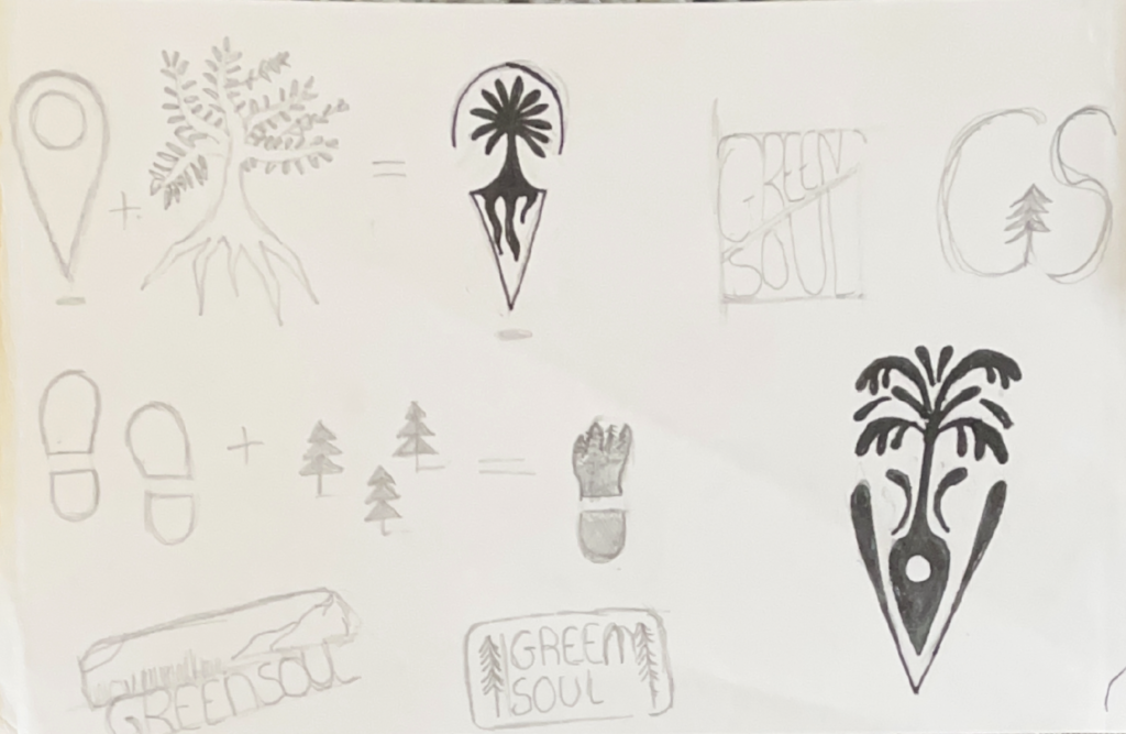
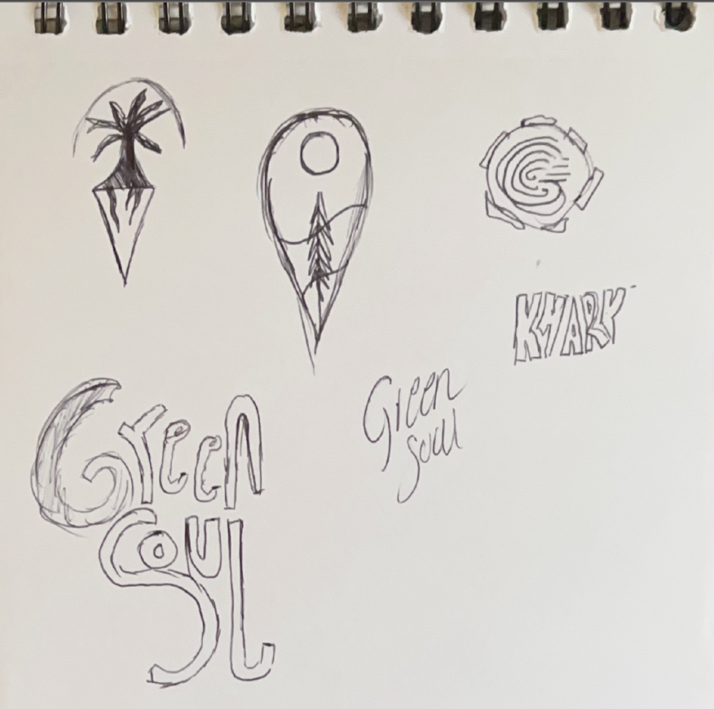
I started off sketching icons that would resemble what the brand and app are about. I liked the idea of the location point as this showed how the app is intended to promote adventure. Additionally, I wanted to include a tree silhouette as the inspiration behind this project stems from forrest bathing. To promote adventure, I also thought about using footprints to try and make a unique idea that would stand out within the competition.
Development
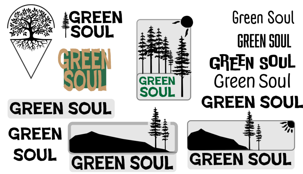
After I had finished coming up with the initial idea I decided to develop some of the logos. I liked the simplistic idea of including a tree silhouette within the logo alongside a rustic yet bold typography style. The aim of this app is to use a unique technique to reduce stress and anxiety.
I noticed that within this design I was drifting towards a pictorial logo. This was because I wanted the logo to show exactly what the brand was about and to be easily identifiable.
Inspiration: Patagonia
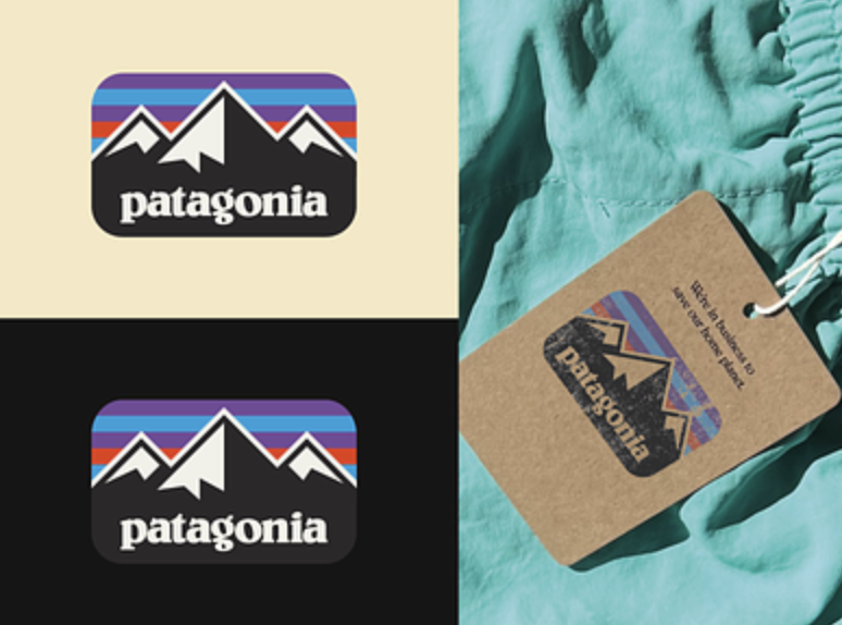
the Patagonia logo is effective in portraying the brand by incorporating a simple and powerful design. As the logo is a pictorial style the logo communicates the idea of outdoor adventure and a timeless connection to nature. It is very recognisable due to its unique colours and abstract shaping which improves brand loyalty.
Additionally, the font placement is very clear and distinctive highlighting the landscape of the mountains which allows the customer to idealise and picture themselves within the environment. This idea is very similar to what I want to portray within my logo.
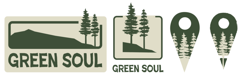
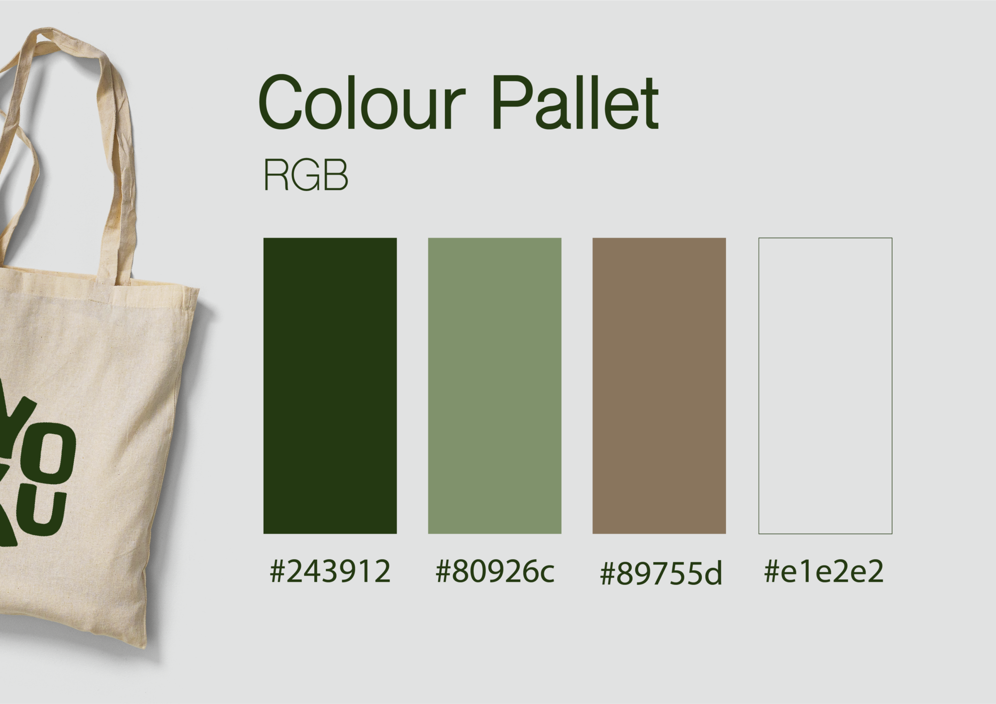
The Patagonia Logo inspired the first iteration of my final 1st draft logo. I decided to incorporate a green colour scheme to represent nature and the environment which portrays the brand’s values. Additionally, I wanted to use a simple yet recognisable silhouette which conveys a sense of adventure.
Although it is clear that this design portrays the brand values. When I asked to receive feedback, the main issue that arose was that it isn’t very versatile and will be difficult to implement into an app interface. Claeys explains that “Simple logos are better because they are more adaptable.”(Claeys, 2017) which shows that logos need to be adaptable for different applications which is important in this project.
Reflection and Redesigning
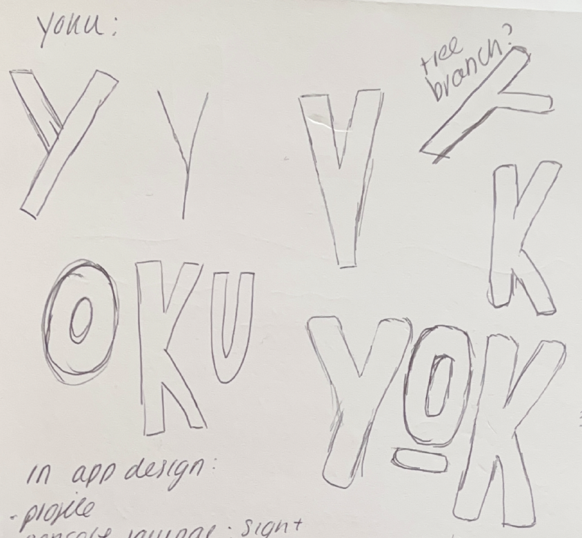
On the second iteration of the logo design, I decided to go with a simpler, more memorable name that is the inspiration behind this project. I decided to prioritise typography within the logo as this would create recognition with users.
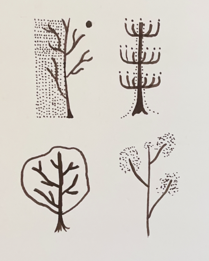
I also experimented with some unique and abstract tree designs which could accompany the logo in the marketing aspect of this project.
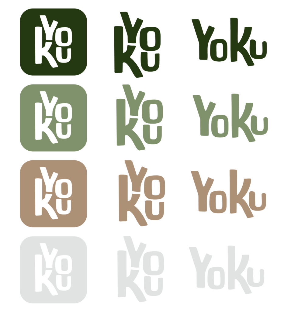
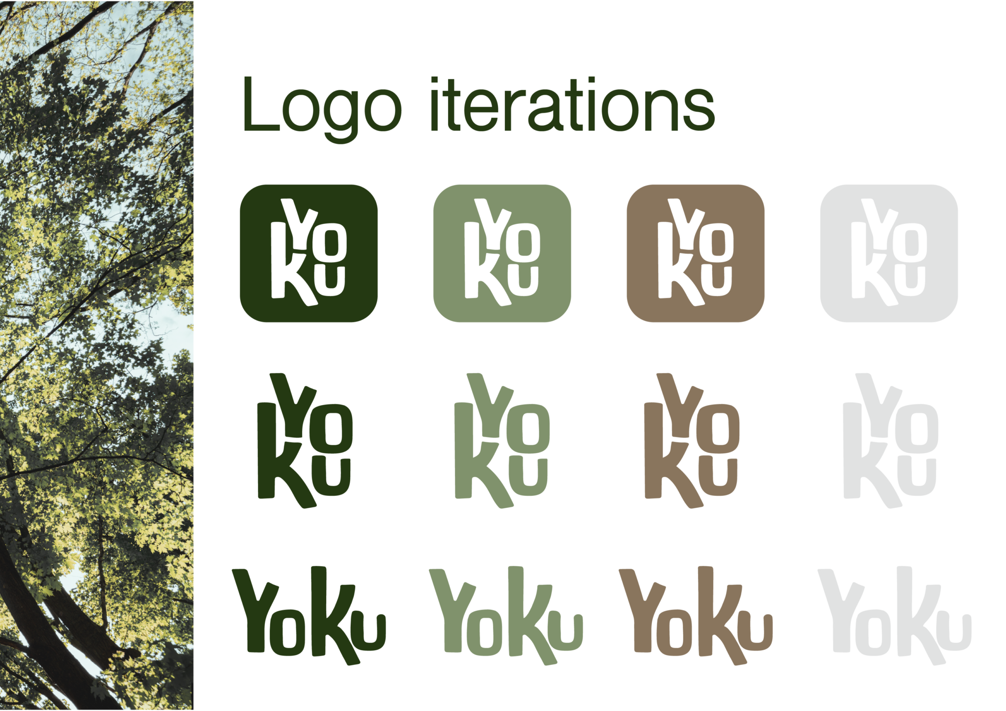
Here are the different variations of the brand’s logo with different colour schemes. I thought that this would be important as it contributes to the overall flexibility and adaptability of the brand identity.
Alongside the primary logo, i decided to design a logo with no background and a horizontal logo as this means that the brand will be accessible on different applications and formats.
Final Branding

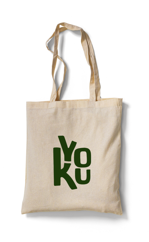
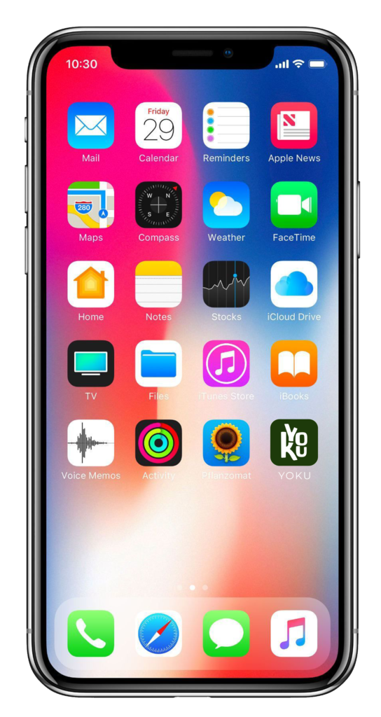
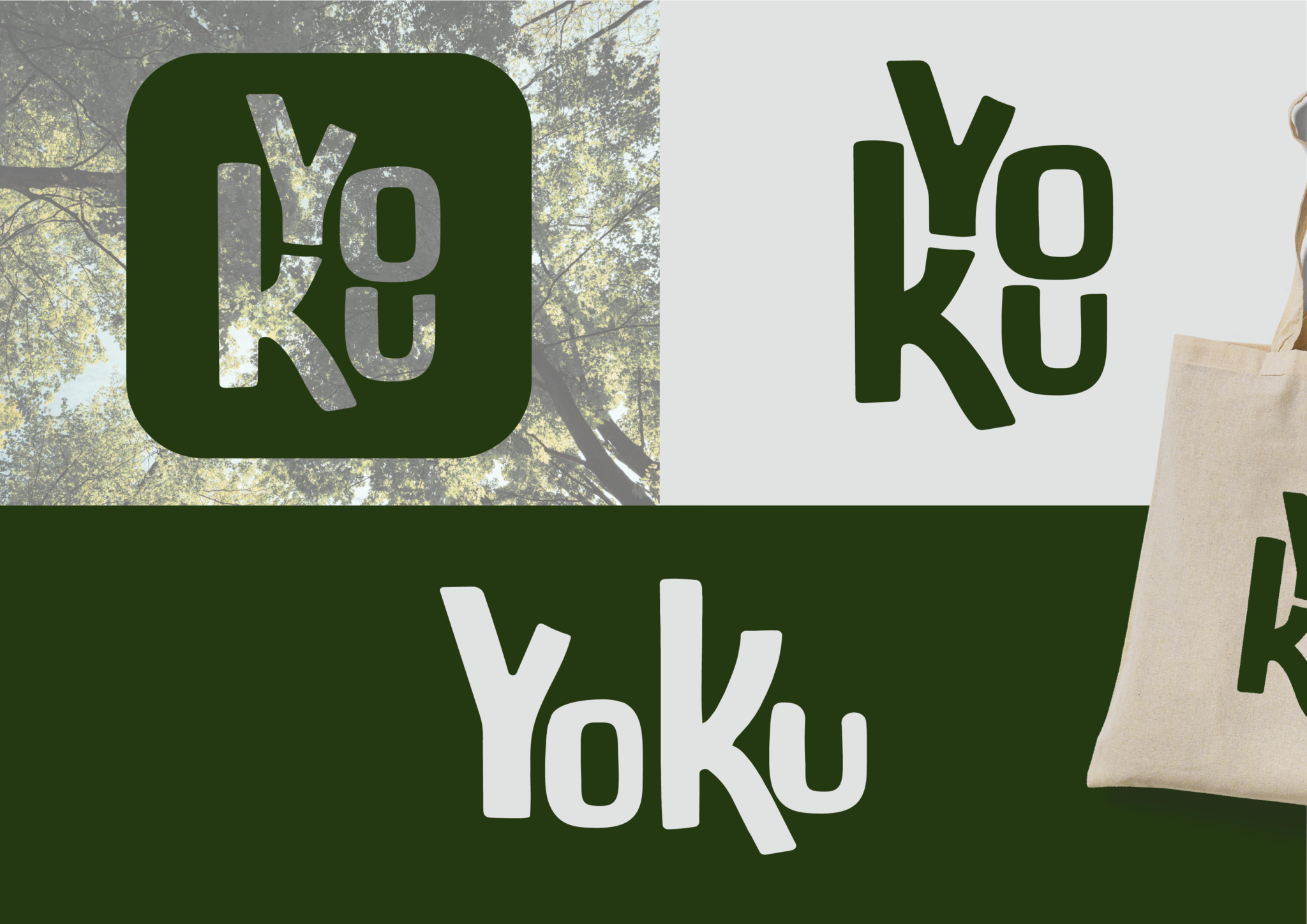
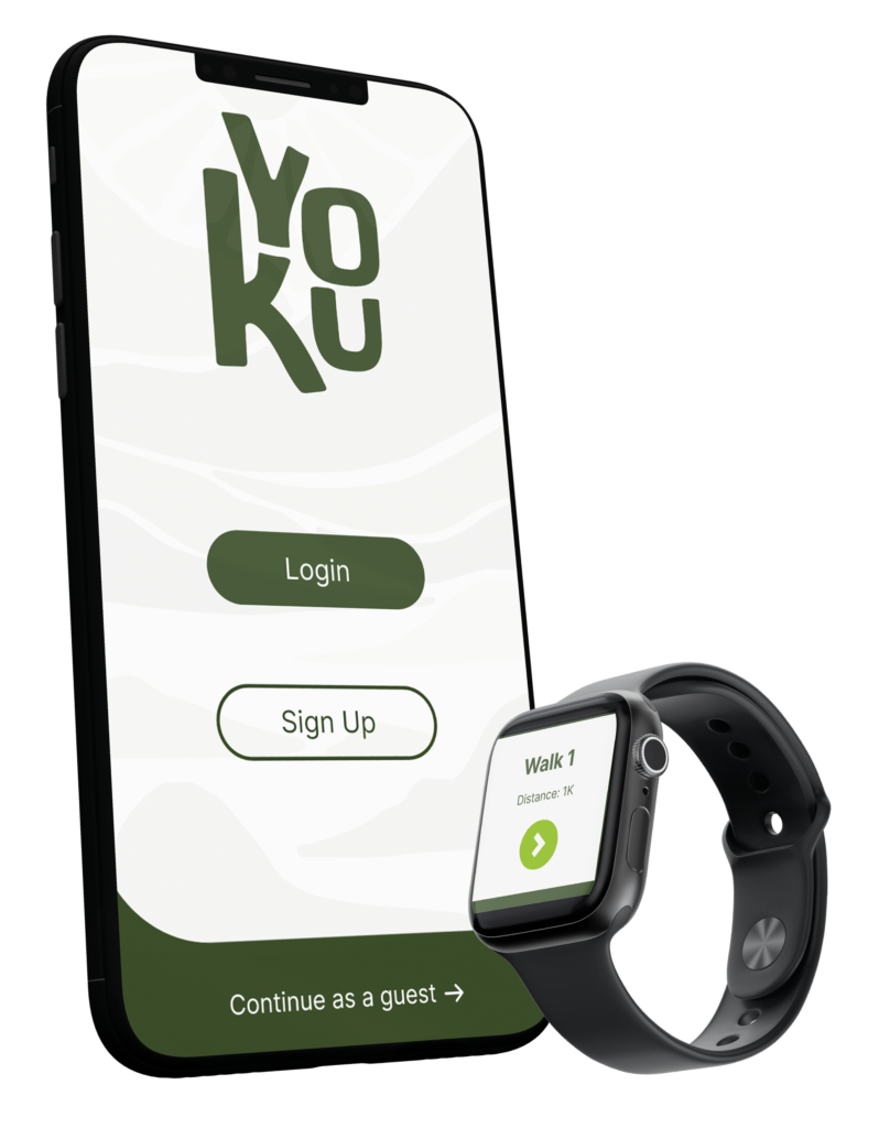
Here are the final branding designs for the YOKU project. I decided that the final logo would be the dark green background as it provides a high contrast which increases the visibility of the design. Additionally, I decided to put the logo on the home screen of an iPhone to show how it would stand out against the rest of the applications.
I think that the final design is effective as it is versatile and could also be used on merchandise and advertisements which will assist in attracting customers to use the app.
Branding Guidelines
You can access and download the full branding guidelines by using the button below.
Stage 2: The App
User journey
Below, is my interactive Figma board where you can navigate by using the plus and minus buttons and the cursor to drag.
The Yoku app focuses on creating simplistic exercises for users to practice whilst on walks which means that it is essential to create a user journey as this will assist in fully understanding the user’s perspective whilst navigating the app. I decided to separate my user journey into six sections.
The first step is onboarding, where the user will come across the app via social media and marketing strategies, the user will then be given a description and introduction of the app alongside an option to download the application. They will then be given the option to create an account or continue as a guest, if the user continues as a guest they can still use the exercises but won’t be able to access the personalisation features until they sign up. Next, the home screen will be displayed where the user can view and reflect on all their past walks, at the bottom of the screen is the menu where the user can navigate between “Walk Reflections” “Meditation” and “Settings”.
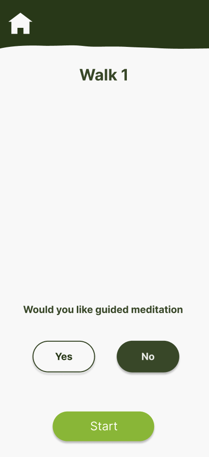
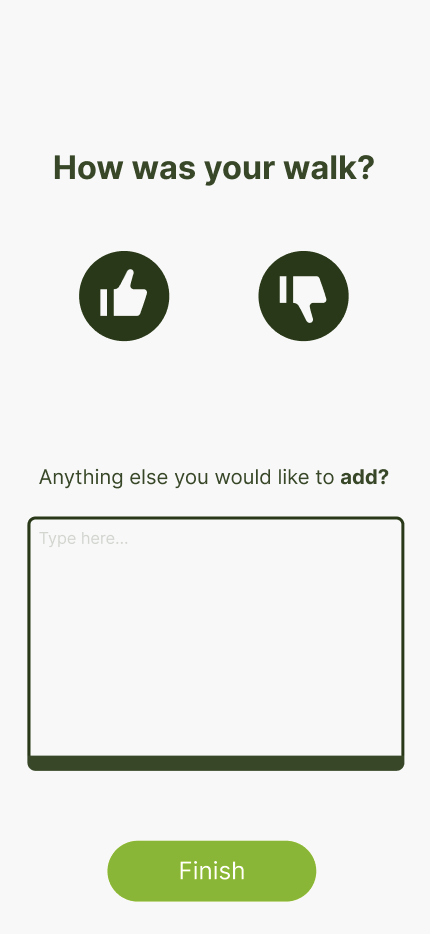
When the user decides that they want to start the walk they will be asked if they want guided meditation on their walk to assist in relaxation. Whilst on the walk the user will be reminded to write down their senses to fully immerse themselves within their location. Once the walk has finished the user can say how they felt on their walk and add any additional notes which will then be saved to their home screen.
App inspiration
When initially sketching what I wanted the app inspiration to look like, I started to research exercise and well-being apps. I found this app called Couch to 5K which was created by the NHS in 2021. The app aims to act as a running plan for beginners who want to increase their exercise. The app became very popular as it was created during covid so assisted in getting people to go exercise. The app consists of a user-friendly interface that includes a dashboard where users can see their overall progress, such as completed workouts, distance covered, and improvements over time.
I decided to download the app myself to understand why the app was successful. The main thing that I noticed from the interface was a progress tracker that is scrollable which was very satisfying and easy to use, this can be seen in the right-hand image below. This inspired me to start creating initial sketches of what I wanted the Yoku app to look like and to have the same user friendly experiences as the Couch to 5k app.
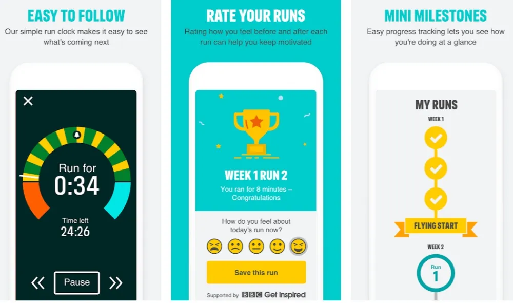
https://www.nhs.uk/live-well/exercise/running-and-aerobic-exercises/get-running-with-couch-to-5k/
Low fedelity wireframe
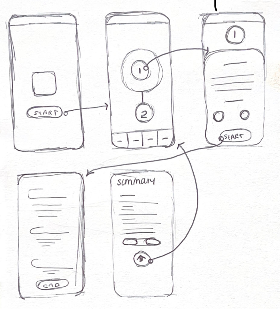
These are some initial sketches of my low-fidelity wireframes, I wanted the wireframe to be clear and simple so I could start to develop the design.
I also mapped out how the pages would flow together, this assisted in understanding the users’ perspective and if I needed to add any extra pages to limit confusion for users when navigating the app
Methodology: user testing
Even though my previous research into studies conducted by previous researchers proved the importance and effectiveness of Forrest Bathing and Sensory Modulation Intervention. I wanted to conduct a simplistic qualitative experiment myself to understand exactly what elements worked best to incorporate into my app. I decided that a qualitative experiment would be better suited to this project in comparison to a quantitive experiment as I wanted to understand how people interact and behave on walks. Pathak, Bijayini and Kalra, (2013) explain that you should use qualitative approaches when you want to “understand people’s beliefs, experiences, attitudes, behaviour, and interactions.” (Pathak, Bijayini and Kalra, 2013), therefore agreeing that a qualitative approach would be the most effective in getting the data I wanted to develop my app.
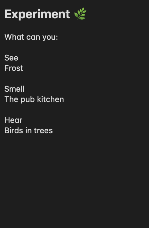
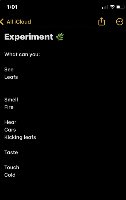
I then created a simple document that was compatible with a phone for participants to download. The document included a list of senses that the participant would need to fill in during their walk, I asked a couple of participants to fill out the document when they were on their next walk. Both participants responded well to the exercise and managed to complete most of the document.
Analysis of results
I received feedback from the experiment that both participants enjoyed the exercise and managed to fill in the majority of the document on their walks. Participant 2 filled in two more senses than Participant 1 highlighting the different types of users. Those who only want to write a couple of words and those who like to go into detail about their experience. There is no right way that this experiment could have been done but it has been shown that the app should be relaxed and it should be up to the user if they want to fill in certain sections.
However, both participants were unable to fill in the section about taste which shows that perhaps people may find taste unusual and hard to focus on. This information led me to simplify the amount of sections that the user should be expected to fill in which will result in a better and more relaxed user experience.
Participant 1
Participant 2
Reflection from experiment:
After conducting my experiment the results indicated that when users are on their walks a simplified, relaxed exercise would be more beneficial to the overall experience of the app. I decided to take out the taste section as participants found this section difficult to fill in and they would still get the same experience without it.
In conclusion, I found this a useful exercise as it allowed me to fully understand the user’s perspective and behaviours when on a walk which enabled me to develop the wireframes to complement the results from the experiment.
High fidelity wireframe
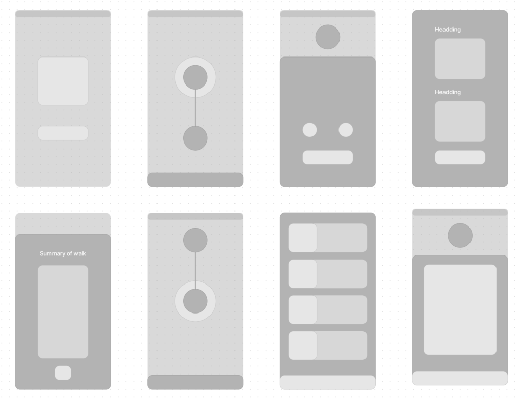
Above are the high-fidelity wireframes of the Yoku app. These are more detailed and provide a better overview of what the final prototype will look like. Creating a detailed version of the initial wireframes is important as this makes it easier to identify design flaws or areas for improvement before implementing the brand assets and colour schemes. From here I can start the design process and develop the aesthetics of the app to complement the branding guidelines to reinforce brand recognition.
Development
Stage 1: Homescreen development
Below are my first developments of the Yoku home screen. I ended up experimenting with six options as the app’s home screen would reflect the style of the rest of the pages and overall add to the brand identity of Yoku.
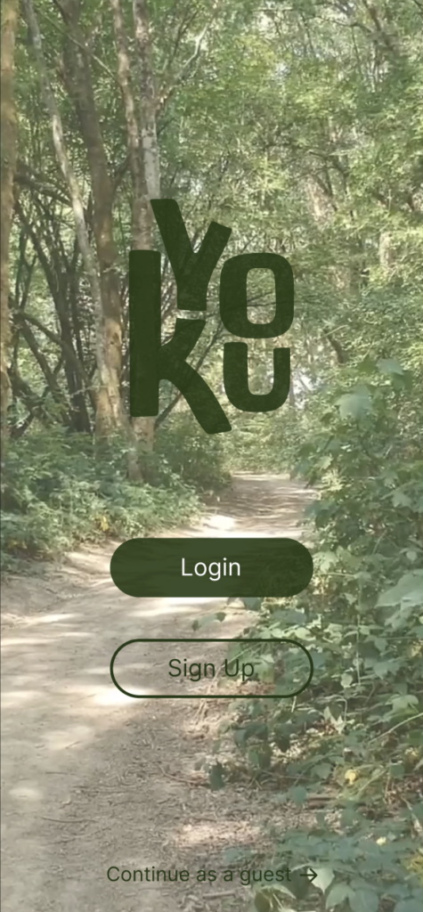
Option 1 : Background Video
The first option took inspiration from the new Apple update on the Mac IOS where the image background would slightly move, providing an interesting immersive experience. Even though this would allow the app to fully immerse the user, finding a high-quality video that worked with the software was difficult as the files wouldn’t be reliable and too big.

Option 2 : Graidient
My second experiment was utilising a gradient effect for the background, I thought that this would create a simplistic yet clean effect that would be accessible to all users. However, I thought that it wanted to portray the brand identity and was similar to other apps in the industry
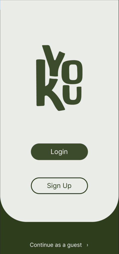
Option 3 : Minimal
I liked the minimalistic idea of the second option so I decided to develop a simple, 3d background with a curved edge to add some more dimension. But I wasn’t completely happy with this as I found that the issue was very similar to option 2 where it wasn’t exciting and interesting enough to grab the user’s attention.
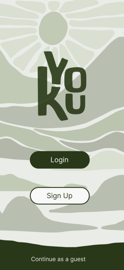
Option 4 : Illustrative
Lastly, I took inspiration from Patagonia which I analysed previously in this project for my logo designs. Although I didn’t decide to use the style for that aspect of the project I thought that there could be a possibility to use a unique abstract style for the home screen. Eventually, I decided to develop this idea further.
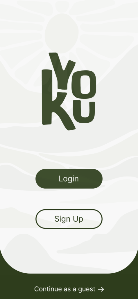
Final Homescreen Design
On the left is my final home screen design. I decided to combine options 3 and 4 as I liked the simplicity of option 3 but wanted to add the unique background of option 4 to enhance a sense of adventure through the Yoku Brand.
I turned down the opacity of the background pattern as I didn’t want the colours to overwhelm the user which would also affect the accessibility of the app.
Overall I am happy with how the home screen turned out as it allowed me to create a style that I can stick to for the rest of the application.
Stage 2 : Development of app journey
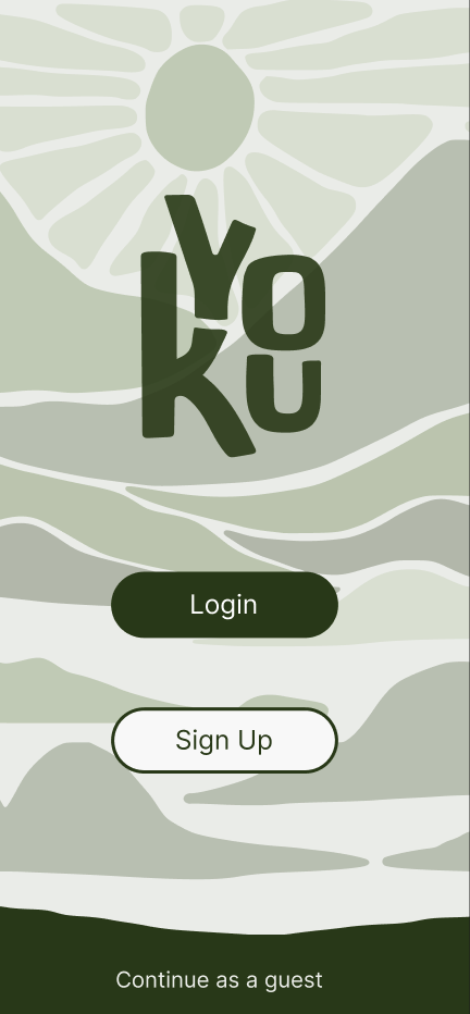
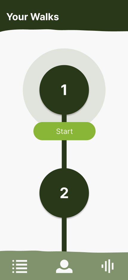
Here is the first part of the initial development from my wireframes. I wanted the app to have a rustic and natural style which is why I created a menu with a torn effect as this would assist in creating a naturalistic feel. I also started to develop the “Your Walks” page which included a circular layout where the user would be able to track their progress through scrolling up and down.
I decided that I would use a bright neon green as a secondary colour within the app to use for buttons, so the app wouldn’t be monotone. The vibrant green assists in grabbing the user’s attention and increases the navigation accessibility.
Feedback
After receiving peer feedback, it was clear that I needed to work on the usability aspect, especially on the “your walks” page as there wasn’t enough information or navigation properties.
I wanted to work on creating another layout for this page that would allow users to view their previous walks without having to scroll down. I took inspiration from the Apple widgets as this would allow me to fit more than one walk on the page. This led to a clean and efficient design where users would be able to see all their walks in one place, therefore creating an effective user experience where the user would not have to search for their previous walks.
Stage 3: Final app design
Stage 3 of this project is the final prototype of the app. Within the application, there will be an option for users to connect the app with their smartwatch to allow a hands-free feature. To enable this, I conducted research into IoT ( Internet of Things) which you can view further down this project.
Below shows:
- The final overall page layout
- Video walkthrough of the app
- In-depth explanation. of the meditation page
- In-depth explanation of the user walk page
- Research into IoT
Overall Page Layout
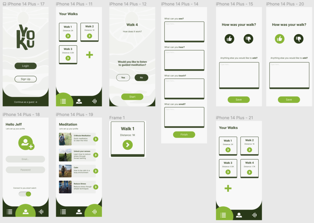
This is the overall page layout of the app, I decided to incorporate the bright green through the navigation at the bottom not just within the buttons. This would create an overall more aesthetic interface and will also be visible for users to navigate between the “your walks ” page, “Profile” page and the “meditation” page.
I decided to create a simple design for the overall look of the app as this would allow for efficiency when the user wants to go on a walk. Additionally, the simplistic style reduces the learning curve for new users and allows them to quickly become proficient in using the app instead of having to learn a new system.
Walkthrough of the app
On the left is a walkthrough from the user’s perspective of how they would navigate through the app and use all the features within the application
Meditation Page
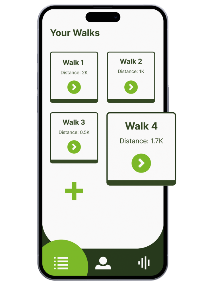
The “Your Walks” page acts as a reflective journal for the users to document what they noticed and felt on their walks, when the user presses the plus icon they will then be able to start another walk. As previously stated I took inspiration from the Apple icon widgets as they are memorable and efficient.
Users walks page
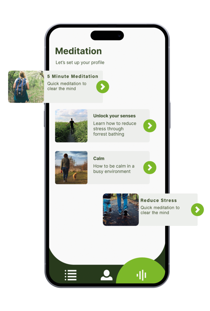
This is an example of what the meditation page would look like. The content would be regularly updated for the users to practice anytime, anywhere to reduce stress and anxiety. The meditation sessions would be presented by professionals who can assist the user through the session.
Emerging Technology Aspect
Internet of things (IoT)
IBM defines IoT as “A network of physical devices, vehicles, appliances and other physical objects that are embedded with sensors, software and network connectivity that allows them to collect and share data.” (Ibm.com, 2023). This emerging technology enables businesses to manage their data more effectively. Therefore creating accurate data usage. In the article, IBM highlights the positives of using the technology:
- Improved efficiency
- Data-driven decision-making
- Cost-savings
- Enhanced customer experience
The advantages that IoT provides are essential in the new improvement of technology and ultimately improve user experience as it enables better personalisation of the app which assists in creating a relationship between the app and the user. Radd (Haider Khaleel Raad, 2021) agrees with IBM and explains that IoT is being used effectively in smart wearable watches that link to apps. He believes that they will swiftly become a “go-to technology” (Haider Khaleel Raad, 2021)
How can I incorporate this into my app?
In the book Fundamentals of IoT and Wearable Technology Design. Raad explains the key characteristics of IoT, this diagram will assist in understanding how the YOKU app could connect to a smart watch.
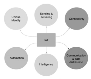
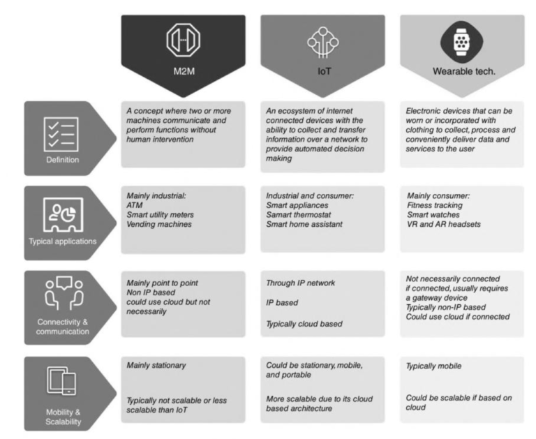
It is also important for this project to understand the other aspects of emerging technology. The diagram below summarises the three components that this project will use. Even though backend technology isn’t my specialised field of study, I still feel as though it’s important to research and present the sustainability and the possibility of how this project idea could evolve with technology.
https://books.google.co.uk/books?hl=en&lr=&id=-8YOEAAAQBAJ&oi=fnd&pg=PA15&dq=wearable+technology+iot&ots=H8hV3pStEh&sig=SmoaQAxvel2lQbi9yTWpKdi_qCk&redir_esc=y#v=onepage&q=wearable%20technology%20iot&f=false
Possible problems to be aware of
Although it is clear that there are many positives of IoT, it is also important to understand the possible negatives. One of the main problems surrounding the technology is data protection and security issues. In order to reduce the problems surrounding data and security issues, the technology used within the app will need to comply with the General Data Protection Regulation (GDPR). Therefore protecting users’ rights to data privacy.
Sustainability goal
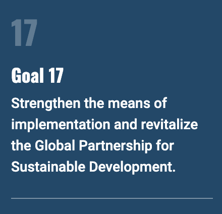
YOKU completes sustainability goal 17 as it creates a global partnership between users who have similar interests in mental well-being, therefore creating a sense of collaboration. Additionally, the app promotes the practising of a sustainable lifestyle which encourages the preservation of natural environments. Furthermore, through data sharing and analytics the app can provide information and partner with mental health practitioners to assist in the research of how forrest bathing can improve mental health.
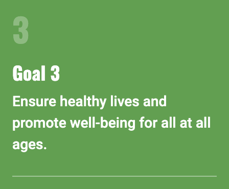
Alongside sustainability goal 17, YOKU also completes goal 3 as the aim of the app is to promote mental health and wellbeing through the theory of forest bathing. As my previous research shows, forest bathing has been proven to reduce stress and anxiety and by using the app the users will receive techniques that they can use in everyday scenarios.
Conclusion
Aim: To create a user-friendly app and recognisable brand that adopts techniques to enable users to reduce stress and anxiety.
Objective 1: Research forest bathing and sensory modulation intervention to understand the topic fully.
Objective 2: To create a unique and recognisable brand that promotes the brand values
Objective 3: To create a prototype that is user-friendly to enable users to reduce their stress and anxiety whilst on a walk
Within this project, I believe that I successfully completed my aims and objectives as I started the project by in-depth researching the two techniques ( Forest Bathing and Sensory Modulation Intervention) that my application would use, this confirmed how successful the two techniques are in reducing stress and anxiety. Additionally, both techniques are simple to the user which enables be to consider how the techniques would work within an app.
Even though I went through two alterations of the logos and names for the project I think that the final logo is simplistic but unique and catches users’ attention which was then transferred through to the application interface where I decided on a minimalistic style to ensure accessibility and easy access for the user to navigate and practice the techniques alongside meditation sessions.
If I had more time on this project I would do more user testing experiments as the one that I conducted in this project provided me with crucial information which I wouldn’t have previously noticed. This project taught me the importance of experimentation and doing in-depth research into the topic before starting the design process.