Introduction
This project was about creating a brand called Quick Give that provides a solution to the issue of the recent lack of charitable donations. I created an outcome of a widget that businesses can implement into their websites that acts as a direct link for donations to the charity of the business’s choosing with a supporting informational webiste. The idea was to encompass Sustainable Goal 17: Strengthen the means of implementation and revitalize the Global Partnership for Sustainable Development.
What technologies I will be using: I will be splitting the project into two sections. the first section will be focused on branding. I will be researching how to create a trustworthy brand and how colour has an influence on that, alongside designing the logo and additional assets in Adobe Illustrator. The second stage will be focused on designing the widget, where I will be using Figma to develop the prototype.
New processes I will be learning: In this project, I will be developing my skills in user experience and user interface. I will be learning a new technology called Figma which is the leading industry standard. I aim to also gain more experience and knowledge about user testing.
Dark UX
At the start of the semester, I knew that I wanted to create a project that would challenge my skills in UX/UI design. I found the topic of Dark UX through a discussion in one of my first lectures, this led me to do my first section of research about dark UX and how I can combat this by creating transparency and trust with users, which I documented in my blog which you can access by pressing the button below.
The Brief
Reflection of the brief: My aims and objectives
Overall Aim: Enhance and simplify the donation experience for users by implementing the “Quick Give” widget into businesses’ websites, simplifying the donation process with online shopping.
Objective 1: To create a brand called Quick Give that creates trust and effective brand relationships.
Objective 2: To research what widgets are and design a user-friendly interface that combats Dark UX yet enables users to donate quickly and effectively
Objective 3: To create an informational website for customers who want to donate and a page for businesses to partner and collaborate with charities.
SWOT Analysis
Strengths
- This is a unique idea that is targeting a new section of the industry.
- The idea could be an inspiration for companies to find ways that they can collaborate with charities more on their interfaces.
Weakness
- Asking companies to incorporate the widget into their interfaces could cause unease and backlash as the companies may not trust it.
- There is a lot of backend development in the creation of widgets which isn’t my speciality.
Opportunities
- Bringing light to how businesses need to promote charities more and how they can collaborate with charities.
- Using Quick Give within interfaces will ease the donation process for users and ultimately drive a higher conversion rate.
Threats
- If the business is successful, there is a chance that other companies will want to replicate the idea which means that there will be competitors.
Problem
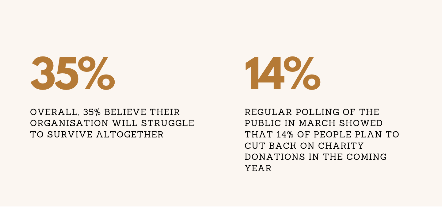
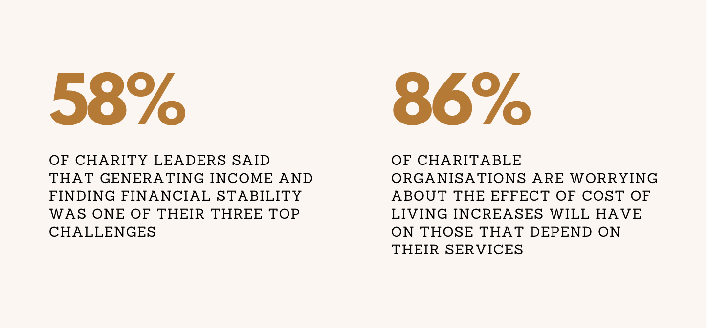
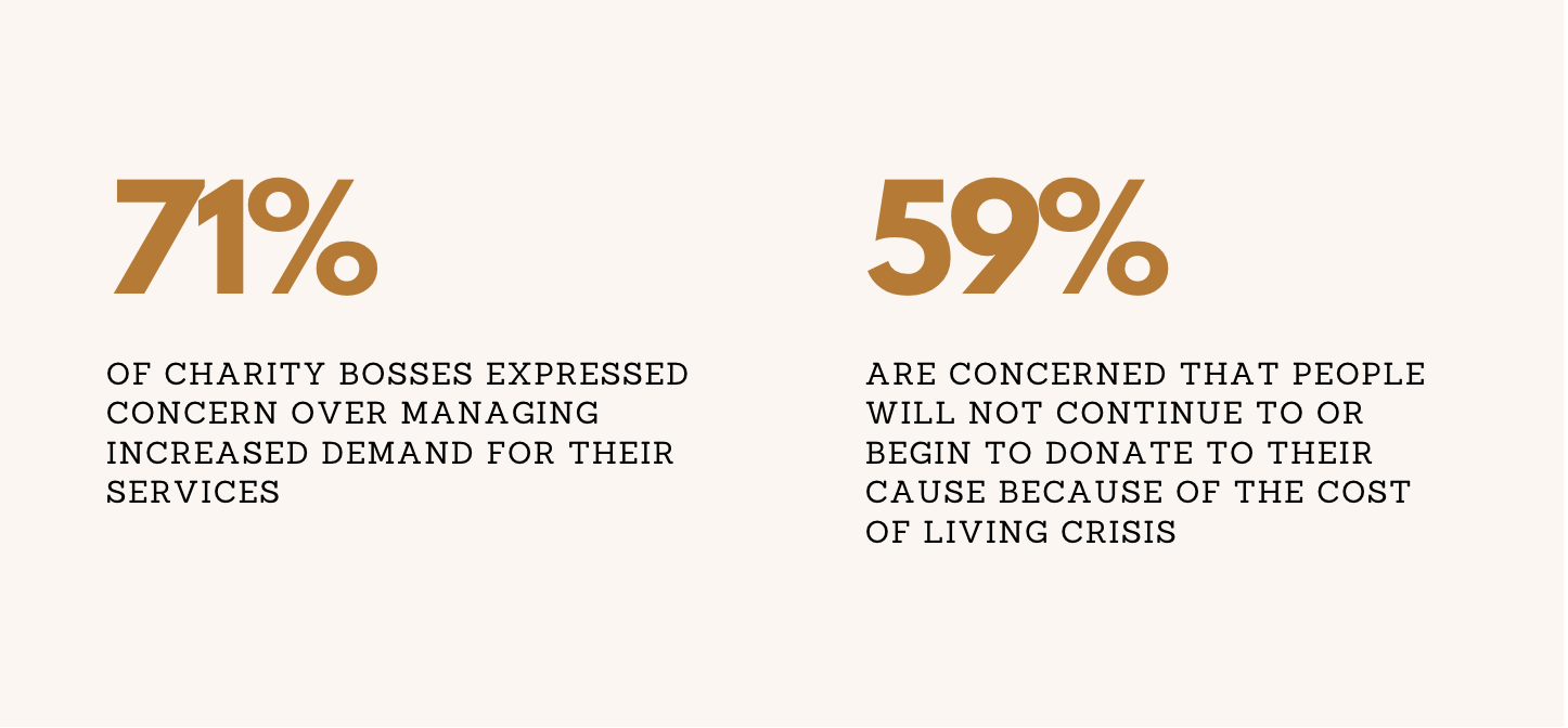
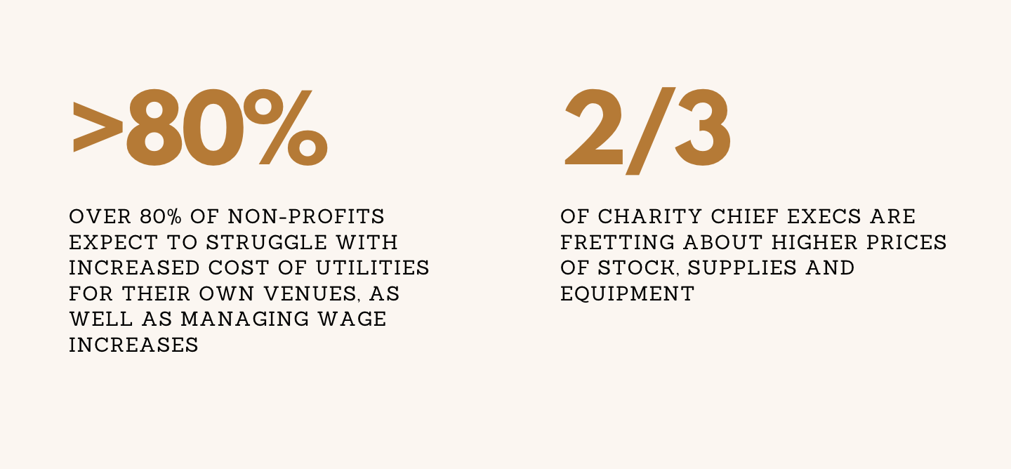
In an article by Charity Link, they highlight how the recent cost of living crisis has significantly impacted the amount of donations that charities receive. The figures on the right have been taken from the website. (CharityLink, 2022). Without charities not receiving enough donations, means that they can’t help as much as they previously have.
These statistics were taken from https://www.charitylink.net/blog/cost-of-living-crisis-impact-uk-charities
Percentage of the population in England who gave to charity from 2013/14 to 2021/22
https://www.statista.com/statistics/380046/charitable-giving-england/
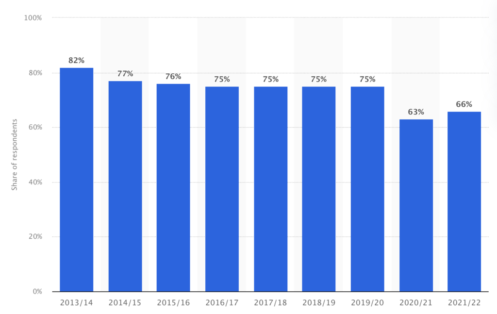
These statistics highlight the decline in charitable giving from 82% in 2013/14 to 66% in 2021/2022 with a lowest of 63% in 2020/21. This highlights how the social situations over the past few years have had a significant impact on charities which has resulted in a decline in donations. Therefore putting a strain on charities to maintain the care that they provide. A good example of this strain is the MacMillan Cancer Support Charity.
Macmillan Cancer Support
The Macmillan Cancer Support charity has managed to raise £3.5 Million to help those struggling with the cost of living crisis (CharityLink, 2022). This is an example of how the cost of living crisis results in a higher demand from charities to assist and provide help to people in need. Therefore increasing the strain on the charity sector.
Why is my project important?
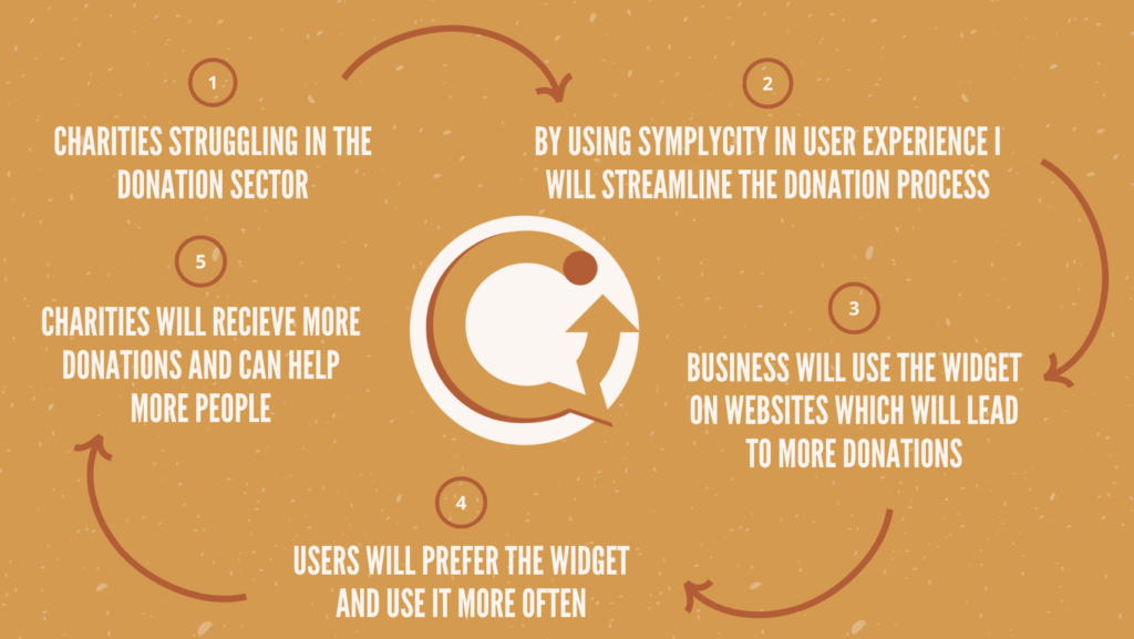
This infographic visibly shows in a circular motion how Quick Give will operate and ultimately increase charitable donations which highlights the importance of the idea.
Time Management
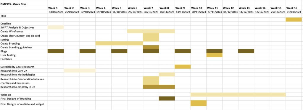
It was important for this project to make a Gantt chart especially as there were various sections to the completion of this project. I found that creating this Gantt chart in the early stages of this project allowed for structure, clarity, and organisation throughout the weeks of this semester. Some examples of how the Gantt chart was effective in this project included:
- Ensured smooth flow of work – the chart allowed me to set my deadlines which resulted in less rushing and a buildup of tasks
- Time management – it allowed me to break my project into sections such as research, branding and user experience. Which reduced my stress over making sure I had enough time to complete everything
- Risk Management – In my undergraduate, I noticed that I underestimated how long it would take to write up my projects and put them into my portfolio which always created a risk of not completing the project fully. However, I was able to set aside six weeks at the end of the semester to upload everything ing to my website which meant that I had enough time to ensure my work was of a high quality.
Milestones:
- Have the majority of the research done by week 6
- Write a blog at least every two weeks to track my progress
- Have the branding done by week 6
- Complete the final design of the widget and website by week 10. Ready for user testing in week 11.
Prioritising assumptions
One of my objectives for this project was to improve my design thinking process. This is why I decided to do some research into prioritising assumptions and implement these theories into my project to also improve my time management.
You can access this by using the link below to my blog:
Initial Ideas and Brainstorming
Section 1: The Branding of Quick Give
Gestalt Principles
Gestalts principles were created by three German psychologists Max Wertheimer, Kurt Koffka, and Wolfgang Kohler in the 1920s. (The Interaction Design Foundation, 2016) . They wanted to understand how people perceive confusing things through the process of perceiving a concept through individual elements that make up a whole. After research and many studies Max Wertheimer, Kurt Koffka, and Wolfgang Kohler came up with sections in which people perceive below are some are the principles that I aim to incorporate in my logo:
- Emergence – this is based on the idea that we quickly need to make sense of our environment so we look for symbols that can show us what a complicated image means.
- Continuity – this principle explains that we tend to group similar elements that follow the same direction
- Multistability – When images are ambiguous and present two or more meaningful interpretations, we experience the sensation of switching between them.
An experiment done in 2013 by Lulu Rodriguez found that “significantly higher behavioural intention responses than logos that were low in gestalt characteristics” (Rodriguez et al., 2013) This shows the success of the theory and therefore proves that the more principles a logo can use, the more interaction and connection users can associate with. Could this be a form of creating a sense of trust within brands?
Colour Theory
D.K.Choudhury explains that “Colour is ubiquitous and is a source of information” (D.K.Choudhury and Batra, 2018). They explain the importance of incorporating colour in brand perception and how it can alter and influence users’ feelings towards a company. This highlights the power of colour, so ensuring that the colour scheme reflects what I want the user to associate Quickportant Give with is important.
Jadi Suriadi, Moh. Mardiyana and Reza support D.K Choudhury in the importance of colour in branding and logo designs. They explain in their study the different connotations that each colour means.
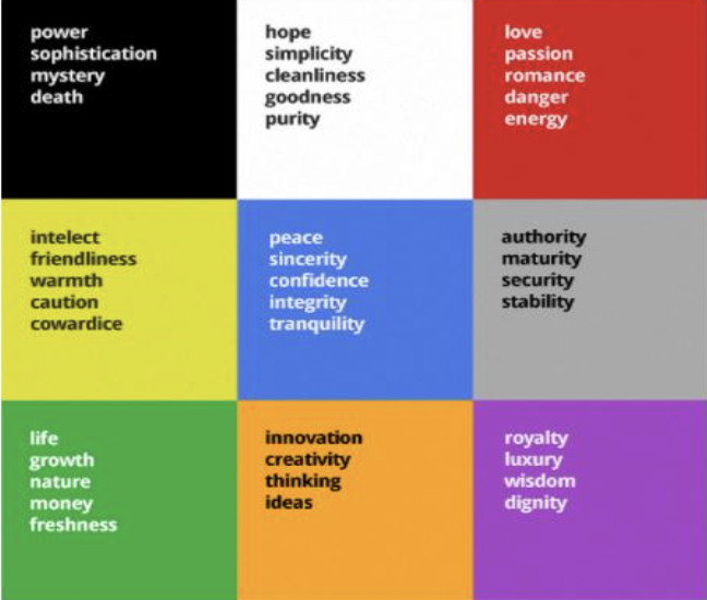
This chart has assisted in deciding the best colours to portray the intention of Quick Give. Although green and blue both portray a sense of trust and finance, it is a common colour seen in the industry such as Paypal.
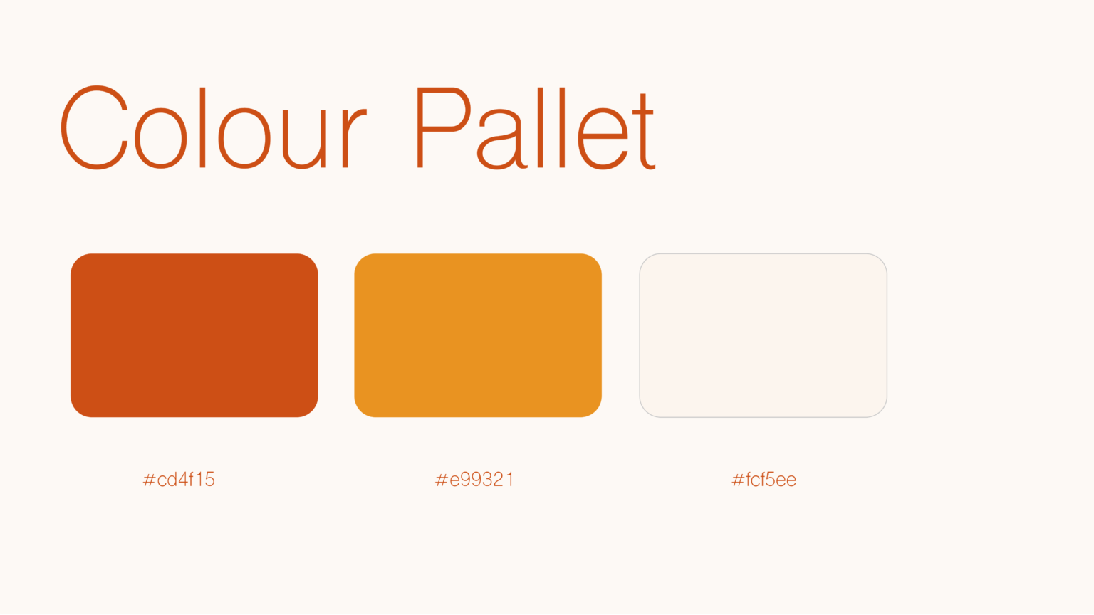
As shown in previous research Quick Give is innovative and the intention is to inspire and portray trust and warmth. This is why I have decided to use a warmer colour scheme as this will differentiate from competitors whilst portraying the correct intentions.
Creating trust in brands
As my project relies on the idea of users donating through the Quick Give widget, It’s essential to ensure users feel comfortable and feel like they can trust the brand and work out how to get people to donate through the widget.
I started off looking into how charities commonly get people to donate and found that they often use a theory called Nudge Theory. The idea of this theory is to encourage charitable giving through certain strategies to increase charitable giving (Hobbs, 2017). There are a variety of strategies that charities use to increase donations:
- Street fund-raising
- Designing giving schemes
- Designing Campaigns
- Designing online donation tools
These strategies are commonly seen on charity websites and in society. However, there are some concerns in the theory. The main criticism is questioning how ethical it is as deception is involved in these strategies which can therefore affect people’s trust in the charities and the process of donating. Ultimately “If it was not for nudges stimulating charitable giving, they would fail to achieve their goals, with their laziness, akrasia, and/or status quo bias undermining their autonomy.” (Ruehle, 2021). Even though it is understandable why charities use nudge theory to increase donations, I want to try to promote donations in a more ethical way and by creating trust with users insured of having to deceive them.
My research showed me that one of the main techniques for building trust with customers is honesty. (Andersen, n.d.) Anderson looks into the company The Body Shops and provides an example of their policies:
Body shop policies
https://www.researchgate.net/profile/Bjorn-Andersen-4/publication/233862683_Honest_Marketing_A_Coherent_Approach_to_Conscientious_Business_Operation/links/00b7d527b8bb1c88cd000000/Honest-Marketing-A-Coherent-Approach-to-Conscientious-Business-Operation.pdf
This example from Anderson shows the importance of being open with customers to increase a sense of trust.
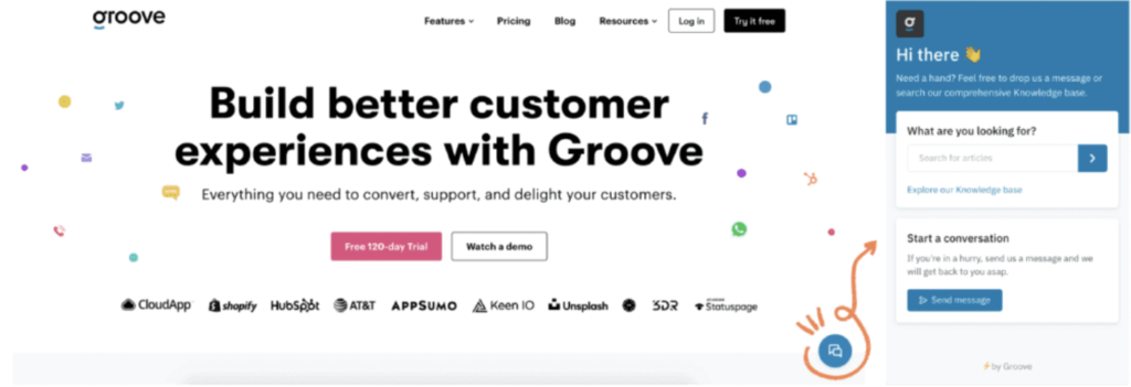
This led me to decide to make an informational website about Quick Give alongside the widget that explains exactly how the widget works. Additionally, to increase usability the widget will have a button link to the website for users to access.
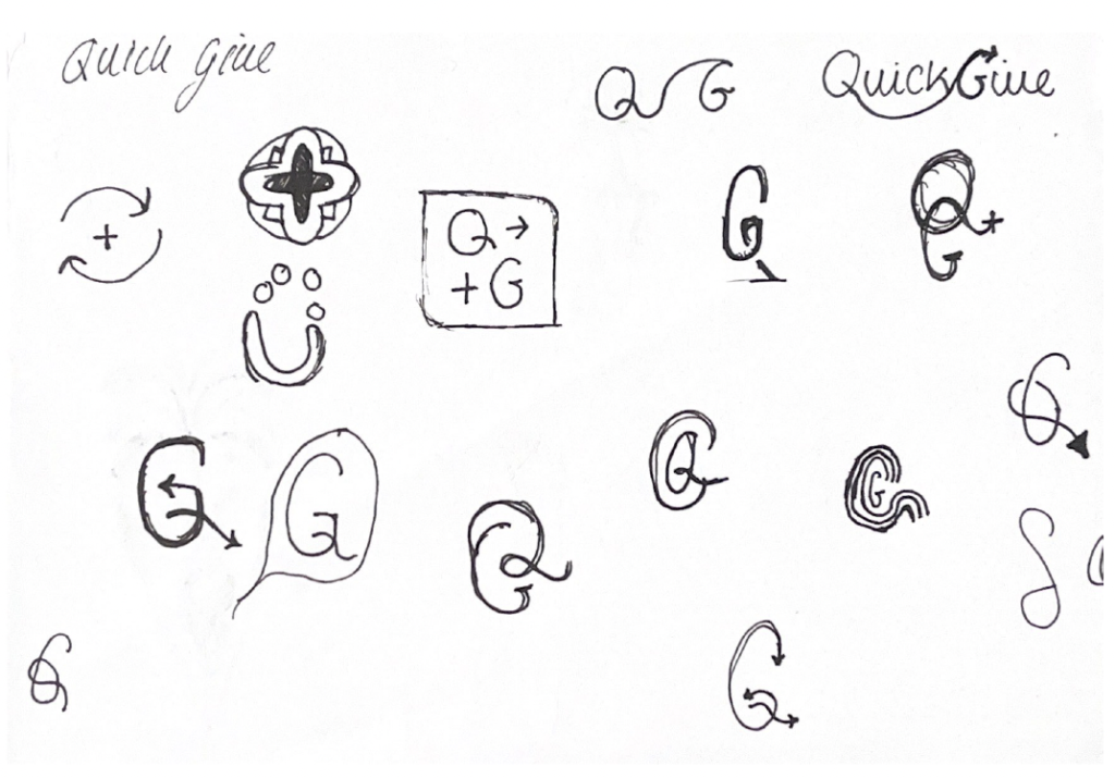
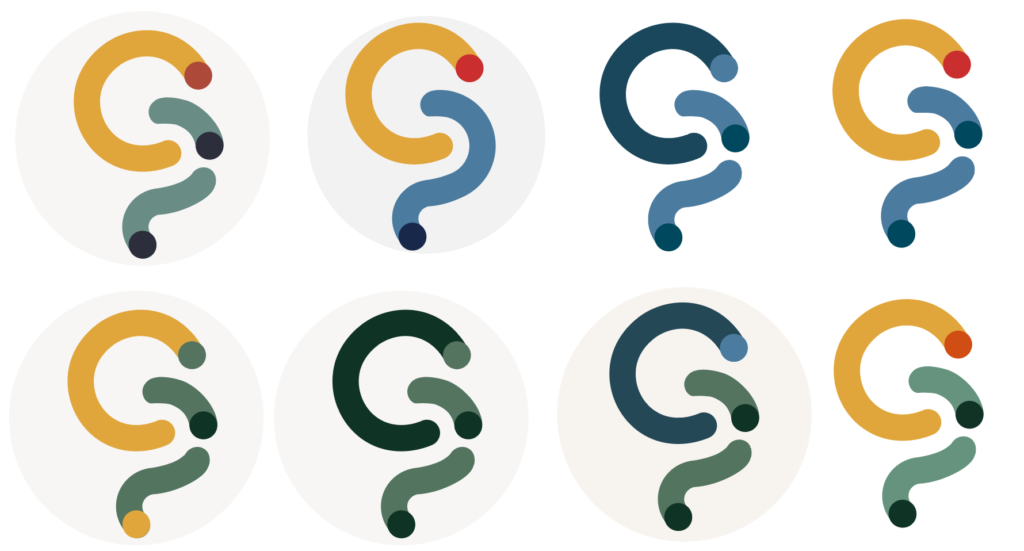
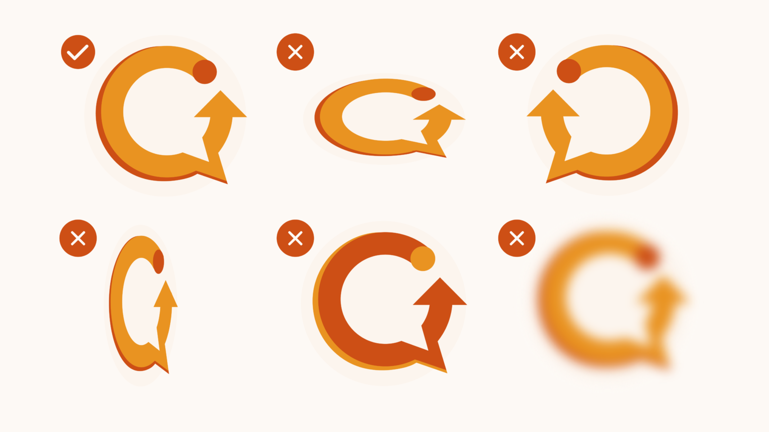
Initial Sketches of the logo
My initial idea for the logo was to incorporate the Q and the G in a different layout. I found that both letters had a circular shape which made it easier to come up with different ideas. I liked the idea of showing the principle of continuity and thought that an arrow would assist in achieving this.
I wanted the logo to be bright and bold as it would be a small icon on a busy website. So I decided to further this idea with some more sketches.
Development of Initial Sketches of the logo
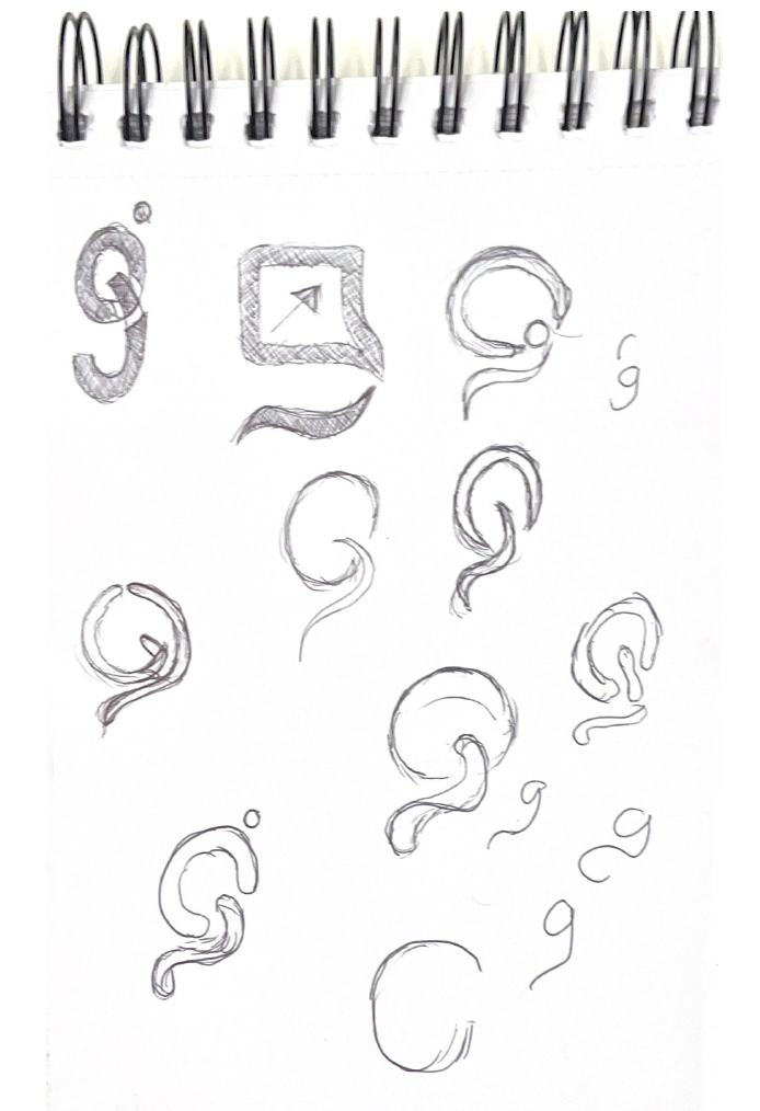
In the next step of the sketching process, I decided to make the lines of the possible logos thicker and also experiment with Multistability to possibly portray more than one meaning to the logo. I also experimented with the different shapes of the Q such as using more of a square shape or a rounded shape. I decided that a circular shape was friendlier which aligned with how I wanted the brand to be perceived by customers.
Development
Once I was happy with the sketches I decided to transfer them into Illustrator. I found that the best style was the abstract link of the Q and the G as it created Emergence within the logo which would help in ensuring the brand was unique and recognisable.
In one of our lectures, we discussed the topic of accessibility and making sure that designs were readable for all disabilities. You can access my blog post by using the button below.
With accessibility in mind, I decided to use a colour-blind app to ensure that my logo would be readable. I found that yellow was the most prominent colour whereas green was the least readable. This would later assist me in choosing the colour scheme for the branding.
Feedback and acting on criticisms

While I initially liked the Emergence aspect of the logo, the practicality as a circular icon on a website meant that I needed to make some adjustments
Placing the logo against a circular background revealed an issue with the continuity aspect. This led me to prioritize adapting the logo to fit within a circular shape.
Further Development
Once i was happy with the logo in its circular format i decided to make a primary version which consisted of using typography to complement the icon. This meant that the logo would be more professional and trustworthy to users.
I went through a few alterations of the typography style but ended up on the bottom version as the circular letters complimented the logo icon.
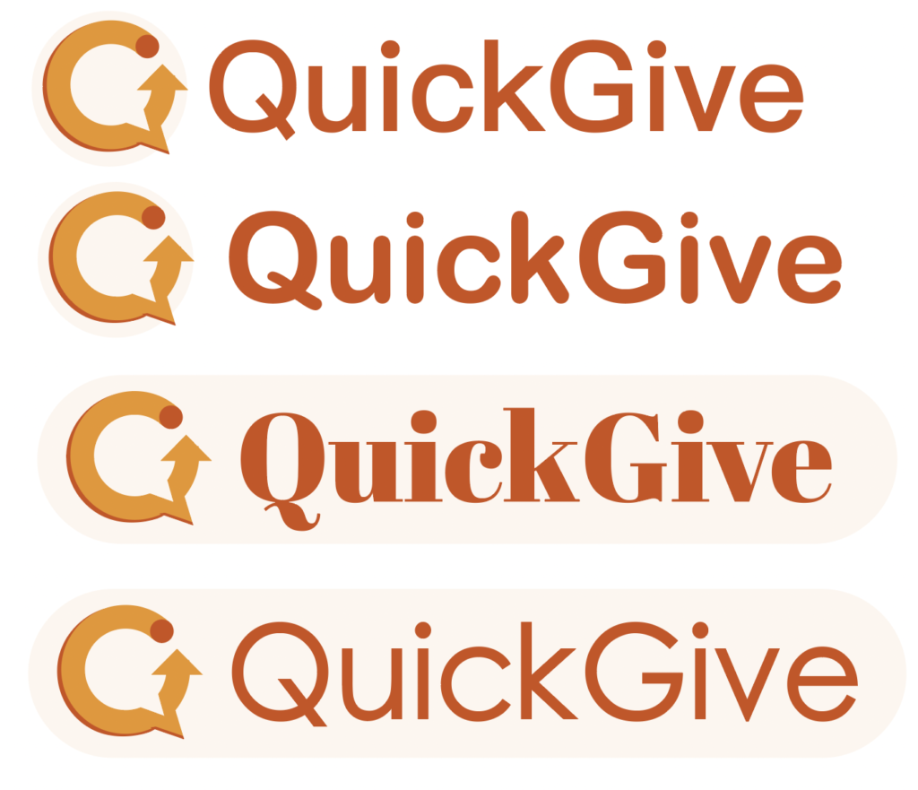
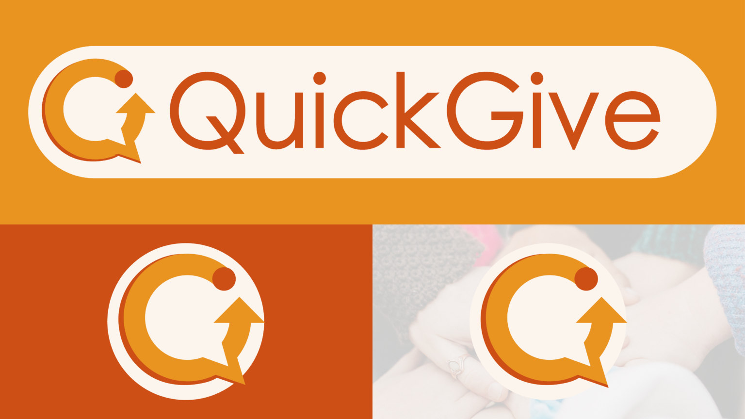
Final Outcomes

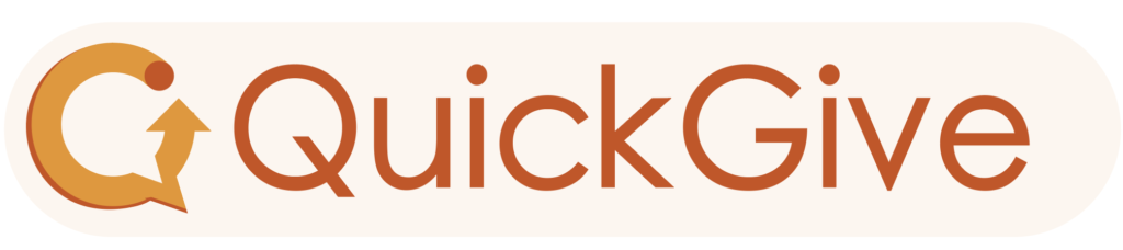
Here are the final designs for the Quick Give logo. I decided to ultimately create two versions, One that would be used as an icon for the widget and the other which would be used on branding and on the website. I decided to go with a warmer colour scheme as this is accessible alongside highlighting warmth and trust which are the core values of the brand.
Branding Guidelines
Section 2: Creating the widget and website
What are widgets?
Karr defines a widget as ” lightweight web applications which are designed for a single specific function and quick instant access to Web 2.0 services or internet content” (Kaar, 2007) He explains that there are three types of widgets:
- Accessory Widgets: these are accessories such as calculators or clocks that don’t rely on support from the internet
- Application Widgets: These are meant to provide users with a less complicated avenue to their final destination on an interface
- Information Widgets: Work with data from the internet to provide creditable information
By understanding the three main types of widgets, enables a further understanding of which widget would be used to complete this projects final outcome.
Neilson explains that UI widgets are created to “invariably draw users’ attention” (Nielsen Norman Group, 2023,a). Neilson also elaborates that widgets can fall under categories however more specific categories such as drop-down menus and selection lists. This shows that websites utilise widgets to gain more attention and make tasks easier for users on certain aspects of a website, therefore highlighting their role in improving user experience. Rosen agrees with Neilson and highlights that website widgets”hold the power to both decrease support volume while increasing customer engagement.”Rosen (2020)
In another article written by Neilson, he shows the changes in web usability since 1994. Within this article the idea of consumer evolution is evident as he highlights that users are “Impatient” and have a tendency to “scan” text rather than read it. (Nielsen Norman Group, 2023,b).
This led me to question if this theory of users being “impatient” could be affecting the users’ motivation to donate through charity websites and if there was a way that I could streamline the donation process. It is clear from Neilson’s research that in his articles that website widgets could assist in making the donation process more efficient .
Examples of website widgets:
Below are some visual examples of what widgets usually look like on websites. These examples are clean and professional however, there’s no indication of the brand or any sense of a unique identity which could be overlooked by users which will hinder the widget’s purpose of being on the website. The aim is to create a widget that will stand out and have a strong brand recognition, therefore being more effective in catching users attention.
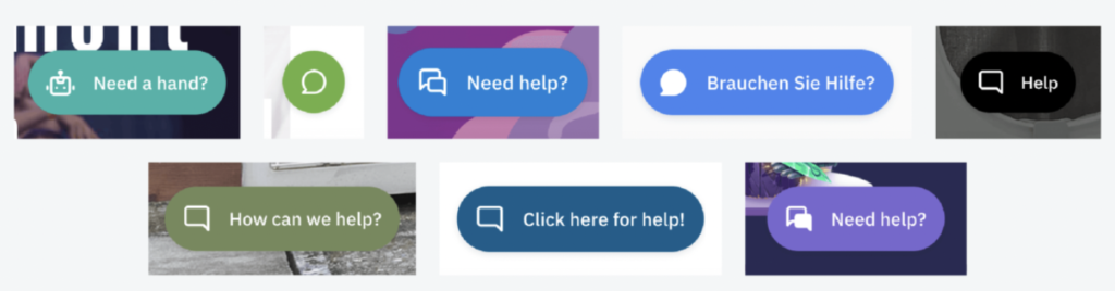
Groove Blog. (2020). What is a Web Widget? Examples and How to Guide. [online] Available at: https://www.groovehq.com/blog/what-is-web-widget [Accessed 8 Nov. 2023].
Sustainability goal 17
One of the properties of Sustainability Goal 17 is a global partnership partnership for sustainable development. Through charitable giving, Quick Give promotes partnerships between charities and businesses to increase donations within the sector. Below are some case studies of how businesses have previously collaborated with charities to promote sustainability which inspired me to create a similar outcome but with a digital aspect through a donation widget can businesses can implement onto their website.
Examples of businesses collaborating with charities:
IKEA Launching 'Real Life Roomsets'
IKEA has partnered with Shelter to create “Real life Roomsets” in IKEA stores to bring light to the issue of homelessness. The idea is to create shock and contrast from ideas normal image of an idyllic showhome and replace it with real environments that people are living in.
They highlight that over 11 million adults are worried about losing their homes and that “One in every 208 people in England is currently experiencing homelessness, with thousands more likely to lose their homes by the end of the year as a result of the cost of living crisis” (Ikea.com, 2023). This is an important example of how companies are advocating social change which can bring more awareness to the issue at hand.
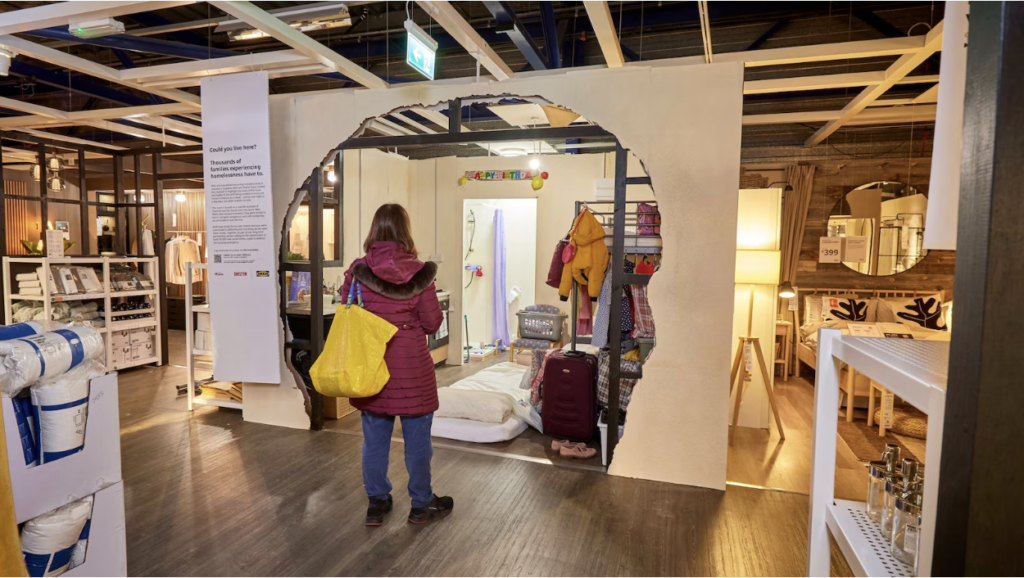
https://www.ikea.com/gb/en/newsroom/corporate-news/ikea-uk-launches-real-life-roomsets-revealing-the-reality-of-those-living-in-temporary-accommodation-pub1db539f0
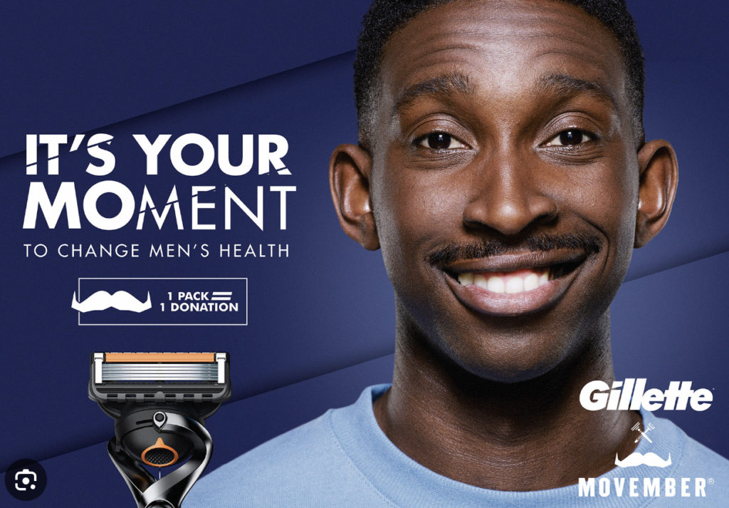
https://uk.movember.com/story/view/id/11618/partnership-spotlight-gillette
Gillette Patrterning with Movember
Movember is the “Leading charity changing the face of men’s health.” they promote the importance of men’s mental health (Movember, 2016). They work with companies such as Gillette to raise funds in order to provide help for men who are struggling with their mental health.
This resulted in a 60% increase in donations in 2020 which shows how impactful partnership is. (Sky Media, 2022)
Target Audience and User Personas
From researching the impact of businesses collaborating with charities and the positive influence the partnership has on donating I decided that I would market the widget to smaller businesses whose brand values involve charitable giving and sustainability. This means that there is a higher chance of businesses supporting the widget and using it within their websites. Although my main target audience is sustainable businesses, I will also be marketing towards people who like to shop online as this will create more traction and popularity around the brand.
Turner (2021) highlights that 75% of customers expect companies to give back to charities. This hilights how important social awareness is to customers and there preferences of where they want to shop. This creates an ideal understanding of who my target audience will be.
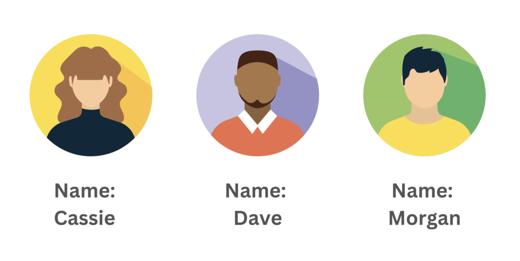
Cassie owns a small business that sells jewellery. One of her goals is to donate a percentage of her earnings to charity but also wants her customers to have the option to donate to her chosen charity though her website.
Dave works for a large corporation that wants to reach out into sustainability and wants to support local charities. His job is to find a way that the company can get their customers to donate whilst navigating their website.
Morgan likes to shop with eco-friendly, sustainable brands that support charities. They want to donate to charity but haven’t got enough time to do it so keep forgetting. They want a quick and easy way that they can donate alongside shopping on their favourite brand’s website.
Archetypes
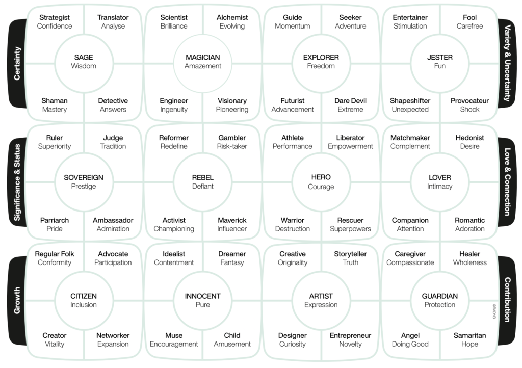
In the article Exploring the changing role of brand archetypes in customer-brand relationships: Why try to be a hero when your brand can be more? Merlo (2023) explains that “Archetypes are universal patterns that everyone is familiar with, or mental images present in the collective unconscious”. Therefore highlighting the importance of categorising target audiences to fully understand how to create an effective brand relationship.
After fully understanding the different archetypes I think that my target audience would be Artists as Quick Give promoted the idea of truth, curiosity and originality. However, I also will aim to target the Guardian as my customers will want to do good and will have compassion for the charities that they are donating to.
Merlo, O. (2023). Exploring the Changing Role of Brand Archetypes in customer-brand relationships: Why Try to Be a Hero When Your Brand Can Be more? [online] Available at: https://www.sciencedirect.com/science/article/pii/S0007681322001355 [Accessed 13 Dec. 2023].
User Journey
As my user’s personas show, Quick Give has two target audiences. The first one is the customer who is navigating and purchasing items on their favourite websites and will use the widget to donate. The second target audience is the businesses that will implement the widget onto their websites for their customers to use. This meant that I needed to make two user journeys for each target audience to understand a variety of perspectives.
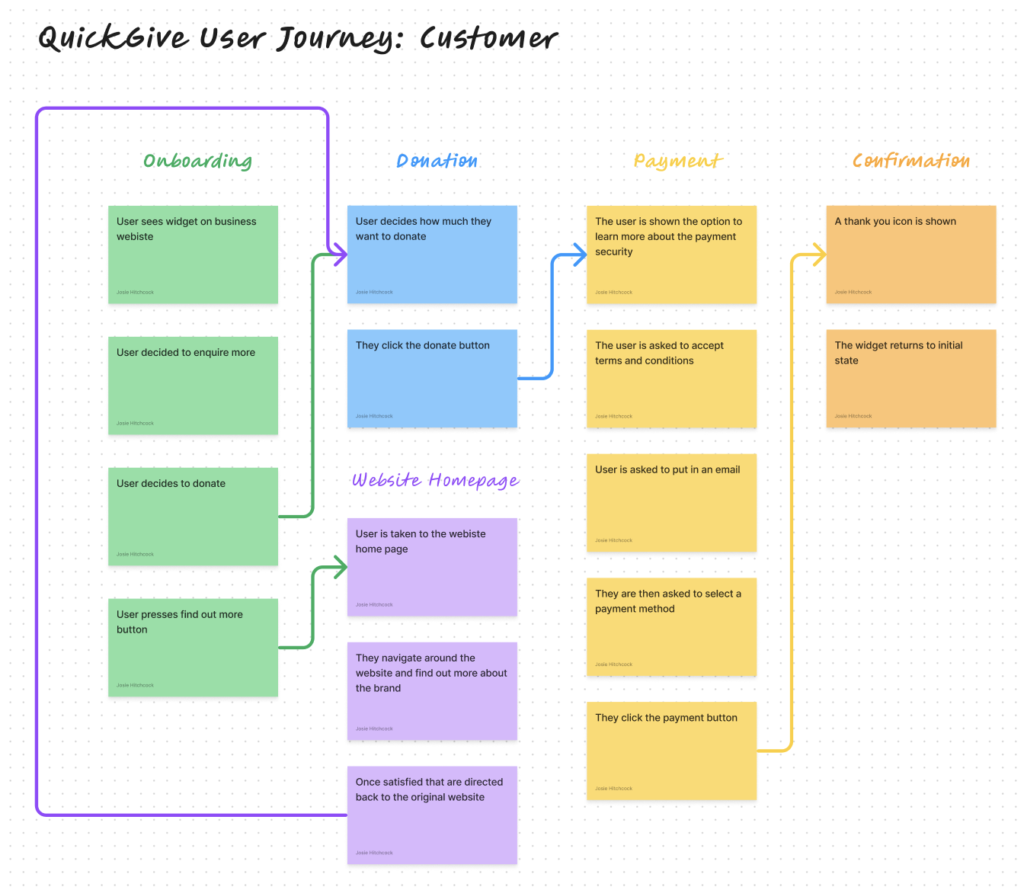
The customer user journey starts with onboarding which is where the customer will first see the widget and enquire more. Then they will have the option to find out more about the company via a link to a supporting website. when the user is satisfied they will then be directed back to the original website where they can choose how much they would like to donate. They will then be asked for an email address for a confirmation email before they choose how they would like to pay. The aim of the widget is to make the process as quick and efficient as possible the payment options will be Apple Pay, Google Pay and PayPal. Once this is completed the user will be shown a confirmation of their payment which then can then continue their shopping.
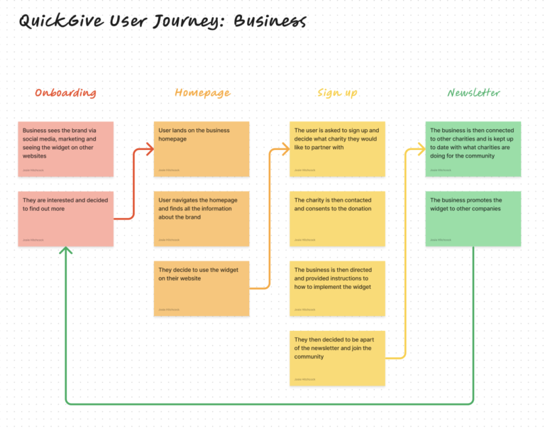
The other target audience which is businesses will have a different user journey which will start with being aware of the company via marketing strategies. This will capture their interest and direct them to our website homepage. The homepage will contain information about who we are and how to incorporate the widget into the website.
Once they decide that they want to use the widget they will be asked to sign up and create an account where they can implement the charities they would like to work with. When the charities have agreed to the partnership the business will be able to download the widget. When the business has created their account they will be kept up to date in via the newsletter.
Marketing Strategies
Partnership marketing
In my user journey for the business target audience, I mentioned that under the onboarding section on the user journey businesses will see the brand via marketing and social media. In order to fully understand the process I have researched the marketing strategies that will be utilised.
Indeed partnership marketing is ” a business relationship between two parties collaborating to produce a marketing campaign that mutually benefits them.” (Indeed.com, 2022) This is supported by the Adobe Communication team where they highlight the advantages of partnership marketing. One of the main advantages that is listed is creating brand trust. As proven previously in this project brand trust is essential to the success of Quick Give so this would be an effective marketing strategy.
Social media marketing
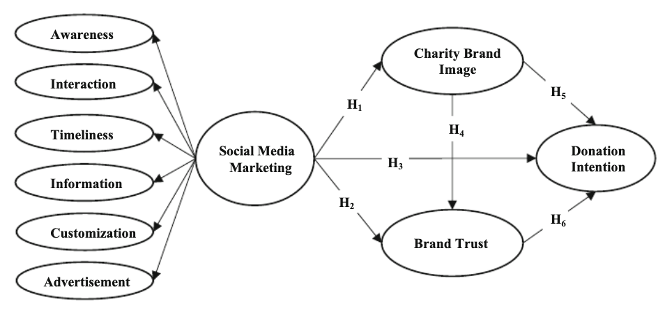
https://www.researchgate.net/publication/357977402_Charity_Social_Media_Marketing_and_Its_Influence_on_Charity_Brand_Image_Brand_Trust_and_Donation_Intention
Bilgin (Yusuf Bilgin and Önder Kethüda, 2022) presents this diagram of how social media marketing works for non-profit organisations. The diagram highlights that by using social media marketing the organisation is creating a link between what the charity wants to achieve and what the customer receives, highlighting the effectiveness of the strategy in creating brand awareness.
Widget Wireframes
Low fidelity
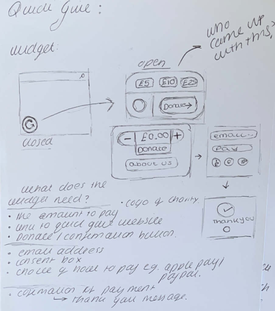
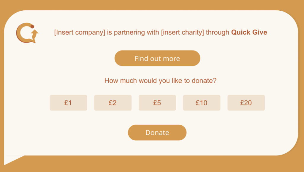
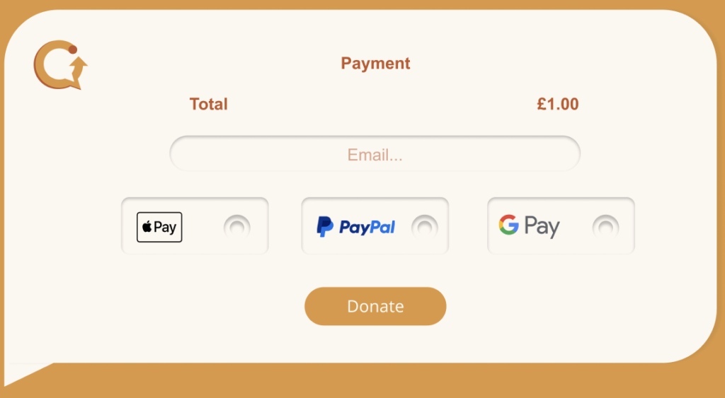
I started off the wireframing process by listing what the widget needs to show and prioritising what is needed to create trust with users. I then started to sketch what the different screens would show, I decided that the widget would have two main screens.
On the first screen there would be a find out more button and a selection of how much the user would like to donate. The second screen will ask for an email and a selection of payment options.
Within my sketches, I experimented with the layout and found that using a centred layout rather than a sectioned layout would be more effective and easier to navigate.
Option 1
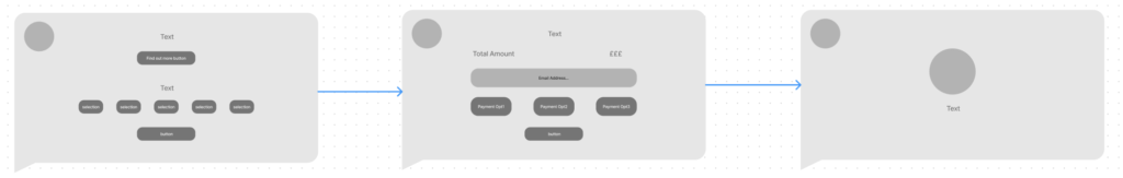
Once I was happy with my initial sketches of the wireframes I started to implement two options of the widget. The first idea consisted of utilising white space to make the layout not seem overcrowded. Once the transaction is finished the widget would reduce back to the icon at the side of the screen.
Option 2
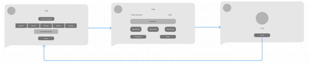
The second option consists of larger buttons to promote accessibility. However, the difference between this option and the first option is that once the user has finished the process they are then directed back to the first screen to have the option to donate again.
Feedback explained that the first option would be best when users are finished with their donation and wouldn’t want to donate again as this may result in frustration and could direct the user off the website.
High fidelity
The next stage of wireframing was to convert the chosen low-fidelity option into a high-fidelity wireframe. This will allow for me to ask feedback from my peers to improve the usability of the widget. This also provides an opportunity to visualise the colour scheme of the widget and ensure that it is readable and accessible for all.
Learning Figma
In order to complete this project to a high quality, I decided to learn an industry-standard software called Figma and documented the process in my blog which you can access by using the button below.
Feedback from Wireframes
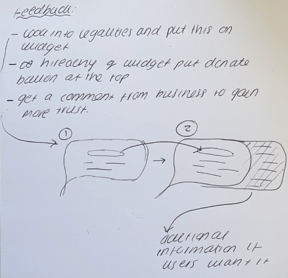
After showing my high fidelity of the wireframe, I decided to ask for feedback on how i could improve the user experience:
- To look into legalities and to ensure to put this onto the widget for users to read – think about how I can do this without making it overcrowded
- Think about the hierarchy of the widget and put the donation button at the top
- Provide a statement form the business to enforce trust
Reflection from feedback
After I had received the feedback I decided to implement my sketch into the design and add another step to the user journey. The user will have an additional option to find out more about Quick Give where they will be shown a quote from the company which will assist in increasing trust. There will be a button for the user to navigate to the quick give website wich will provide additional information
Legalities
This project is based on donations and the transfer of money. It is important to understand the legalities that may be used. Even though this isn’t my expertise I have decided to conduct research based on my feedback.
Incorporating legal conduct in my project is important for several reasons:
- Terms of Service and User Agreements: This is essential for this project as the aim is to create trust between the users and the widget. Being open to users and getting them to agree to the terms of service promotes a positive relationship
- Brand Reputation: Users are increasingly concerned about privacy and ethical business practices. A company that respects legal standards is more likely to gain trust and positive recognition from users.
I have looked into two legal websites that will assist in providing the correct information on the website and widget for users to agree to before donating any money.
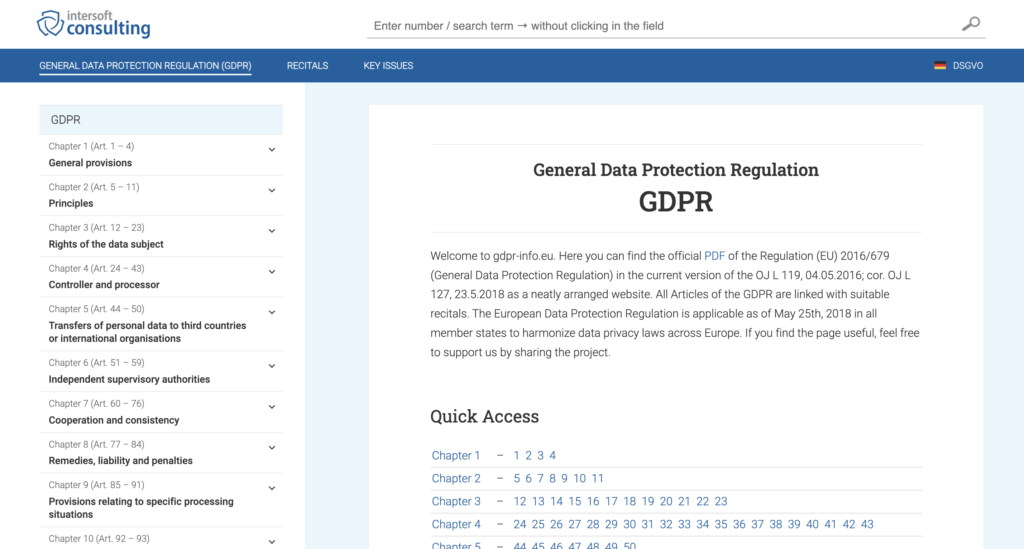
https://gdpr-info.eu/
https://www.fca.org.uk/about/what-we-do/protecting-consumers
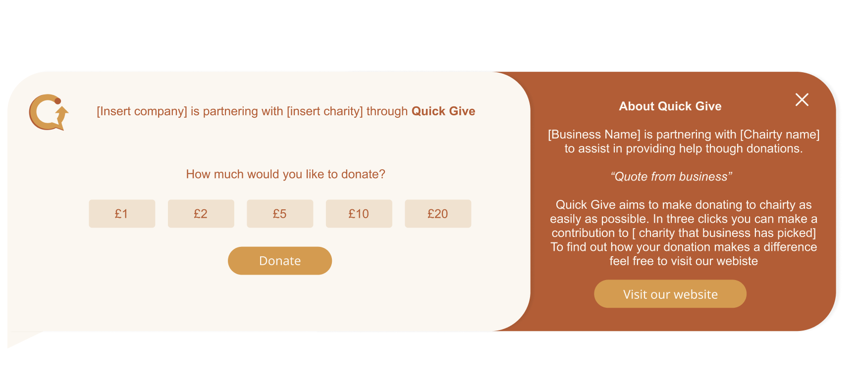
Widget Final Outcome
Below is the final design of the widget, implemented onto the Patagonia website. I chose Patagonia as this is the type of brand which Quick Give would target as their brand values surround sustainability. As you can see the widget would initially be placed on the left side of the screen and when clicked on it would expand which will then be where the user can do the donation. After the user has completed their donation the widget would then minimise back to its original state where the user can then carry on shopping.
I decided that the widget would be placed on the left side of the screen as Neilson found that “Web users spend 80% of their time viewing the left half of the page and 20% viewing the right half.” (Nielsen Norman Group, 2018). Therefore highlighting that placing the widget on the left will increase its efficiency of the widget and enable more donations for charities in comparison to placing the widget on any other location on the website.
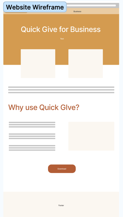
Initial Website Wireframes
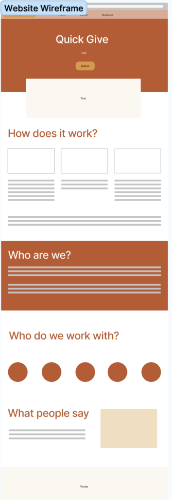
These are my initial website wireframes, I decided to separate the website into two main sections which are Quick Give for customers and Quick Give for business. I used colour to visually represent the separation for users.
The business page was short and simple as I originally thought that the only information the users would need would be how to download the widget onto their website, whereas the customer page would be longer as it is important to be clear and transparent about who we are and how the widget works as my research into the body shop proved how important this is when creating a customer relationship.
Empathy in UX and Card sorting
As part of the research in this project, I decided to write a blog about an article published by Nelson Norman which you can view by pressing the button below
In the article it was clear that understanding empathy in UX design is vital in producing effective interfaces. In order to further my research I decided to practice one of the techniques called card sorting that Neilson suggests to assist in understanding empathy in UX.
Card Sorting:
Alongside Neilson, Spencer and Warfel (2004) promote the exercise of card sorting and agree that it can assist in fully understanding users and their needs. They set out a definitive guide that explains the different techniques and methods that can be used:
- Open Card Sorting: Participants are given a selection of cards that they have to organise into their own headings and categories
- Closed Card Sorting: Participants are given cards that they must categorise but are asked to do this under pre-given headings.
Both methods can be used to detect empathy however one method may be more appropriate than the other.
- Open card sorting: is cheap and simple to exercise however is harder to analyse and the results may vary
- Closed card sorting: is more structured and can produce more definitive results but may not allow users to freely categorise.
Before
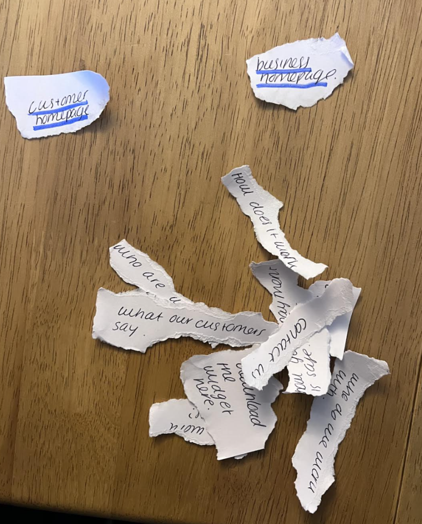
During
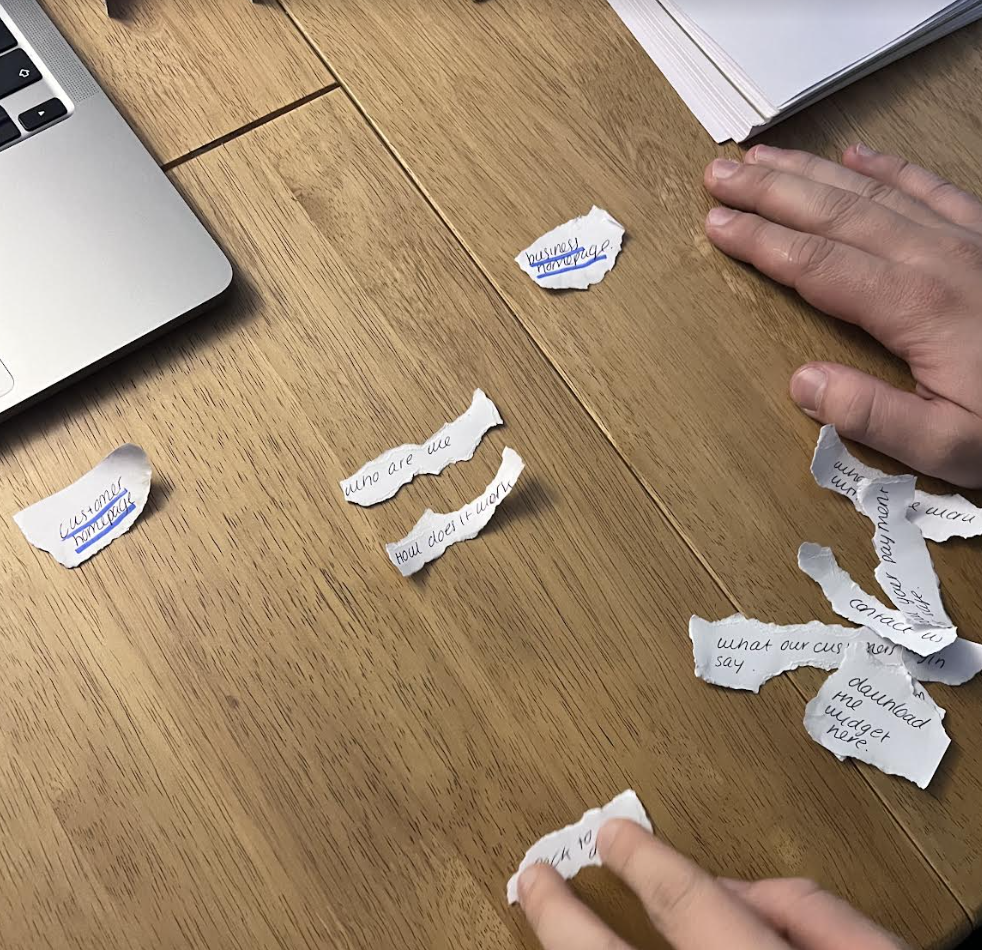
The Result
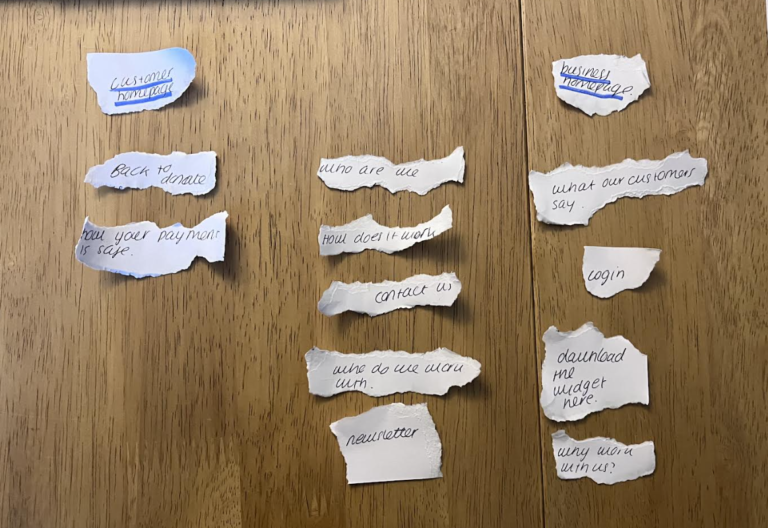
In reflection on the exercise, I found it interesting to see how my users may navigate around my website which will assist in creating an effective informational website to increase trust between the user and my brand.
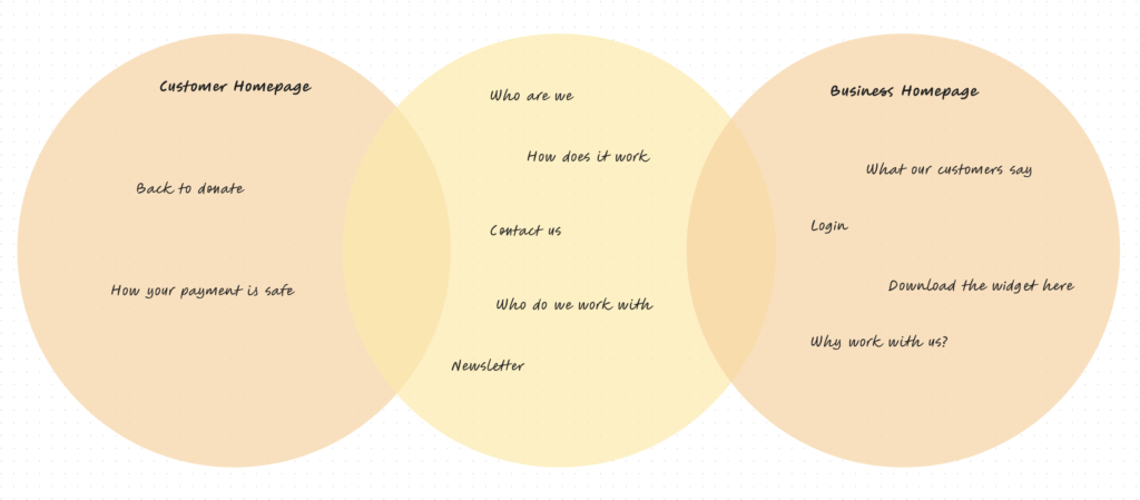
Updated Webiste Wireframes
After completing the card sorting exercise, I decided to develop my initial wireframes further as I noticed that I needed to fix some aspects to ensure an effective user experience.
One of the first improvements that I made was increasing the information on the business page. My feedback showed that even though this target audience wasn’t making the transaction, they still needed to feel confident in implementing the widget onto their website. To ensure this I decided to add some more sections about why the company should work with us and show which chairs we work with.
The second improvement I learnt was that I needed to include a section where the user could sign up for a newsletter which would show the positive things that quick give and charities are doing.
I realised how important this would be in combating dark UX and creating a deeper aspect of the project that highlighted the overall purpose of Quick Give.
Website Final Outcome
Below are the final designs for both website pages. I have added the static image of what they look like overall and alongside a video of how different sections of the pages move and collide. My blog about trends explains the importance of micro-interactions in interfaces and how using a simple animation can increase user engagement and interest.
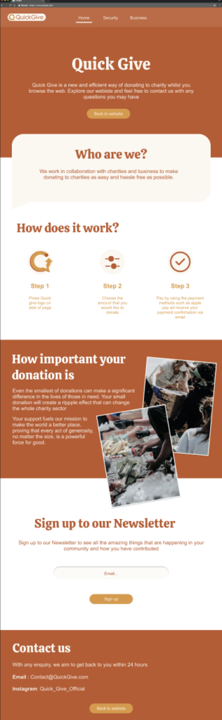
Customer Page
This is the final design for the customer page. I decided to create a modern and unique design as this complements the originality of the business itself and how it is unique in the sector. The first section of the website is who we are as this is the most important for creating the relationship with users. I also replicated the outline of the widget to use as a text box to create a sense of familiarity and brand recognition.
I also wanted to add a section to show customers how their small donation can make a big impact which would hopefully persuade them to donate more regularly.
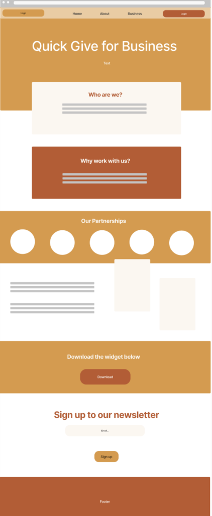
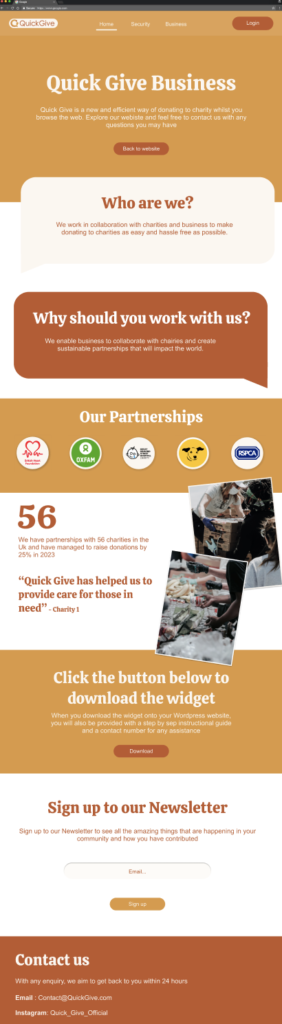
Business Page
This is the final design of the business page. I liked my original idea of implementing some of the same sections as the customer page such as who we are and the newsletter.
I also kept the images that were used in the customer page as they add a visual aspect to how Quick Give is supporting people
However, I wanted to add additional sections such as why work with us and the charities we work with. Also, I wanted to add a quote from one of the charities to promote a sense of community and strong relationships with the people we work with.
The most important section to add to the business page was a button to download the widget. I wanted to make the download process as easy as possible which is why a set of instructions as well as a contact number in case of assistance. This would enable good customer service which has been proven to be important when creating a relationship with users.
Conclusion: Reflection of the project
Review of my aims and objectives
Overall Aim: Enhance and simplify the donation experience for users by implementing the “Quick Give” widget into businesses’ websites, simplifying the donation process with online shopping.
Objective 1: To create a brand called Quick Give that creates trust and effective brand relationships.
Objective 2: To research what widgets are and design a user-friendly interface that combats Dark UX yet enables users to donate quickly and effectively
Objective 3: To create an informational website for customers who want to donate and a page for businesses to partner and collaborate with charities.
My objectives in this project allowed me to fully research the opportunities that widgets have in creating efficient and accessible user interface experiences and the possible potential of using technology partner businesses and non-profit organisations to ultimately help society. Through my research of Dark UX and
My overall thoughts of the project
Overall I enjoyed pushing myself in this project as I decided to create an interface for a sector in which I hadn’t had previous experience but now I feel confident that I know how to design a widget interface that would be easy and effective for users to navigate around.
If I had more time on this project I would focus on the marketing aspects and promote the widget and brand though charity events which would also improve the company connections and partnerships, overall creating a larger base doe businesses to choose possibly more than one choice to partner with.